


소개
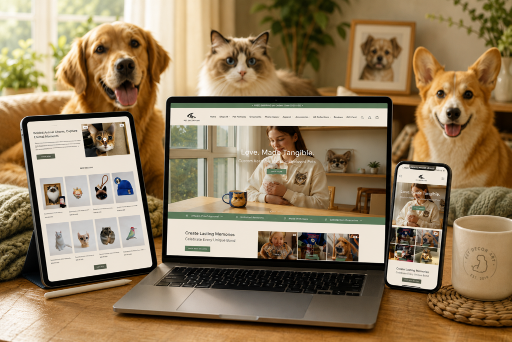
Creating a successful 쇼피파이 website for a personalized pet gift brand requires more than attractive visuals. The website must create emotional engagement, communicate trust instantly, and guide visitors naturally from inspiration to purchase. For a niche focused on custom pet portraits, memorial keepsakes, embroidered apparel, and emotional gifting, design plays an even bigger role because customers are not only shopping for products — they are shopping for memories and emotional experiences.
This project focused on designing a Shopify storefront that feels warm, personal, premium, and emotionally comforting while still maintaining strong e-commerce usability. The goal was to create a shopping experience that balanced storytelling, product discovery, visual hierarchy, and conversion-focused structure without overwhelming visitors.
Rather than treating the website like a standard online store, the entire design direction centered around creating a digital experience that emotionally connected with pet owners from the very first screen. Every page, section, banner, image layout, typography decision, and customer journey was intentionally designed to support that emotional connection.
This article explores how the website design was planned, the challenges involved, the visual strategy behind the Shopify storefront, and how thoughtful Shopify page design helped shape a stronger brand identity and shopping experience.
| 배송 시간 | 범주 | 애플리케이션 플랫폼 |
| 20일 | Pet Decorative Ornaments | shopify |
| 참여 디자이너 | 비용 | 효과 |
| 낸시 | $1800 | Sales📈354% |
Understanding the Brand Vision
Designing for Emotion Instead of Transactions
One of the first priorities during the planning stage was understanding the emotional nature of the brand. Unlike traditional e-commerce stores that focus mainly on pricing or functionality, this type of Shopify website depends heavily on emotional storytelling.
Customers visiting the store are often purchasing:
- Personalized pet portraits
- Pet memorial gifts
- Embroidered pet clothing
- Custom keepsakes
- Handmade remembrance items
- Emotional gifts for pet lovers
Because of this, the design direction needed to feel soft, trustworthy, calming, and highly personal.
Instead of aggressive sales-focused layouts, the website needed to create an atmosphere that encouraged visitors to slow down, browse emotionally, and imagine their own pets transformed into meaningful artwork or keepsakes.
Building a Luxury Yet Comforting Aesthetic
The visual identity focused on balancing two important feelings:
Emotional Warmth
The store needed to feel heartfelt and comforting rather than commercial.
Premium Presentation
At the same time, the products needed to appear valuable, artistic, and gift-worthy.
To achieve this balance, the design strategy included:
- Neutral color palettes
- Warm beige and cream tones
- Large lifestyle photography
- Elegant typography
- Spacious layouts
- Minimal visual clutter
- Oversized product imagery
- Soft transitions between sections
This combination helped the Shopify website feel premium without becoming cold or overly minimalistic.
홈페이지 디자인 전략
강렬한 첫인상 만들기
The homepage became the emotional centerpiece of the entire Shopify experience.
Since most visitors land on the homepage first, the opening visual experience needed to communicate several things immediately:
- The brand specializes in personalized pet products
- The products are emotional and meaningful
- The shopping experience is premium
- The store feels trustworthy and professional
- Navigation is simple and intuitive
Hero Banner Layout
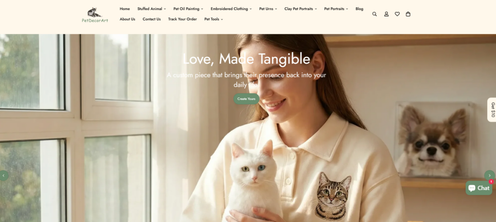
The hero section used large emotional imagery featuring personalized pet artwork and lifestyle-focused visuals.
Rather than overcrowding the banner with excessive text, the design emphasized:
- Clear visual storytelling
- Minimal copy
- Strong emotional photography
- Clean spacing
- Easy-to-see calls to action
This approach helped create a calm and visually engaging entry point instead of overwhelming new visitors.
Structuring the Homepage for Better User Flow
Organizing Product Categories Clearly
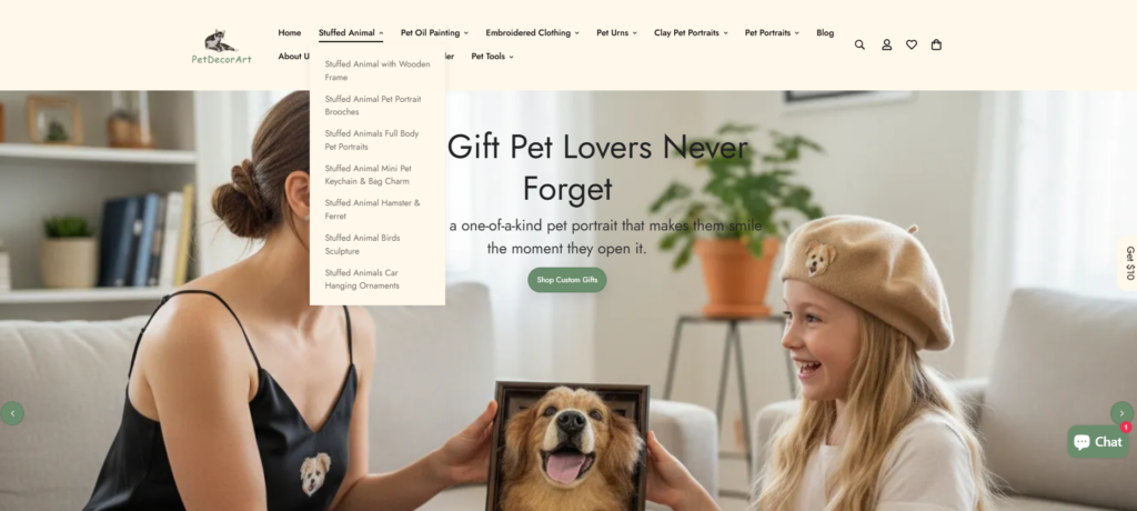
One major challenge was balancing emotional storytelling with practical shopping usability.
The store offers multiple product types, including:
- Portraits
- Apparel
- Memorial products
- 부속품
- Custom artwork
- Handmade gifts
Without careful organization, the homepage could easily feel chaotic.
Our Solution
We designed category sections that used:
- Clear collection groupings
- Large thumbnail previews
- 일정한 간격
- Soft hover interactions
- Balanced typography
- Simple navigation structure
This helped users quickly understand the product range while keeping the browsing experience visually comfortable.
Designing Product Collection Pages
Making Collections Feel Inspirational
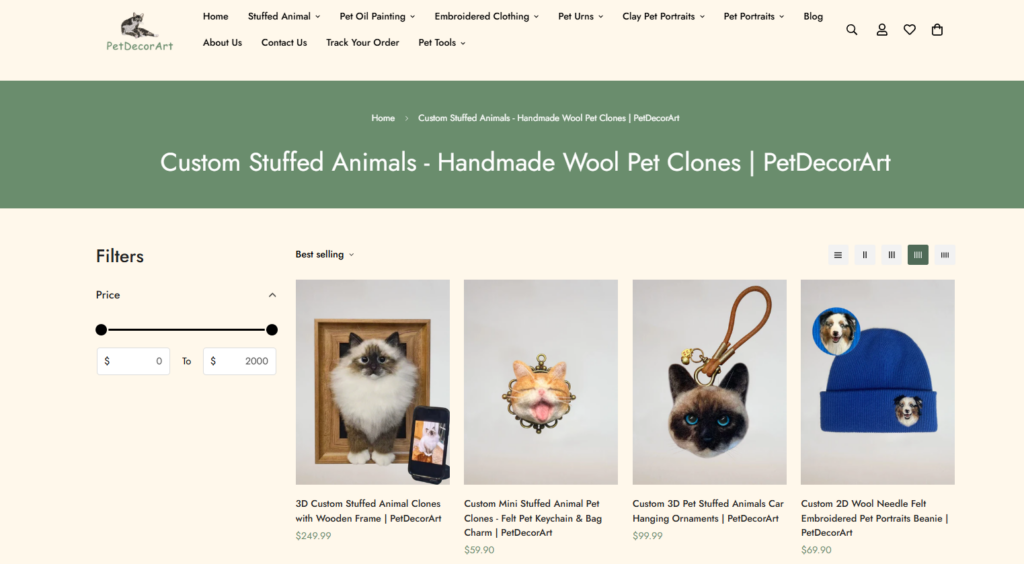
Many Shopify stores treat collection pages like simple product grids. For this project, we approached collections more like curated galleries.
The goal was to make browsing feel inspirational rather than transactional.
Visual Priorities Included:
Large Product Imagery
Products needed enough visual space to showcase personalization details clearly.
Consistent Product Alignment
Uniform image ratios and spacing created a cleaner premium appearance.
Emotional Product Presentation
Lifestyle imagery was mixed with product-focused visuals to help visitors emotionally connect with the items.
Simplified Navigation
Filtering and category transitions needed to remain visually clean and intuitive.
제품 페이지 디자인 접근 방식
Helping Customers Visualize Personalization
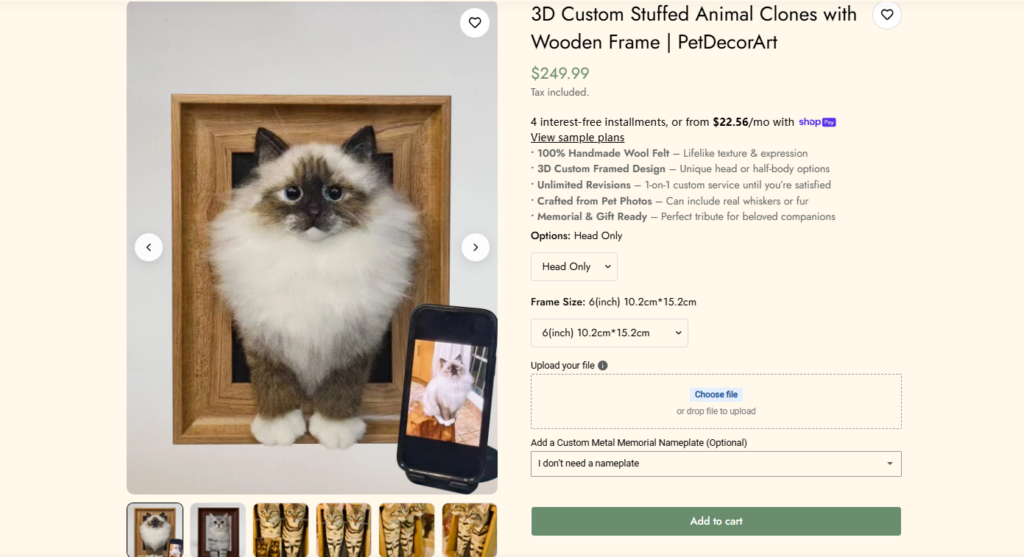
Custom pet products depend heavily on imagination. Customers need to picture their own pets inside the final artwork or keepsake.
Because of this, product page design became extremely important.
Our Product Page Strategy
Oversized Product Images
Large visuals allowed customers to inspect artwork quality, embroidery details, and customization examples.
Cleaner Information Hierarchy
We simplified information flow so visitors could focus on the emotional value of the product rather than becoming distracted by cluttered layouts.
Personalized Preview Inspiration
We incorporated multiple examples showing different customization possibilities to help customers better imagine their own orders.
Soft Conversion Design
Rather than using aggressive sales tactics, the page design encouraged purchases through emotional storytelling and polished presentation.
Typography and Visual Consistency
Choosing Fonts That Matched the Brand Personality
Typography played a major role throughout the Shopify website.
The goal was to create text styles that felt:
- Elegant
- Warm
- 프리미엄
- Readable
- Emotional
We avoided overly playful fonts because they reduced the premium feeling of the store. Instead, we focused on refined typography combinations that supported both emotional storytelling and professional presentation.
Maintaining Visual Consistency Across Pages
Consistency became one of the most important design principles across the project.
We carefully standardized:
- Button styles
- Section spacing
- Image ratios
- Heading hierarchy
- Hover animations
- Color palette
- Product card layouts
- Collection spacing
- Typography sizing
This consistency helped the website feel cohesive and professionally designed from homepage to checkout journey.
Mobile Shopify Design Optimization
Designing for Mobile-First Shopping Behavior
A large percentage of Shopify traffic now comes from mobile users, especially within lifestyle and gift-focused industries.
Because of this, mobile design was not treated as a secondary version of the desktop site.
Instead, we designed the mobile experience intentionally from the beginning.
Mobile Design Priorities
Simplified Navigation
We reduced visual clutter and made category access easier on smaller screens.
Better Scroll Flow
Sections were reorganized to create smoother scrolling behavior and better storytelling progression.
Larger Touch-Friendly Elements
Buttons, menus, and interactive areas were designed for easier mobile interaction.
Balanced Content Spacing
Spacing adjustments helped maintain the premium aesthetic while improving readability on mobile devices.
Creating an Emotional Shopping Journey
Turning Products Into Stories
One of the biggest goals throughout the design process was transforming ordinary product browsing into emotional storytelling.
This affected every major design decision.
Instead of Basic Product Listings
We designed experiences that helped customers emotionally connect with:
- Pet memories
- Personalized artwork
- Meaningful gifting
- Emotional attachment
- Custom craftsmanship
Using Lifestyle Photography Strategically
Lifestyle imagery played a huge role in the visual strategy.
Rather than relying only on plain product photos, the website incorporated images showing products in realistic emotional settings.
This helped customers visualize:
- Gifts being displayed at home
- Memorial pieces within living spaces
- Portraits integrated into daily life
- Emotional reactions connected to personalization
These visuals strengthened emotional engagement while also elevating the perceived value of the products.
Challenges We Faced During the Design Process
Balancing Emotional Design With E-Commerce Functionality
One challenge involved maintaining emotional storytelling without reducing shopping usability.
If the website became too artistic, users might struggle to navigate products efficiently.
If it became too sales-focused, the emotional warmth would disappear.
Our Solution
We carefully balanced:
- Visual storytelling
- 명확한 탐색
- Product accessibility
- Emotional imagery
- Conversion-focused structure
This helped maintain both emotional engagement and strong usability.
Preventing Visual Overload
Because personalized pet products often feature colorful artwork and emotional imagery, there was a risk of overwhelming the interface visually.
Our Solution
We introduced:
- 더 많은 여백
- Softer section transitions
- Cleaner content separation
- Controlled color usage
- Simpler text structures
This improved readability and helped the products remain the visual focus.
Shopify Design Elements That Improved User Experience
Cleaner Navigation Structure
We simplified menu organization to help visitors quickly explore collections without confusion.
Better Homepage Hierarchy
Important sections were prioritized strategically to improve browsing flow.
More Organized Product Displays
Product cards were redesigned for cleaner alignment and stronger visual consistency.
Softer Call-To-Action Styling
Buttons and conversion elements were integrated naturally into the visual experience instead of feeling overly aggressive.
Improved Collection Discovery
Category presentation was designed to encourage deeper browsing across multiple product types.
The Final Result
A More Memorable Brand Experience
The finished Shopify website successfully created a stronger emotional identity for the brand.
Instead of feeling like a generic e-commerce template, the store now delivers:
- A premium visual atmosphere
- Emotional storytelling
- Better product presentation
- Stronger user engagement
- Improved browsing flow
- Cleaner navigation
- More consistent branding
- Higher perceived product value
Stronger Customer Connection
Most importantly, the design helped the brand connect emotionally with pet owners in a more authentic and memorable way.
The website now feels less like a standard online store and more like a carefully curated emotional gifting experience.
Why Shopify Design Matters for Modern Brands
Many businesses underestimate how much design influences customer trust, emotional engagement, and purchase behavior.
For emotional gifting brands especially, website design directly affects:
- Brand perception
- Product value
- 고객 신뢰
- User engagement
- Conversion potential
- Shopping comfort
- 감정적 연결
A visually strategic Shopify website does more than showcase products. It shapes how customers emotionally experience the brand.
결론
이것 쇼피파이 design project demonstrated how thoughtful visual strategy can completely transform the way customers interact with a personalized pet gift brand. By combining emotional storytelling, clean user experience principles, premium visual presentation, and conversion-focused structure, the website evolved into a more engaging and emotionally resonant shopping experience.
From homepage storytelling to collection organization and product presentation, every design decision focused on improving how visitors felt while browsing the store. The result was a Shopify experience that feels warm, elegant, memorable, and highly aligned with the emotional nature of personalized pet products.
At the end of the project, the brand gained more than just a redesigned Shopify storefront. It gained a stronger visual identity, a clearer customer journey, and a more emotionally impactful online presence — the type of strategic Shopify design approach that reflects the creative direction and branding philosophy behind AIRSANG.


완전한 전자상거래 시스템을 갖춘 워드프레스 웹사이트 또는 기업 사이트를 디자인하고 구축하세요.
가격 범위: $200.00~$2,500.00사용자 지정 요구 사항 또는 특별 견적
원래 가격: $2.00.$1.00현재 가격: $1.00. 아마존 가정용 물리치료 기기 메인 이미지 디자인 설명
소개 소개: 아마존에서 홈 테라피 기기의 신뢰할 수 있는 이미지 구축 아마존에서 홈 테라피 기기의 기본 이미지를 디자인할 때 기본 ...

아마존 립스틱 전환을 위한 메인 이미지 디자인
소개: 소개: 아마존에서 판매되는 립스틱 메인 이미지 디자인하기 아마존 립스틱의 메인 이미지를 디자인할 때 우리의 책임은 그 이상입니다.

해커들이 워드프레스 관리자 이메일을 훔치는 방법(그리고 이를 막는 방법)
불편한 진실부터 말씀드리자면, 워드프레스 관리자 이메일은 생각보다 훨씬 더 많이 공개되어 있습니다. 그들은 그것을 좋아합니다. 해커에게 여러분의...

아마존 리퀴드 파운데이션 메인 이미지 변환의 특징은 무엇일까요?
서론 아마존 리퀴드 파운데이션의 메인 이미지 디자인은 단순히 제품을 아름답게 보이게 하는 것만이 아닙니다. 아마존에서 메인 이미지와...

필터 카트리지 제품을 위한 효과적인 아마존 메인 이미지 디자인하기
서론 아마존 메인 이미지 디자인은 단순히 제품을 매력적으로 보이게 하는 것만이 아닙니다. 명확성, 신뢰, 그리고 즉각적인 이해를 제공하는 것이 중요합니다. 특히...

워드프레스에 대한 리플레이 공격: 실제 위협인가, 과장된 신화인가?
먼저 한 가지를 분명히 해두죠. 리플레이 공격은 겉보기에 무섭지 않습니다. 비밀번호를 날려버리지도 않고, 초록색 해커 텍스트가 사방에 흩날리는 악성 코드를 주입하지도 않습니다. 그저 교묘하게 이루어질 뿐입니다.

WordPress 페이지를 손상 없이 복제하는 방법
솔직히 말해봅시다. 때로는 새 페이지를 만들고 싶지 않을 때가 있죠. 그냥 기존 페이지를 약간만 다르게 하고 싶을 때가 있어요. 레이아웃도, 블록도, 설정도 그대로요. 왜냐하면...

반려동물 관련 워드프레스 테마 5가지 비교
서론 반려동물 관련 워드프레스 테마를 선택하는 것은 단순한 디자인 결정 이상의 의미를 지닙니다. 사용성, 확장성, 그리고 장기적인 비즈니스 성장에 직접적인 영향을 미치기 때문입니다. 반려동물 관리 및 관련...

수영복 온라인 쇼핑몰 테마 5가지 비교
서론 수영복이나 란제리 독립 매장에 적합한 테마를 선택하는 것은 단순히 시각적인 결정에 그치는 것이 아니라, 전환율, 확장성, 그리고 장기적인 성공에 직접적인 영향을 미칩니다.

워드프레스에서 댓글 기능을 끄는 방법 (정신줄 놓지 않고)
워드프레스 댓글에 대해 이야기해 봅시다. 이론적으로 댓글은 훌륭합니다. 토론을 장려하고, 커뮤니티를 형성하며, 웹사이트에 생동감을 불어넣습니다. 하지만 현실은 어떨까요? 댓글은 종종 문제를 야기하기도 합니다...

과학 중심 브랜드를 위한 확장 가능한 워드프레스 웹사이트 구축: 아미노USA 프로젝트
서론 오늘날의 디지털 환경에서 웹사이트는 단순히 제품을 나열하는 공간 이상의 의미를 지닙니다. 규제 산업이나 연구 중심 산업에서 활동하는 과학 기반 브랜드에게 웹사이트는 더욱 중요한 역할을 합니다.

글로벌 블레이드 브랜드를 위한 확장 가능한 쇼피파이 스토어 구축: 쿨카타나 프로젝트
서론: 국경을 넘나드는 전자상거래에서 Shopify 웹사이트는 단순한 매장 이상의 의미를 지닙니다. 특정 문화권에서 사업을 운영하는 브랜드의 경우, 웹사이트는 단순한 판매 공간을 넘어 훨씬 더 많은 기능을 수행해야 합니다.

포켓몬 카드 판매를 위한 높은 전환율을 자랑하는 쇼피파이 스토어 디자인하기
서론 수집품 전자상거래, 특히 포켓몬 트레이딩 카드 게임(TCG) 시장에서 웹사이트는 단순히 제품 목록을 나열하는 것 이상의 역할을 해야 합니다.

맞춤형 오프라인 브랜드에 최적화된 전환율 높은 쇼피파이 디자인
서론 오늘날 경쟁이 치열한 전자상거래 환경, 특히 맞춤형 선물 및 수집품 분야에서 Shopify 웹사이트는 단순히 제품을 전시하는 것 이상의 역할을 해야 합니다. ...

Shopify 고객 지원팀에 문의하는 방법: 간단하고 스트레스 없는 가이드
쇼피파이 스토어 운영은 흥미진진해야지 혼란스러워서는 안 됩니다. 궁금한 점이 생기거나 문제가 발생하여 진행이 늦어질 때, 쇼피파이는 상황에 따라 다양한 지원 경로를 제공합니다.

쇼피파이 스토어 비활성화 방법: 명확하고 실용적인 가이드
쇼피파이 스토어를 비활성화하는 것은 복잡하지 않지만, 많은 판매자가 간과하는 몇 가지 결과가 따릅니다. 이 가이드에서는 비활성화 과정을 간단하고 유익하게 설명합니다.

프리미엄 꽃집 브랜드를 위한 쇼피파이 웹사이트 디자인 사례 연구
서론 오늘날 경쟁이 치열한 전자상거래 환경에서 Shopify 웹사이트는 단순히 제품을 보여주는 것 이상의 역할을 해야 합니다. 브랜드 가치를 즉시 전달하고 사용자를 안내해야 합니다...

Shopify 디자인 사례 연구: 레트로 게임 스토어
서론: 경쟁이 치열한 전자상거래 환경에서 시각적 명확성과 감정적 연결은 방문자가 고객이 될지 여부를 결정짓는 중요한 요소입니다. 특히 다음과 같은 경우에 더욱 그렇습니다...