


소개
In today’s competitive eCommerce landscape, design is no longer just about aesthetics—it’s about guiding user behavior, building trust, and driving conversions. For furniture-focused brands, especially those offering functional lifestyle products like slipcovers, the challenge becomes even more nuanced: how do you visually communicate comfort, durability, and style—within seconds?
This case study explores how we approached the design of a premium 쇼피파이 website for a furniture covers brand, focusing on user experience, visual storytelling, and conversion-oriented layout strategy. Rather than relying on technical complexity, the project was driven entirely by thoughtful design decisions—ensuring that every visual element served a purpose.
| 배송 시간 | 범주 | 애플리케이션 플랫폼 |
| 29일 | Furniture Covers | shopify |
| 참여 디자이너 | 비용 | 효과 |
| 린 장 | $3200 | Turnover📈263% |
Understanding the Brand and Market Position
Defining the Core Identity
Before any design work began, we first clarified the brand’s positioning:
- 고급스러우면서도 부담 없이 즐길 수 있는
- Pet-friendly and family-oriented
- Italian-inspired craftsmanship
- Practical solutions for modern homes
This positioning informed every design decision—from typography and color palette to layout structure and image direction.
Target Audience Insights
We identified key audience segments:
- Pet owners seeking protection for furniture
- Families looking for easy maintenance solutions
- Design-conscious homeowners who value aesthetics
These users are highly visual and emotionally driven. They don’t just buy products—they buy lifestyle upgrades.
Homepage Design Strategy: First Impressions That Convert
Visual Hierarchy and Layout Flow
The homepage was structured to guide users through a natural journey:
- Hero Section – Emotional Hook
- Value Proposition – Quick Clarity
- Product Categories – Easy Navigation
- Lifestyle Imagery – Emotional Engagement
- Social Proof – Trust Building
- Product Highlights – Rational Justification
- Call-to-Action – Conversion Push
Every section was intentionally placed to answer a specific user question.
Hero Section: Selling a Lifestyle, Not a Product
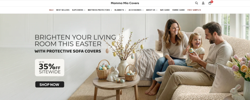
Instead of focusing purely on product features, the hero section emphasizes real-life scenarios:
- Cozy living rooms
- Pets lounging on sofas
- Natural lighting and warm tones
This approach immediately answers the subconscious question:
“Will this fit into my life?”
Design Choices:
- Full-width imagery for immersion
- Soft, neutral color palette to evoke comfort
- Clear headline with benefit-driven messaging
- Minimal distractions to keep focus on the product
Typography and Color System
We selected a combination of:
- Modern sans-serif fonts for readability
- Elegant serif accents for a premium feel
The color palette focused on:
- Warm beige and soft gray tones
- Subtle contrasts to maintain clarity
- Avoiding overly saturated colors to preserve a calm, home-like atmosphere
This balance ensures the site feels both premium and welcoming.
Product Presentation: Clarity Meets Emotion
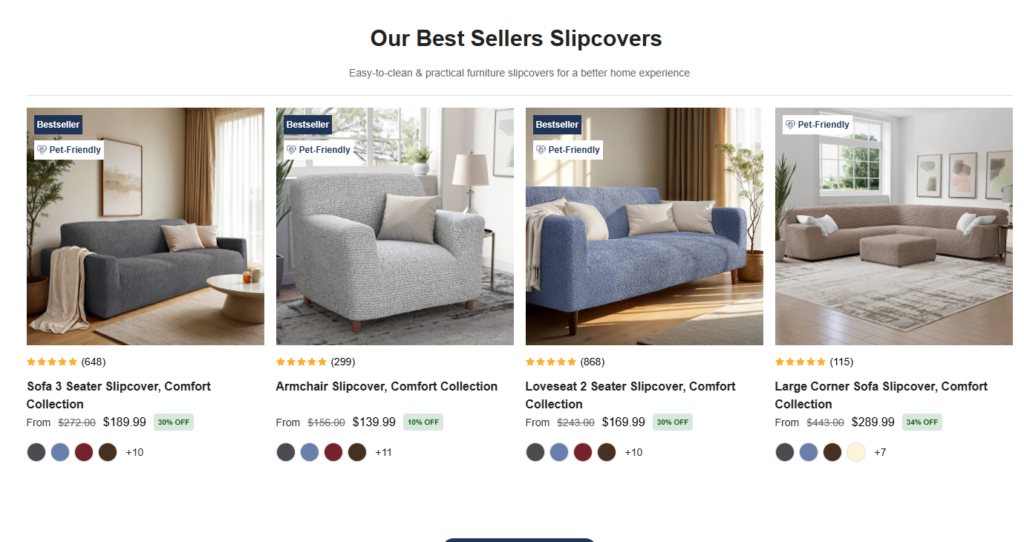
Lifestyle-Driven Product Displays
Instead of isolated product shots, we used:
- Real home environments
- Before-and-after comparisons
- Close-up textures showing fabric quality
This helps users visualize the product in context.
Conversion-Focused Product Cards
각 제품 카드는 다음과 같은 목적으로 설계되었습니다.
- Highlight key benefits (e.g., pet-friendly, washable)
- Maintain visual consistency
- 인지 부하를 줄이세요
Key Elements:
- Clean spacing
- Clear pricing visibility
- Subtle hover interactions (design-led, not technical-heavy)
Navigation and User Experience Design
Simplified Navigation Structure
We avoided overwhelming users with too many options. Instead, we focused on:
- 명확한 카테고리 구분
- Logical grouping of products
- 간편한 접근을 위한 고정 내비게이션
Smart Filtering Experience
Rather than complex filtering systems, we designed a visually intuitive filtering flow:
- Fabric type
- Color options
- Sofa compatibility
This allows users to quickly narrow down choices without friction.
디자인을 통해 신뢰를 구축하세요
Social Proof Integration
Trust is critical in eCommerce, especially for higher-ticket home products.
We incorporated:
- Customer testimonials
- Lifestyle user-generated content
- Subtle review highlights
These elements were integrated seamlessly into the design—not as intrusive blocks, but as natural parts of the browsing experience.
시각적 신뢰 신호
Instead of overwhelming users with badges, we used:
- 깔끔한 아이콘 디자인
- Minimal trust indicators
- Consistent styling
This maintains a premium feel while still reinforcing credibility.
Supporting Pages: Extending the Design System
While the homepage sets the tone, supporting pages reinforce consistency.
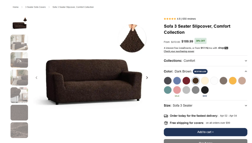
Product Detail Pages (PDP)
The PDP design focused on:
- Clear product storytelling
- Step-by-step feature explanation
- 강력한 시각적 계층 구조
Key Sections:
- Fabric benefits explained visually
- Size and fit guidance
- Lifestyle imagery to reinforce usage scenarios
About Page: Humanizing the Brand
The About page was designed to:
- Highlight craftsmanship
- Communicate brand values
- Build emotional connection
Instead of long text blocks, we used:
- Visual storytelling
- Short, impactful copy
- Clean layouts for readability
Collection Pages: Balancing Choice and Clarity
Collection pages were designed to:
- Showcase variety without overwhelming users
- 일정한 간격과 정렬을 유지하십시오.
- Use visual cues to guide selection
우리의 디자인 프로세스
1. Research and Discovery
We analyzed:
- Competitor websites
- 사용자 행동 패턴
- Industry trends
The goal was to identify gaps and opportunities.
2. Wireframing and Structure Planning
Before visual design, we mapped:
- User journeys
- Content hierarchy
- Conversion pathways
This ensured that the design would be both functional and intuitive.
3. Visual Direction and Mood Development
We defined:
- 색상 팔레트
- Typography systems
- Image style guidelines
This created a cohesive visual identity.
4. Iteration and Refinement
We continuously refined:
- Layout spacing
- Image selection
- Copy placement
Every iteration focused on improving clarity and conversion potential.
우리가 직면했던 어려움
Communicating Function Through Design
Furniture covers are practical products, but functionality alone isn’t enough.
Challenge:
How to visually communicate durability, flexibility, and ease of use—without relying on technical explanations?
Balancing Aesthetic and Usability
A premium look can sometimes conflict with usability.
Challenge:
Maintaining a high-end feel while ensuring the site remains easy to navigate.
Avoiding Visual Clutter
With multiple product variations and features, there’s a risk of overwhelming users.
Challenge:
Keeping the design clean while still delivering all necessary information.
당사의 디자인 솔루션
Visual Storytelling Over Technical Explanation
우리는 다음을 사용했습니다:
- Lifestyle imagery
- Before-and-after visuals
- Texture close-ups
This communicates product value instantly.
Minimalist Layout with Strong Hierarchy
우리는 다음을 보장했습니다:
- Clear section separation
- 일정한 간격
- Focused content blocks
This improves readability and user flow.
Emotion-Driven Design Approach
Instead of selling features, we focused on:
- Comfort
- Convenience
- Lifestyle enhancement
This aligns with how users actually make purchasing decisions.
자주 묻는 질문
A high-converting Shopify furniture store design focuses on clear visual hierarchy, lifestyle-driven imagery, and intuitive navigation. Instead of overwhelming users with features, it highlights key benefits like comfort, durability, and ease of use. Strong product storytelling and trust elements—such as reviews and real-life scenarios—also play a crucial role in guiding users toward purchase decisions.
Lifestyle imagery helps customers visualize how products fit into their daily lives. For furniture covers, showing real homes, pets, and cozy environments builds emotional connection and trust. This approach reduces uncertainty and makes the product feel more relevant, which significantly increases engagement and conversion rates.
Good design improves user experience by simplifying navigation, organizing content clearly, and reducing cognitive load. Elements like clean layouts, consistent spacing, and easy-to-use filters help users find what they need quickly. A well-structured design ensures users move smoothly from browsing to purchasing without confusion.
An effective Shopify homepage typically includes a strong hero section, clear value propositions, organized product categories, lifestyle visuals, and trust-building elements like testimonials. Each section should serve a specific purpose, guiding users step-by-step toward understanding the product and taking action.
Balancing aesthetics and functionality means creating a visually appealing interface without sacrificing usability. This involves using clean layouts, readable typography, and a consistent color system while ensuring all key information remains easy to access. The goal is to create a premium feel that still allows users to navigate effortlessly and make quick decisions.
결과 및 영향
Improved User Engagement
The design led to:
- Longer session durations
- Higher interaction with product pages
- Increased exploration of collections
Stronger Brand Perception
Users perceived the brand as:
- 프리미엄
- Trustworthy
- Lifestyle-oriented
Enhanced Conversion Potential
By simplifying navigation and improving clarity, the design:
- Reduced friction in decision-making
- Made product benefits instantly understandable
- Encouraged faster purchasing decisions
디자인이 그 어느 때보다 중요한 이유
This project reinforces a key principle:
Good design is not decoration—it’s strategy.
In eCommerce, especially on platforms like Shopify, design directly influences:
- 사용자 신뢰
- Product understanding
- 전환율
A well-designed store doesn’t just look good—it performs.
결론
Designing a high-performing 쇼피파이 store requires more than templates or visual polish. It demands a deep understanding of user behavior, brand positioning, and conversion psychology.
From homepage structure to product storytelling, every element of this project was crafted with intention—ensuring that users not only understand the product but also feel confident purchasing it.
에서 AIRSANG, we specialize in design-driven eCommerce experiences. From independent site design to product visual strategy, we help brands turn ideas into high-converting digital storefronts. If you’re looking to elevate your Shopify presence through thoughtful design, our team is here to help.


완전한 전자상거래 시스템을 갖춘 워드프레스 웹사이트 또는 기업 사이트를 디자인하고 구축하세요.
가격 범위: $200.00~$2,500.00custom-requirements-or-special-quotations
원래 가격: $2.00.$1.00현재 가격: $1.00. 아마존 가정용 물리치료 기기 메인 이미지 디자인 설명
소개 소개: 아마존에서 홈 테라피 기기의 신뢰할 수 있는 이미지 구축 아마존에서 홈 테라피 기기의 기본 이미지를 디자인할 때 기본 ...

아마존 립스틱 전환을 위한 메인 이미지 디자인
소개: 소개: 아마존에서 판매되는 립스틱 메인 이미지 디자인하기 아마존 립스틱의 메인 이미지를 디자인할 때 우리의 책임은 그 이상입니다.

해커들이 워드프레스 관리자 이메일을 훔치는 방법(그리고 이를 막는 방법)
불편한 진실부터 말씀드리자면, 워드프레스 관리자 이메일은 생각보다 훨씬 더 많이 공개되어 있습니다. 그들은 그것을 좋아합니다. 해커에게 여러분의...

아마존 리퀴드 파운데이션 메인 이미지 변환의 특징은 무엇일까요?
서론 아마존 리퀴드 파운데이션의 메인 이미지 디자인은 단순히 제품을 아름답게 보이게 하는 것만이 아닙니다. 아마존에서 메인 이미지와...

필터 카트리지 제품을 위한 효과적인 아마존 메인 이미지 디자인하기
서론 아마존 메인 이미지 디자인은 단순히 제품을 매력적으로 보이게 하는 것만이 아닙니다. 명확성, 신뢰, 그리고 즉각적인 이해를 제공하는 것이 중요합니다. 특히...

워드프레스에 대한 리플레이 공격: 실제 위협인가, 과장된 신화인가?
먼저 한 가지를 분명히 해두죠. 리플레이 공격은 겉보기에 무섭지 않습니다. 비밀번호를 날려버리지도 않고, 초록색 해커 텍스트가 사방에 흩날리는 악성 코드를 주입하지도 않습니다. 그저 교묘하게 이루어질 뿐입니다.

WordPress 페이지를 손상 없이 복제하는 방법
솔직히 말해봅시다. 때로는 새 페이지를 만들고 싶지 않을 때가 있죠. 그냥 기존 페이지를 약간만 다르게 하고 싶을 때가 있어요. 레이아웃도, 블록도, 설정도 그대로요. 왜냐하면...

반려동물 관련 워드프레스 테마 5가지 비교
서론 반려동물 관련 워드프레스 테마를 선택하는 것은 단순한 디자인 결정 이상의 의미를 지닙니다. 사용성, 확장성, 그리고 장기적인 비즈니스 성장에 직접적인 영향을 미치기 때문입니다. 반려동물 관리 및 관련...

수영복 온라인 쇼핑몰 테마 5가지 비교
서론 수영복이나 란제리 독립 매장에 적합한 테마를 선택하는 것은 단순히 시각적인 결정에 그치는 것이 아니라, 전환율, 확장성, 그리고 장기적인 성공에 직접적인 영향을 미칩니다.

워드프레스에서 댓글 기능을 끄는 방법 (정신줄 놓지 않고)
워드프레스 댓글에 대해 이야기해 봅시다. 이론적으로 댓글은 훌륭합니다. 토론을 장려하고, 커뮤니티를 형성하며, 웹사이트에 생동감을 불어넣습니다. 하지만 현실은 어떨까요? 댓글은 종종 문제를 야기하기도 합니다...

과학 중심 브랜드를 위한 확장 가능한 워드프레스 웹사이트 구축: 아미노USA 프로젝트
서론 오늘날의 디지털 환경에서 웹사이트는 단순히 제품을 나열하는 공간 이상의 의미를 지닙니다. 규제 산업이나 연구 중심 산업에서 활동하는 과학 기반 브랜드에게 웹사이트는 더욱 중요한 역할을 합니다.

글로벌 블레이드 브랜드를 위한 확장 가능한 쇼피파이 스토어 구축: 쿨카타나 프로젝트
서론: 국경을 넘나드는 전자상거래에서 Shopify 웹사이트는 단순한 매장 이상의 의미를 지닙니다. 특정 문화권에서 사업을 운영하는 브랜드의 경우, 웹사이트는 단순한 판매 공간을 넘어 훨씬 더 많은 기능을 수행해야 합니다.

포켓몬 카드 판매를 위한 높은 전환율을 자랑하는 쇼피파이 스토어 디자인하기
서론 수집품 전자상거래, 특히 포켓몬 트레이딩 카드 게임(TCG) 시장에서 웹사이트는 단순히 제품 목록을 나열하는 것 이상의 역할을 해야 합니다.

맞춤형 오프라인 브랜드에 최적화된 전환율 높은 쇼피파이 디자인
서론 오늘날 경쟁이 치열한 전자상거래 환경, 특히 맞춤형 선물 및 수집품 분야에서 Shopify 웹사이트는 단순히 제품을 전시하는 것 이상의 역할을 해야 합니다. ...

Shopify 고객 지원팀에 문의하는 방법: 간단하고 스트레스 없는 가이드
쇼피파이 스토어 운영은 흥미진진해야지 혼란스러워서는 안 됩니다. 궁금한 점이 생기거나 문제가 발생하여 진행이 늦어질 때, 쇼피파이는 상황에 따라 다양한 지원 경로를 제공합니다.

쇼피파이 스토어 비활성화 방법: 명확하고 실용적인 가이드
쇼피파이 스토어를 비활성화하는 것은 복잡하지 않지만, 많은 판매자가 간과하는 몇 가지 결과가 따릅니다. 이 가이드에서는 비활성화 과정을 간단하고 유익하게 설명합니다.

프리미엄 꽃집 브랜드를 위한 쇼피파이 웹사이트 디자인 사례 연구
서론 오늘날 경쟁이 치열한 전자상거래 환경에서 Shopify 웹사이트는 단순히 제품을 보여주는 것 이상의 역할을 해야 합니다. 브랜드 가치를 즉시 전달하고 사용자를 안내해야 합니다...

Shopify 디자인 사례 연구: 레트로 게임 스토어
서론: 경쟁이 치열한 전자상거래 환경에서 시각적 명확성과 감정적 연결은 방문자가 고객이 될지 여부를 결정짓는 중요한 요소입니다. 특히 다음과 같은 경우에 더욱 그렇습니다...