


소개
In today’s competitive eCommerce landscape, a website must do more than just display products—it needs to communicate trust, clarity, and brand authority within seconds. This is especially true for niche, high-value markets like drone technology, where customers expect both technical credibility and a seamless buying experience.
When working on the Shopify store for Drone Nerds, our goal was to transform a product-heavy catalog into a clean, conversion-focused experience that speaks directly to both hobbyists and professionals. Rather than relying on complex development, we approached the project from a design-first perspective—refining structure, visual hierarchy, and storytelling across key pages.
This case study breaks down how we approached the redesign, the challenges we encountered, and how strategic Shopify design decisions helped elevate the overall user experience.
| 배송 시간 | 범주 | 애플리케이션 플랫폼 |
| 27일 | Drone | shopify |
| 참여 디자이너 | 비용 | 효과 |
| 린 장 | $2800 | Turnover📈277% |
Understanding the Brand and Market Position
Before touching layout or visuals, we focused on understanding the brand’s position.
Drone Nerds operates in a space where:
- Products are technical and often expensive
- Customers require confidence before purchasing
- Education and clarity are critical to conversion
Key Observations
- The catalog is broad: drones, accessories, parts, and bundles
- Users range from beginners to enterprise-level buyers
- Product differentiation is not always visually obvious
Design Implication
We needed to:
- Simplify decision-making
- Highlight trust and authority
- Reduce cognitive load across all pages
Homepage Design: Building Instant Trust and Clarity
The homepage is where most first impressions happen. Our approach focused on creating a structured, high-clarity layout that immediately communicates professionalism.
Hero Section: Authority Over Noise
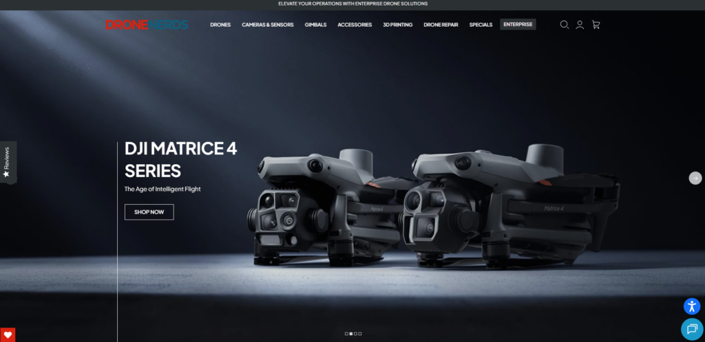
Instead of cluttered promotions, we designed a hero section that:
- Features high-quality drone visuals
- Uses minimal, confident messaging
- Prioritizes category entry over discounts
작동 원리:
Users in this niche don’t respond to aggressive sales tactics. They respond to clarity and confidence.
Category Navigation: Reducing Friction
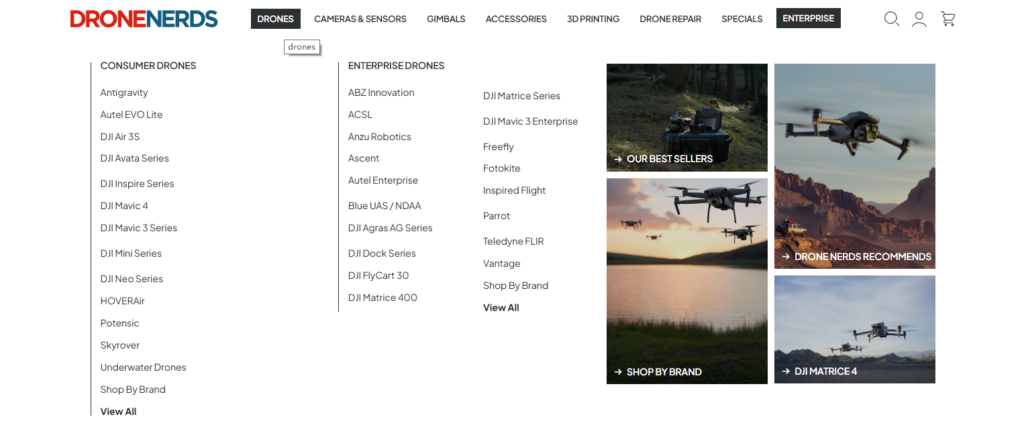
We structured the homepage around clear product pathways:
- Consumer drones
- Professional drones
- Accessories and parts
- Enterprise solutions
Each category block:
- Uses consistent visual framing
- Includes concise descriptors
- Avoids overwhelming detail
Trust-Building Sections
We introduced modular trust sections that reinforce credibility:
- Brand partnerships
- Certifications and warranties
- Customer support highlights
These sections are visually lightweight but strategically placed.
Product Page Design: Turning Complexity into Clarity
The product page is where conversion happens—and where most drone websites fail due to information overload.
Structured Information Hierarchy
We redesigned product pages to follow a clear flow:
- Visual-first gallery
- Key specs summary (above the fold)
- Detailed specifications (scannable blocks)
- Use-case storytelling
Visual Storytelling Instead of Technical Overload
Instead of listing specs as dense text, we:
- Broke information into digestible sections
- Used icons and spacing to guide reading
- Highlighted real-world applications
Conversion-Focused Elements
- Sticky add-to-cart areas
- Clear pricing and availability
- Simplified variant selection
The goal: remove hesitation at every step.
Collection Pages: From Catalog to Guided Experience
Collection pages often become overwhelming in product-heavy stores. Our approach focused on turning them into guided shopping experiences.
Key Improvements
- Clean grid layouts with consistent spacing
- Visual uniformity across product cards
- Reduced unnecessary badges and labels
Filtering and Browsing Experience
Rather than overloading filters, we prioritized:
- 명확한 분류
- Logical grouping
- Easy scanning
This ensures users can quickly find what they need without friction.
Design System: Consistency Across the Entire Store
A major part of this project was establishing a cohesive design system.
Typography
- Clean, modern sans-serif fonts
- Strong hierarchy between headings and body text
- Consistent spacing for readability
Color Strategy
- Neutral base (white, gray, black)
- Accent colors used sparingly
- Focus on product visuals rather than decoration
Component Consistency
We standardized:
- Buttons
- Cards
- Section spacing
- Icon styles
This creates a seamless experience across all pages.
우리의 디자인 프로세스
1. Research and Benchmarking
We analyzed:
- Leading electronics eCommerce sites
- 사용자 행동 패턴
- Competitor positioning
2. Structure First, Visuals Second
We always start with layout:
- Wireframes for key pages
- Content hierarchy mapping
- User flow optimization
Only after structure is finalized do we apply visual styling.
3. Modular Section Design
We designed reusable Shopify sections:
- Homepage blocks
- Product content modules
- Trust and branding sections
This allows flexibility without complexity.
Challenges and Our Solutions
Challenge 1: Product Complexity
문제:
Drone products come with technical specifications that can overwhelm users.
해결책:
We translated technical information into visual and structured content blocks.
Challenge 2: Broad Audience Range
문제:
Beginners and professionals have different needs.
해결책:
We created layered content:
- Simple summaries for quick understanding
- Detailed sections for advanced users
Challenge 3: Maintaining Brand Authority
문제:
A cluttered design reduces perceived trust.
해결책:
We implemented a clean, premium layout that emphasizes clarity and professionalism.
Results: A More Focused and Conversion-Ready Store
After implementing the design improvements, the store achieved:
- Clearer navigation and reduced bounce rates
- Improved product page engagement
- 더욱 강력한 브랜드 인지도
- 더욱 직관적인 브라우징 경험
Most importantly, the site now aligns with how Western customers expect high-end tech eCommerce to feel—clean, structured, and trustworthy.
Why Design Matters More Than Ever in Shopify
Many stores focus heavily on apps and features, but overlook the importance of design.
실제로는:
- Design determines first impressions
- Structure determines usability
- Clarity determines conversion
A well-designed Shopify store doesn’t just look better—it performs better.
결론
디자인하다 쇼피파이 store for a complex product category like drones requires more than aesthetics. It requires a deep understanding of user behavior, information hierarchy, and visual storytelling.
By focusing on clarity, structure, and consistency, we transformed a product-heavy catalog into a streamlined shopping experience that builds trust and drives action.
At the end of the day, great eCommerce design is not about adding more—it’s about removing friction.
바로 여기가 AIRSANG comes in. We specialize in crafting conversion-focused Shopify designs that help brands stand out, communicate clearly, and grow in competitive global markets.


완전한 전자상거래 시스템을 갖춘 워드프레스 웹사이트 또는 기업 사이트를 디자인하고 구축하세요.
가격 범위: $200.00~$2,500.00사용자 지정 요구 사항 또는 특별 견적
원래 가격: $2.00.$1.00현재 가격: $1.00. 아마존 가정용 물리치료 기기 메인 이미지 디자인 설명
소개 소개: 아마존에서 홈 테라피 기기의 신뢰할 수 있는 이미지 구축 아마존에서 홈 테라피 기기의 기본 이미지를 디자인할 때 기본 ...

아마존 립스틱 전환을 위한 메인 이미지 디자인
소개: 소개: 아마존에서 판매되는 립스틱 메인 이미지 디자인하기 아마존 립스틱의 메인 이미지를 디자인할 때 우리의 책임은 그 이상입니다.

해커들이 워드프레스 관리자 이메일을 훔치는 방법(그리고 이를 막는 방법)
불편한 진실부터 말씀드리자면, 워드프레스 관리자 이메일은 생각보다 훨씬 더 많이 공개되어 있습니다. 그들은 그것을 좋아합니다. 해커에게 여러분의...

아마존 리퀴드 파운데이션 메인 이미지 변환의 특징은 무엇일까요?
서론 아마존 리퀴드 파운데이션의 메인 이미지 디자인은 단순히 제품을 아름답게 보이게 하는 것만이 아닙니다. 아마존에서 메인 이미지와...

필터 카트리지 제품을 위한 효과적인 아마존 메인 이미지 디자인하기
서론 아마존 메인 이미지 디자인은 단순히 제품을 매력적으로 보이게 하는 것만이 아닙니다. 명확성, 신뢰, 그리고 즉각적인 이해를 제공하는 것이 중요합니다. 특히...

워드프레스에 대한 리플레이 공격: 실제 위협인가, 과장된 신화인가?
먼저 한 가지를 분명히 해두죠. 리플레이 공격은 겉보기에 무섭지 않습니다. 비밀번호를 날려버리지도 않고, 초록색 해커 텍스트가 사방에 흩날리는 악성 코드를 주입하지도 않습니다. 그저 교묘하게 이루어질 뿐입니다.

WordPress 페이지를 손상 없이 복제하는 방법
솔직히 말해봅시다. 때로는 새 페이지를 만들고 싶지 않을 때가 있죠. 그냥 기존 페이지를 약간만 다르게 하고 싶을 때가 있어요. 레이아웃도, 블록도, 설정도 그대로요. 왜냐하면...

반려동물 관련 워드프레스 테마 5가지 비교
서론 반려동물 관련 워드프레스 테마를 선택하는 것은 단순한 디자인 결정 이상의 의미를 지닙니다. 사용성, 확장성, 그리고 장기적인 비즈니스 성장에 직접적인 영향을 미치기 때문입니다. 반려동물 관리 및 관련...

수영복 온라인 쇼핑몰 테마 5가지 비교
서론 수영복이나 란제리 독립 매장에 적합한 테마를 선택하는 것은 단순히 시각적인 결정에 그치는 것이 아니라, 전환율, 확장성, 그리고 장기적인 성공에 직접적인 영향을 미칩니다.

워드프레스에서 댓글 기능을 끄는 방법 (정신줄 놓지 않고)
워드프레스 댓글에 대해 이야기해 봅시다. 이론적으로 댓글은 훌륭합니다. 토론을 장려하고, 커뮤니티를 형성하며, 웹사이트에 생동감을 불어넣습니다. 하지만 현실은 어떨까요? 댓글은 종종 문제를 야기하기도 합니다...

과학 중심 브랜드를 위한 확장 가능한 워드프레스 웹사이트 구축: 아미노USA 프로젝트
서론 오늘날의 디지털 환경에서 웹사이트는 단순히 제품을 나열하는 공간 이상의 의미를 지닙니다. 규제 산업이나 연구 중심 산업에서 활동하는 과학 기반 브랜드에게 웹사이트는 더욱 중요한 역할을 합니다.

글로벌 블레이드 브랜드를 위한 확장 가능한 쇼피파이 스토어 구축: 쿨카타나 프로젝트
서론: 국경을 넘나드는 전자상거래에서 Shopify 웹사이트는 단순한 매장 이상의 의미를 지닙니다. 특정 문화권에서 사업을 운영하는 브랜드의 경우, 웹사이트는 단순한 판매 공간을 넘어 훨씬 더 많은 기능을 수행해야 합니다.

포켓몬 카드 판매를 위한 높은 전환율을 자랑하는 쇼피파이 스토어 디자인하기
서론 수집품 전자상거래, 특히 포켓몬 트레이딩 카드 게임(TCG) 시장에서 웹사이트는 단순히 제품 목록을 나열하는 것 이상의 역할을 해야 합니다.

맞춤형 오프라인 브랜드에 최적화된 전환율 높은 쇼피파이 디자인
서론 오늘날 경쟁이 치열한 전자상거래 환경, 특히 맞춤형 선물 및 수집품 분야에서 Shopify 웹사이트는 단순히 제품을 전시하는 것 이상의 역할을 해야 합니다. ...

Shopify 고객 지원팀에 문의하는 방법: 간단하고 스트레스 없는 가이드
쇼피파이 스토어 운영은 흥미진진해야지 혼란스러워서는 안 됩니다. 궁금한 점이 생기거나 문제가 발생하여 진행이 늦어질 때, 쇼피파이는 상황에 따라 다양한 지원 경로를 제공합니다.

쇼피파이 스토어 비활성화 방법: 명확하고 실용적인 가이드
쇼피파이 스토어를 비활성화하는 것은 복잡하지 않지만, 많은 판매자가 간과하는 몇 가지 결과가 따릅니다. 이 가이드에서는 비활성화 과정을 간단하고 유익하게 설명합니다.

프리미엄 꽃집 브랜드를 위한 쇼피파이 웹사이트 디자인 사례 연구
서론 오늘날 경쟁이 치열한 전자상거래 환경에서 Shopify 웹사이트는 단순히 제품을 보여주는 것 이상의 역할을 해야 합니다. 브랜드 가치를 즉시 전달하고 사용자를 안내해야 합니다...

Shopify 디자인 사례 연구: 레트로 게임 스토어
서론: 경쟁이 치열한 전자상거래 환경에서 시각적 명확성과 감정적 연결은 방문자가 고객이 될지 여부를 결정짓는 중요한 요소입니다. 특히 다음과 같은 경우에 더욱 그렇습니다...