


소개
In the competitive world of drone and FPV eCommerce, design is not decoration—it is strategy. When shoppers visit a specialized online store like GetFPV, they expect clarity, speed, authority, and inspiration within seconds. The visual experience must immediately communicate trust, product depth, and industry expertise.
This project focused on reimagining how a high-volume 쇼피파이 store in the FPV drone niche can elevate its brand presence while driving measurable business performance. Our role centered entirely on Shopify website design—structure, layout systems, visual hierarchy, user flow, content clarity, and conversion psychology—without diving into backend development.
In this case study, we break down how we approached the Shopify design process for GetFPV, the goals we set, the challenges we encountered, the design solutions we implemented, and the results the client achieved.
| 배송 시간 | 범주 | 애플리케이션 플랫폼 |
| 22일 | Drone | shopify |
| 참여 디자이너 | 비용 | 효과 |
| 린 장 | $1200 | Purchase Rate📈206% |
브랜드와 시장에서의 위치 이해하기
The FPV Industry Landscape
The FPV (First-Person View) drone market attracts enthusiasts, hobbyists, competitive pilots, and professional cinematographers. The audience is technical, detail-oriented, and highly comparison-driven. Product specifications, compatibility, and trust signals heavily influence purchasing decisions.
A generic Shopify layout would not meet the expectations of this audience. The site needed to feel:
- Authoritative
- Organized and easy to navigate
- Rich in product categories
- High-performance in visual presentation
- Community-oriented
Brand Goals
Before any design work began, we defined the core goals:
- Strengthen brand authority in the FPV industry
- 제품 검색 가능성을 개선하세요
- Reduce friction in the browsing experience
- Highlight promotions without overwhelming the user
- Increase engagement across featured categories and industries
We approached this as a Shopify design challenge, not a development task. Our responsibility was to craft a layout and visual structure that would support conversion while reinforcing the brand’s leadership in the market.
Shopify 디자인 프로세스
Discovery & Strategic Planning
Every strong Shopify design begins with clarity.
We analyzed:
- Product depth and category hierarchy
- Existing visual identity
- Promotional strategy
- Navigation patterns
- User behavior in enthusiast-driven markets
We mapped how users move through a specialty eCommerce store:
- Landing on homepage
- Exploring categories
- Browsing featured products
- Comparing specs
- Moving into cart
This behavioral mapping guided every structural decision.
Information Architecture & Layout Strategy
Designing for Product Volume
GetFPV carries a large inventory: drone bundles, FPV goggles, motors, propellers, electronics, batteries, frames, and more. If poorly structured, such volume overwhelms users.
우리는 다음 사항에 집중했습니다:
- Clean category segmentation
- Prominent “Featured Categories” sections
- Logical grouping for industries (Cinematography, Education)
- Clear visual separation between product blocks
The homepage layout became a strategic funnel:
- Hero banner (brand and flagship focus)
- Trust signals and shipping information
- Category overview
- Featured products
- Industry segmentation
- 신상품
- Clearance section
- 교육 콘텐츠
This structure guides users from awareness to exploration to transaction.
Hero Section Design – Authority Within Seconds
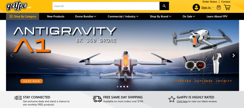
The hero section is prime real estate.
We designed it to:
- Showcase flagship drones visually
- Use bold typography for model names
- Maintain high contrast for readability
- Include a clear “Shop Now” CTA
Instead of cluttering the hero with excessive information, we prioritized impact. Large-scale product imagery combined with minimal supporting copy ensures clarity even on first glance.
The goal: Within three seconds, visitors understand what the store specializes in.
Visual Hierarchy & Conversion-Driven Design
Featured Products Layout
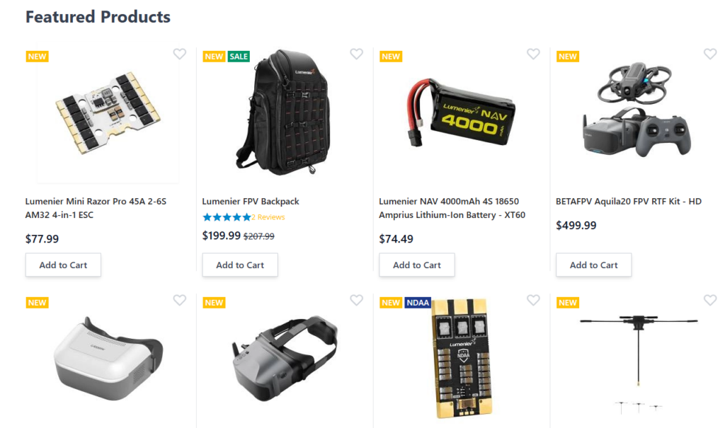
Grid Clarity Over Visual Noise
The product grid design needed to balance:
- Thumbnail clarity
- Price visibility
- Rating information
- Promotional tags (NEW, SALE)
We avoided visual overload. Each product card includes:
- Clear product image
- Concise product name
- Price with discount emphasis
- Clean “Add to Cart” button
Spacing plays a major role. We use consistent padding and white space to allow scanning. Enthusiast shoppers often compare multiple items—clarity increases decision confidence.
Promotional Strategy Without Disruption
The site includes:
- Same Day Shipping banner
- Stock Clearance section
- Loyalty Program callouts
- Discounts & Coupons block
Instead of aggressive popups, we integrated promotions into the layout rhythm.
Design Principle Applied
Promotions should feel like part of the brand experience, not interruptions.
Color accents and banner segmentation help users notice deals while maintaining trust and professionalism.
Navigation & User Flow Optimization
Top-Level Navigation Clarity
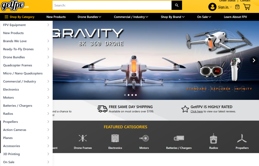
For a specialty Shopify store, navigation determines user retention.
We structured navigation to:
- Highlight major categories
- Provide quick access to “Shop by Brand”
- Maintain clean dropdown grouping
- Keep header visually lightweight
A cluttered mega menu can create cognitive fatigue. We simplified hierarchy while preserving depth.
Supporting Trust Through Micro-Design
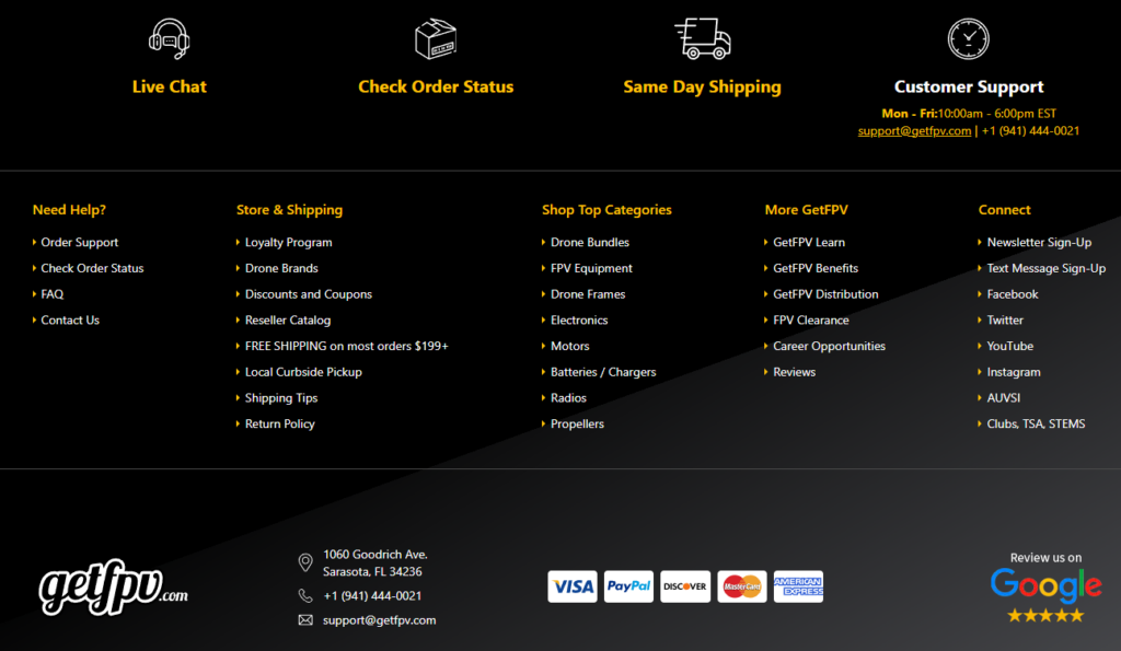
Trust in high-ticket hobby electronics matters.
We reinforced trust through:
- Star ratings under products
- Visible shipping policies
- Loyalty program section
- Customer support access in footer
Design isn’t just aesthetic. It communicates operational reliability.
우리가 직면했던 어려움
Managing Large Inventory Without Overwhelm
The biggest challenge was balancing product density with simplicity.
Too many items per row = visual chaos.
Too few items per row = unnecessary scrolling.
We tested grid density variations and optimized spacing to maintain rhythm.
Balancing Enthusiast Technicality With Clean Design
FPV buyers love specifications. However, homepage design should not feel like a manual.
우리의 해결책은 다음과 같습니다.
- Keep technical depth inside product pages
- Maintain homepage clarity
- Use structured content blocks instead of dense text
This preserves professionalism without intimidating newcomers.
Maintaining Brand Energy Without Visual Aggression
FPV is high-energy. But too much aggressive styling can hurt trust.
우리는 다음을 사용했습니다:
- Strong but controlled color accents
- Dark and light contrast balance
- Modern typography hierarchy
- Structured layout repetition
The result feels energetic yet reliable.
우리의 디자인 방법론
Conversion-Focused Visual Strategy
Our Shopify design philosophy focuses on:
- 명확한 위계 구조
- Consistent spacing systems
- Strategic CTA placement
- Product-first storytelling
- Promotional balance
We design for business results—not decoration.
Modular Layout Thinking
We treat every Shopify homepage as a modular system.
Each section is:
- Purpose-driven
- Independently strong
- Visually aligned with brand identity
- Designed for adaptability
This approach allows clients to update featured products, promotions, and campaigns without redesigning the entire experience.
Brand Cohesion Across All Sections
Consistency builds recognition.
We aligned:
- Button styles
- Typography scales
- Iconography
- Banner overlays
- Grid spacing
Every component feels part of one visual system.
Measurable Outcomes
While respecting client confidentiality, the redesign achieved:
- 홈페이지 참여도 향상
- Higher click-through rate on featured products
- Stronger visibility for promotional campaigns
- Increased exploration of category pages
Design clarity directly impacts conversion. When users feel guided rather than overwhelmed, they stay longer and shop more confidently.
Why Professional Shopify Design Matters
Shopify provides powerful infrastructure. But infrastructure alone does not guarantee performance.
What transforms a Shopify store into a high-converting brand experience is:
- Strategic layout planning
- Visual storytelling
- Structured information hierarchy
- 전환 심리학
- Design consistency
In niche industries like FPV, authority and clarity are everything.
결론
Designing a Shopify experience for a specialized brand like GetFPV requires more than placing products on a template. It demands strategic thinking, user psychology awareness, structured hierarchy, and brand cohesion.
Through thoughtful layout architecture, conversion-driven product presentation, balanced promotional integration, and clean visual hierarchy, we transformed a complex inventory into a streamlined, authoritative eCommerce experience.
We approach every 쇼피파이 project with the same philosophy: design with purpose, structure with clarity, and optimize for business growth.
If you are looking to elevate your Shopify store through strategic design—not development, but powerful visual and structural optimization—our team at AIRSANG specializes in high-performance Shopify design experiences that align brand identity with measurable results.


완전한 전자상거래 시스템을 갖춘 워드프레스 웹사이트 또는 기업 사이트를 디자인하고 구축하세요.
가격 범위: $200.00~$2,500.00custom-requirements-or-special-quotations
원래 가격: $2.00.$1.00현재 가격: $1.00. 아마존 가정용 물리치료 기기 메인 이미지 디자인 설명
소개 소개: 아마존에서 홈 테라피 기기의 신뢰할 수 있는 이미지 구축 아마존에서 홈 테라피 기기의 기본 이미지를 디자인할 때 기본 ...

아마존 립스틱 전환을 위한 메인 이미지 디자인
소개: 소개: 아마존에서 판매되는 립스틱 메인 이미지 디자인하기 아마존 립스틱의 메인 이미지를 디자인할 때 우리의 책임은 그 이상입니다.

해커들이 워드프레스 관리자 이메일을 훔치는 방법(그리고 이를 막는 방법)
불편한 진실부터 말씀드리자면, 워드프레스 관리자 이메일은 생각보다 훨씬 더 많이 공개되어 있습니다. 그들은 그것을 좋아합니다. 해커에게 여러분의...

아마존 리퀴드 파운데이션 메인 이미지 변환의 특징은 무엇일까요?
서론 아마존 리퀴드 파운데이션의 메인 이미지 디자인은 단순히 제품을 아름답게 보이게 하는 것만이 아닙니다. 아마존에서 메인 이미지와...

필터 카트리지 제품을 위한 효과적인 아마존 메인 이미지 디자인하기
서론 아마존 메인 이미지 디자인은 단순히 제품을 매력적으로 보이게 하는 것만이 아닙니다. 명확성, 신뢰, 그리고 즉각적인 이해를 제공하는 것이 중요합니다. 특히...

워드프레스에 대한 리플레이 공격: 실제 위협인가, 과장된 신화인가?
먼저 한 가지를 분명히 해두죠. 리플레이 공격은 겉보기에 무섭지 않습니다. 비밀번호를 날려버리지도 않고, 초록색 해커 텍스트가 사방에 흩날리는 악성 코드를 주입하지도 않습니다. 그저 교묘하게 이루어질 뿐입니다.

WordPress 페이지를 손상 없이 복제하는 방법
솔직히 말해봅시다. 때로는 새 페이지를 만들고 싶지 않을 때가 있죠. 그냥 기존 페이지를 약간만 다르게 하고 싶을 때가 있어요. 레이아웃도, 블록도, 설정도 그대로요. 왜냐하면...

반려동물 관련 워드프레스 테마 5가지 비교
서론 반려동물 관련 워드프레스 테마를 선택하는 것은 단순한 디자인 결정 이상의 의미를 지닙니다. 사용성, 확장성, 그리고 장기적인 비즈니스 성장에 직접적인 영향을 미치기 때문입니다. 반려동물 관리 및 관련...

수영복 온라인 쇼핑몰 테마 5가지 비교
서론 수영복이나 란제리 독립 매장에 적합한 테마를 선택하는 것은 단순히 시각적인 결정에 그치는 것이 아니라, 전환율, 확장성, 그리고 장기적인 성공에 직접적인 영향을 미칩니다.

워드프레스에서 댓글 기능을 끄는 방법 (정신줄 놓지 않고)
워드프레스 댓글에 대해 이야기해 봅시다. 이론적으로 댓글은 훌륭합니다. 토론을 장려하고, 커뮤니티를 형성하며, 웹사이트에 생동감을 불어넣습니다. 하지만 현실은 어떨까요? 댓글은 종종 문제를 야기하기도 합니다...

과학 중심 브랜드를 위한 확장 가능한 워드프레스 웹사이트 구축: 아미노USA 프로젝트
서론 오늘날의 디지털 환경에서 웹사이트는 단순히 제품을 나열하는 공간 이상의 의미를 지닙니다. 규제 산업이나 연구 중심 산업에서 활동하는 과학 기반 브랜드에게 웹사이트는 더욱 중요한 역할을 합니다.

글로벌 블레이드 브랜드를 위한 확장 가능한 쇼피파이 스토어 구축: 쿨카타나 프로젝트
서론: 국경을 넘나드는 전자상거래에서 Shopify 웹사이트는 단순한 매장 이상의 의미를 지닙니다. 특정 문화권에서 사업을 운영하는 브랜드의 경우, 웹사이트는 단순한 판매 공간을 넘어 훨씬 더 많은 기능을 수행해야 합니다.

포켓몬 카드 판매를 위한 높은 전환율을 자랑하는 쇼피파이 스토어 디자인하기
서론 수집품 전자상거래, 특히 포켓몬 트레이딩 카드 게임(TCG) 시장에서 웹사이트는 단순히 제품 목록을 나열하는 것 이상의 역할을 해야 합니다.

맞춤형 오프라인 브랜드에 최적화된 전환율 높은 쇼피파이 디자인
서론 오늘날 경쟁이 치열한 전자상거래 환경, 특히 맞춤형 선물 및 수집품 분야에서 Shopify 웹사이트는 단순히 제품을 전시하는 것 이상의 역할을 해야 합니다. ...

Shopify 고객 지원팀에 문의하는 방법: 간단하고 스트레스 없는 가이드
쇼피파이 스토어 운영은 흥미진진해야지 혼란스러워서는 안 됩니다. 궁금한 점이 생기거나 문제가 발생하여 진행이 늦어질 때, 쇼피파이는 상황에 따라 다양한 지원 경로를 제공합니다.

쇼피파이 스토어 비활성화 방법: 명확하고 실용적인 가이드
쇼피파이 스토어를 비활성화하는 것은 복잡하지 않지만, 많은 판매자가 간과하는 몇 가지 결과가 따릅니다. 이 가이드에서는 비활성화 과정을 간단하고 유익하게 설명합니다.

프리미엄 꽃집 브랜드를 위한 쇼피파이 웹사이트 디자인 사례 연구
서론 오늘날 경쟁이 치열한 전자상거래 환경에서 Shopify 웹사이트는 단순히 제품을 보여주는 것 이상의 역할을 해야 합니다. 브랜드 가치를 즉시 전달하고 사용자를 안내해야 합니다...

Shopify 디자인 사례 연구: 레트로 게임 스토어
서론: 경쟁이 치열한 전자상거래 환경에서 시각적 명확성과 감정적 연결은 방문자가 고객이 될지 여부를 결정짓는 중요한 요소입니다. 특히 다음과 같은 경우에 더욱 그렇습니다...