


소개
When shoppers browse 오존, decisions happen in seconds. A product image must instantly communicate function, mood, and value—without explanation. For this RGB electronic alarm clock, our design goal was clear: transform a compact bedside device into a visually irresistible lifestyle product while remaining fully compliant with Ozon’s main image and gallery logic.
Rather than relying on technical specs alone, we built a visual narrative around light, simplicity, and everyday usability. Each image was designed to answer a specific buyer question: What does it do? How does it look in real life? How easy is it to use? Will it fit my space? This article breaks down how each image contributes to that story and why these decisions matter for conversion on Ozon.
| 배송 시간 | 범주 | 애플리케이션 플랫폼 |
| 7일 | RGB electronic alarm clock | 오존 |
| 참여 디자이너 | 비용 | 효과 |
| 낸시 | $100 | Purchase rate📈279% |
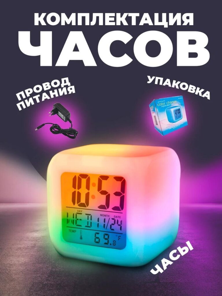
Image 1: Hero Main Image — RGB Light as the Core Selling Point
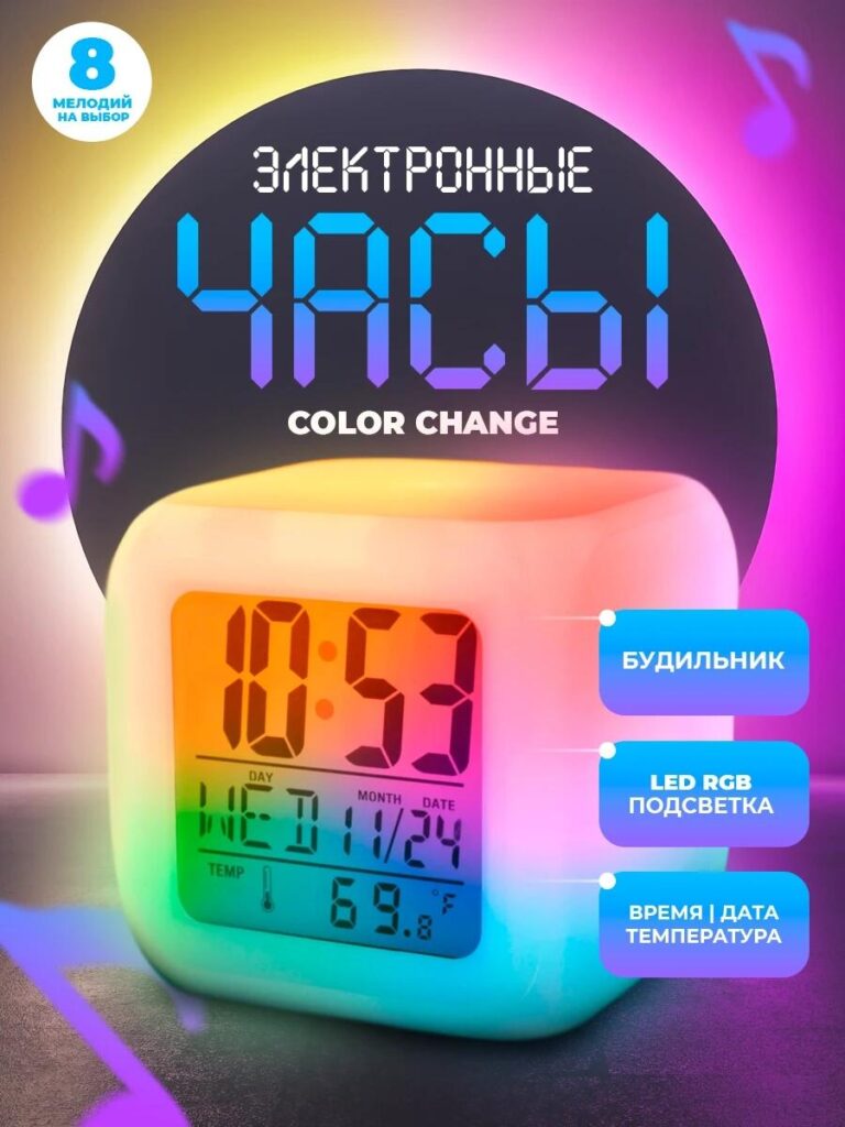
The first image functions as the primary Ozon main image, and its responsibility is to stop the scroll.
We centered the RGB electronic alarm clock against a darkened, gradient-lit background to amplify the LED color-change effect. Instead of showing a flat white product, we highlighted the clock glowing in multiple hues—cyan, pink, yellow, and green—blended smoothly across the body. This immediately communicates the RGB feature without text-heavy explanations.
The clock face remains sharp and readable, displaying time, date, and temperature simultaneously. This balance between ambient lighting and digital clarity reassures buyers that the product is not just decorative, but practical. Supporting callouts reinforce key functions—alarm, RGB LED backlight, and time/date display—positioned to guide the eye without overwhelming the product.
This image establishes three things instantly:
- The product is modern and tech-driven
- The RGB lighting is soft, not harsh
- The clock is designed for nightstand use
For Ozon, where thumbnails matter, this image ensures clarity even at reduced sizes.
Image 2: Size & Proportion Image — Compact Form, Clear Measurements
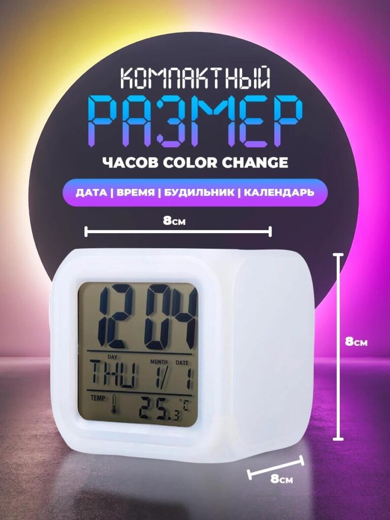
The second image answers a critical buyer concern: How big is it?
We introduced precise measurements—8 cm on each side—over a clean, neutral background. The clock is shown from a slight angle to reveal depth while maintaining accurate proportions. This prevents false expectations and reduces return risk, which is especially important on marketplaces like Ozon.
Instead of cluttering the image with unnecessary elements, we kept the focus on scale. The compact cube shape communicates portability and versatility: suitable for desks, bedside tables, shelves, or even children’s rooms.
By visually reinforcing that the clock is small yet functional, this image builds trust and positions the product as a space-friendly solution for modern interiors.
Image 3: User Interaction & Control Logic — Simplicity in Action
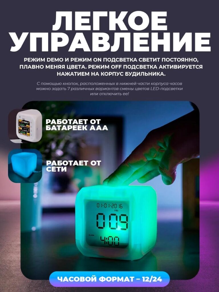
This image shifts from static product presentation to real-world interaction.
We captured a hand gently touching the top of the clock, demonstrating how the lighting modes can be controlled directly from the body. The glowing green tone emphasizes responsiveness, while the environment suggests a calm nighttime setting.
Text overlays explain the lighting modes:
- Demo mode with smooth color transitions
- Constant ON mode
- OFF mode via touch
We also visually introduce dual power options—AAA batteries and wired power—using small inset icons. This reassures buyers that the clock is flexible and reliable in different setups.
This image is crucial because it removes friction. It shows that the RGB electronic alarm clock does not require complex menus or apps. The interaction feels intuitive, which is a strong selling point for all age groups.
Image 4: Lifestyle & Interior Compatibility — Design That Fits Anywhere
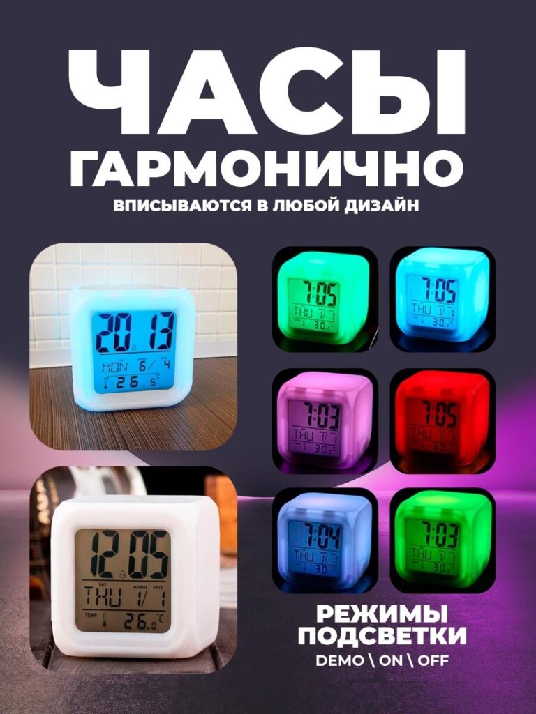
In this image, we focused on aesthetic adaptability.
We placed the clock in realistic interior environments and paired it with a grid of RGB color variations: blue, green, pink, red, and soft white. This instantly communicates that the product is not limited to one mood or style.
The headline emphasizes harmony with any interior design. Instead of technical language, the message is emotional: the clock adapts to you. Whether used as a nightlight, accent lamp, or minimal alarm clock, it blends seamlessly into modern homes.
For Ozon shoppers who often compare multiple products quickly, this image differentiates the clock as both functional and decorative—bridging tech and lifestyle.
Image 5: Packaging & What’s Included — Transparency Builds Trust
The final image addresses the last buyer question before purchase: What do I receive?
We clearly displayed:
- The RGB electronic alarm clock
- 전원 케이블
- Retail packaging
Each item is visually separated and labeled. The packaging design reinforces that this is a finished consumer product, not a generic gadget. Showing the box also adds perceived value and makes the product feel gift-ready.
This image helps eliminate uncertainty and reduces customer service inquiries, which is especially important for marketplace sales at scale.
Why This Image System Works on Ozon
This image sequence follows a deliberate conversion path:
- Attract attention with RGB lighting
- Build trust through size and clarity
- Demonstrate ease of use
- Show lifestyle fit
- Confirm package contents
Each image has a single, focused job. Together, they form a complete visual sales story that aligns perfectly with Ozon’s browsing behavior and platform requirements.
결론
Effective main image design on 오존 is not about adding more effects—it is about making the product instantly understandable and emotionally appealing. For this RGB electronic alarm clock, we translated technical features into visual experiences that feel intuitive, calm, and modern.
By structuring the image set around user questions and real usage scenarios, we helped the product stand out in a competitive marketplace while maintaining clarity and trust. This is exactly how we approach marketplace visual design—strategically, intentionally, and with conversion in mind.
If you are looking to elevate your Ozon product listings through professional main image design and structured visual storytelling, this is the type of result we create at AIRSANG.


완전한 전자상거래 시스템을 갖춘 워드프레스 웹사이트 또는 기업 사이트를 디자인하고 구축하세요.
가격 범위: $200.00~$2,500.00custom-requirements-or-special-quotations
원래 가격: $2.00.$1.00현재 가격: $1.00. 아마존 가정용 물리치료 기기 메인 이미지 디자인 설명
소개 소개: 아마존에서 홈 테라피 기기의 신뢰할 수 있는 이미지 구축 아마존에서 홈 테라피 기기의 기본 이미지를 디자인할 때 기본 ...

아마존 립스틱 전환을 위한 메인 이미지 디자인
소개: 소개: 아마존에서 판매되는 립스틱 메인 이미지 디자인하기 아마존 립스틱의 메인 이미지를 디자인할 때 우리의 책임은 그 이상입니다.

아마존 리퀴드 파운데이션 메인 이미지 변환의 특징은 무엇일까요?
서론 아마존 리퀴드 파운데이션의 메인 이미지 디자인은 단순히 제품을 아름답게 보이게 하는 것만이 아닙니다. 아마존에서 메인 이미지와...

필터 카트리지 제품을 위한 효과적인 아마존 메인 이미지 디자인하기
서론 아마존 메인 이미지 디자인은 단순히 제품을 매력적으로 보이게 하는 것만이 아닙니다. 명확성, 신뢰, 그리고 즉각적인 이해를 제공하는 것이 중요합니다. 특히...

반려동물 관련 워드프레스 테마 5가지 비교
서론 반려동물 관련 워드프레스 테마를 선택하는 것은 단순한 디자인 결정 이상의 의미를 지닙니다. 사용성, 확장성, 그리고 장기적인 비즈니스 성장에 직접적인 영향을 미치기 때문입니다. 반려동물 관리 및 관련...

과학 중심 브랜드를 위한 확장 가능한 워드프레스 웹사이트 구축: 아미노USA 프로젝트
서론 오늘날의 디지털 환경에서 웹사이트는 단순히 제품을 나열하는 공간 이상의 의미를 지닙니다. 규제 산업이나 연구 중심 산업에서 활동하는 과학 기반 브랜드에게 웹사이트는 더욱 중요한 역할을 합니다.

글로벌 블레이드 브랜드를 위한 확장 가능한 쇼피파이 스토어 구축: 쿨카타나 프로젝트
서론: 국경을 넘나드는 전자상거래에서 Shopify 웹사이트는 단순한 매장 이상의 의미를 지닙니다. 특정 문화권에서 사업을 운영하는 브랜드의 경우, 웹사이트는 단순한 판매 공간을 넘어 훨씬 더 많은 기능을 수행해야 합니다.

포켓몬 카드 판매를 위한 높은 전환율을 자랑하는 쇼피파이 스토어 디자인하기
서론 수집품 전자상거래, 특히 포켓몬 트레이딩 카드 게임(TCG) 시장에서 웹사이트는 단순히 제품 목록을 나열하는 것 이상의 역할을 해야 합니다.

맞춤형 오프라인 브랜드에 최적화된 전환율 높은 쇼피파이 디자인
서론 오늘날 경쟁이 치열한 전자상거래 환경, 특히 맞춤형 선물 및 수집품 분야에서 Shopify 웹사이트는 단순히 제품을 전시하는 것 이상의 역할을 해야 합니다. ...

프리미엄 꽃집 브랜드를 위한 쇼피파이 웹사이트 디자인 사례 연구
서론 오늘날 경쟁이 치열한 전자상거래 환경에서 Shopify 웹사이트는 단순히 제품을 보여주는 것 이상의 역할을 해야 합니다. 브랜드 가치를 즉시 전달하고 사용자를 안내해야 합니다...

Shopify 디자인 사례 연구: 레트로 게임 스토어
서론: 경쟁이 치열한 전자상거래 환경에서 시각적 명확성과 감정적 연결은 방문자가 고객이 될지 여부를 결정짓는 중요한 요소입니다. 특히 다음과 같은 경우에 더욱 그렇습니다...

Shopify 디자인 사례 연구: 전술 구조 브랜드
서론: 훌륭한 Shopify 웹사이트는 단순히 제품을 보여주는 것 이상의 역할을 합니다. 목적을 전달하고, 신뢰를 구축하며, 사용자가 확신 있는 구매 결정을 내리도록 안내합니다. 특히 다음과 같은 경우에 더욱 그렇습니다...

전기 자전거 브랜드의 쇼피파이 웹사이트 디자인 사례 연구
서론 오늘날 경쟁이 치열한 전기 자전거 시장에서 Shopify 웹사이트는 단순히 제품을 전시하는 것 이상의 역할을 해야 합니다. 스토리를 전달하고, 신뢰를 구축하며, 사용자를 안내해야 합니다...

창의적인 브랜드를 위한 확장 가능한 Shopify 전자상거래 플랫폼
서론: 창의적인 브랜드가 성장함에 따라 웹사이트는 종종 그 성장을 따라잡기 어려워집니다. 제품 라인이 확장되고, 콘텐츠가 증가하고, 트래픽이 늘어나면서 시각적인 요소를 중시하는 많은 브랜드들이 어려움을 겪습니다...

홈데코 브랜드의 쇼피파이 웹사이트 디자인 사례 연구
서론: 경쟁이 치열한 홈데코 시장에서 시각적 정체성은 더 이상 단순히 미적인 요소에만 국한되지 않습니다. 이는 신뢰도, 제품 검색 행태, 그리고 구매 결정에 직접적인 영향을 미칩니다. 따라서...

확장 가능한 워드프레스 구독 웹사이트 구축 사례 연구
서론 현대 전자상거래 브랜드에게 웹사이트는 더 이상 단순한 디지털 매장이 아닙니다. 웹사이트는 구독 서비스, 콘텐츠 스토리텔링, 신뢰 구축 등을 지원하는 핵심 동력입니다.

성인 브랜드에 적합한 고전환율 워드프레스 디자인
서론: 경쟁이 치열한 전자상거래 시장에서는 시각적인 요소만으로는 충분하지 않습니다. 성공적인 워드프레스 웹사이트는 방문자를 명확하고 의도적인 여정으로 안내해야 합니다. 이러한 여정은...

확장 가능한 워드프레스 기반 섹스돌 전자상거래 웹사이트
서론: 뛰어난 성과를 내는 해외 전자상거래 웹사이트를 구축하는 것은 단순히 제품을 온라인에 올리는 것만이 아닙니다. 경쟁이 치열하고 시각적인 요소가 중요한 시장에서 사업을 운영하는 브랜드에게 웹사이트는...