Project overview
CarbonCase is a brand focusing on high-end carbon fiber mobile phone cases and technology accessories. It mainly targets global consumers who pay attention to material texture, product performance and design aesthetics. As the brand continues to develop, the original website has been unable to meet the needs for further improvement of conversions in terms of brand sense, product value expression, category browsing, and promotional information presentation. Therefore, the customer came to us hoping to reorganize the overall e-commerce visual and user experience. The project is based on the Shopify platform. We focus on systematic design around the homepage visuals, product categories, product display, promotion modules, user reviews and trust content. While highlighting the carbon fiber material, sense of power and technology, we keep the page simple, high-end and easy to browse, ultimately helping the brand build a more unified, professional and convertible Shopify brand website experience.
| 서비스 | Industry | 플랫폼 |
| Website design and decoration | Home department store | shopify |
| Project requirements | target market | design style |
| Create a website that takes into account both brand presentation and sales conversion | 글로벌 | A sense of technology | A sense of toughness | A sense of high-end |
| project budget | Delivery content | Delivery time |
| ¥7200 | Website construction and full-site page design | 18 working days |
Project Challenges
The core challenge of this project is how to make the Shopify website have a high-end brand feel and a clear purchase path while highlighting the carbon fiber material, lightweight and high-performance features of CarbonCase. Due to the high similarity in product appearance, if there is a lack of clear information hierarchy, users will easily have difficulty choosing between models, adapted devices and product differences. In the early stage of the project, we first sorted out the brand positioning, target users, core product lines and main selling points, and conducted a visual and structural analysis of similar technology accessories and mobile phone case brands. At the same time, plan the homepage content priority, product classification logic, promotional information and trust modules to establish a unified visual direction and clear conversion path for subsequent page design.
Home Page Design Strategy
Hero above the fold: focus on value rather than creating visual noise
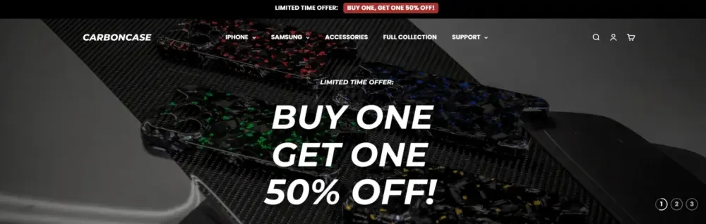
Home Hero The above-the-fold screen needs to grab the user’s attention within seconds. For CarbonCase, we wanted three core messages to be immediately conveyed above the fold:
what is the product
Why is it a high-end product?
Why current offers are worth paying attention to
Create a sense of urgency to buy without visual crowding through a combination of large font headlines, eye-catching promotional messages, and immersive product images.
The background image highlights the texture of the carbon fiber material while maintaining sufficient contrast between light and dark to ensure good readability of the text.
This balance allows promotional messages to appear purposeful and designed without being overpowering or oppressive.
Tell your brand’s visual story through category navigation
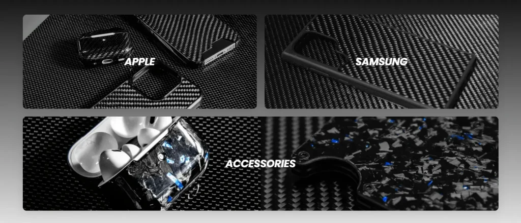
Rather than relying on a large number of text menus, we designed a more visually expressive classification module, allowing the classification entrance to play the role of navigation and brand display at the same time.
Major categories such as Apple, Samsung and Accessories use:
Full width visual picture
Clear classification labels
Uniform image proportions
This design method allows users to quickly choose the product path they need through vision, and at the same time further strengthens the brand’s product quality with the help of high-quality pictures.
Selected product area design
Designed for fast views and conversions
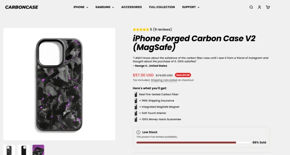
The featured products area emphasizes information clarity and browsing efficiency.
Each product card only retains the information that users really care about during the purchase decision stage:
Product images showing material details
Clear price and discount information
Simple text hierarchy
Uniform and neat visual arrangement
We deliberately avoid adding too many icons, labels, or lengthy copy to product cards in order to reduce users’ cognitive load and make comparisons between different products more direct and easy.
This design method is not only suitable for desktop browsing, but also more in line with mobile shopping habits, because mobile phone users usually complete browsing and purchasing decisions more quickly.
The balance between promotional design and brand tone
Balancing purchase urgency with premium positioning
Promotional activities are very important for the growth of DTC brand website, but if the visual processing is not done properly, it can easily weaken the brand’s sense of luxury.
For CarbonCase, instead of overlaying promotional content as a separate, obtrusive advertising layer on the page, we let the promotional elements blend naturally into the overall brand visual system.
Key design strategies include:
Promotional copy and brand copy use a unified font system
Use low-key offer labels instead of large, over-the-top promotional banners
Clearly differentiate the visual hierarchy between offer information and the product itself
The result is a promotional experience that drives users to take purchasing action without disrupting CarbonCase’s original premium brand positioning.
Build user trust through page layout
Social proof and brand credibility design
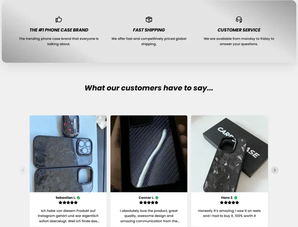
We do not hide user reviews deep in the product detail page, but directly integrate customer feedback into the home page browsing path.
The customer evaluation area mainly uses:
Product photos uploaded by real customers
Short and easy-to-read reviews
Clear and intuitive star rating
This module is placed after the user browses the product and before entering the FAQ and footer.
This position can provide additional proof of trust when the user is already interested in purchasing but still has some hesitation, thereby effectively reducing purchasing concerns.
Service advantage display area
Quickly respond to users’ most concerned questions
We have designed a compact service advantage module to quickly solve consumers’ common purchasing concerns, including:
Delivery reliability
Customer service responsiveness
brand credibility
By combining concise icons with short copy, you can further strengthen brand trust without interrupting the user’s shopping process.
FAQ frequently asked questions area
Serve as a conversion tool rather than an information accumulation area
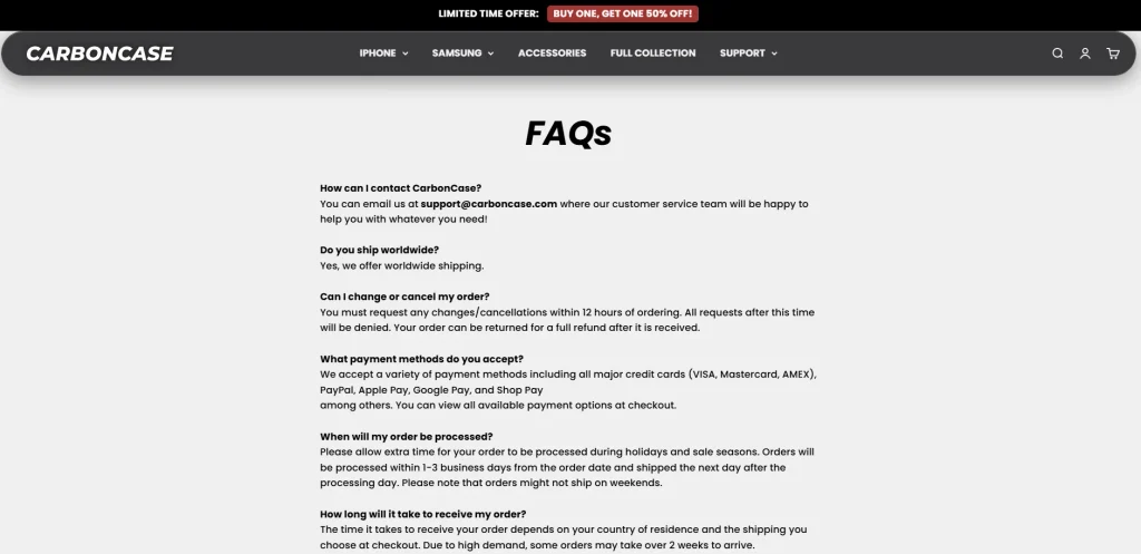
The FAQ area mainly focuses on the most common questions and resistance users have in the purchasing process, including:
Which countries or regions can be shipped to?
How long is expected to be delivered?
Is carbon fiber material real?
In terms of visual design, we kept this module lightweight, simple and easy to browse quickly.
This can not only help users obtain the information needed for purchasing decisions in a timely manner, but also avoid increasing reading pressure due to excessive content, making the FAQ truly a tool to assist conversion, rather than a simple information accumulation area.