


장바구니에 상품이 없습니다.

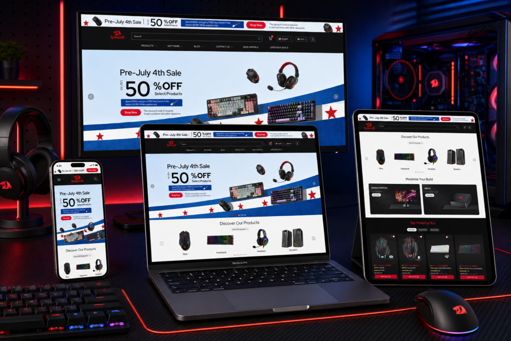
Redragonshop presents Redragon as a PC gear brand focused on gaming peripherals, including mechanical keyboards, mice, headsets, and gaming accessories. From a design perspective, this type of Shopify website cannot rely only on product listings. Gaming customers care about performance, visual identity, price value, community proof, and brand trust. They want to see products clearly, compare categories quickly, understand promotions immediately, and feel confident before checkout.
That is why the website uses a strong mix of promotional banners, category navigation, product recommendations, content marketing, loyalty messaging, user-generated setups, trust badges, media proof, and brand storytelling. Each section supports a different stage of the shopping journey. The homepage first attracts attention, then organizes the product catalog, then builds desire, then creates urgency, then reinforces trust. The About page completes the experience by explaining the brand’s history, manufacturing background, values, and official-store benefits.
As designers, we would describe this website as a conversion-focused gaming commerce experience. It does not simply display products; it builds a full path from first impression to brand confidence. The design order matters, because each module answers a different customer question at the right moment: What is the offer? What does the brand sell? What setup can I build? Which products are popular? Can I learn more? Can I earn rewards? Do real users like this brand? Can I trust the store? Who is behind the brand?
| 배송 시간 | 범주 | 웹사이트 유형 |
| 21days | Computer peripherals | shopify |
| 참여 디자이너 | 비용 | 효과 |
| 린 장 | $2500 | 판매📈279% |
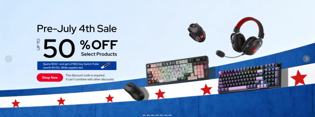
The first uploaded image shows the Pre-July 4th Sale hero banner, and this is the correct starting point for a gaming Shopify store because the first screen must create urgency. We designed this area to communicate the core offer within seconds. The large “50% OFF” text becomes the strongest visual anchor, while the smaller supporting copy explains the discount condition and free key switch puller gift.
This hierarchy matters. Online shoppers do not read every detail at first glance. They scan the biggest message, recognize the savings opportunity, and then decide whether to continue. By placing the discount message on the left and product visuals on the right, the design balances information and emotion. The customer sees the reason to act and the products that make the offer relevant.
The light blue background keeps the banner open and readable, while the red, white, and blue visual system supports the July 4th theme. The red “Shop Now” button stands out strongly against the softer background, giving users a clear next step. This button placement is important because promotional banners often fail when they look exciting but do not direct action. Here, the call-to-action sits directly below the offer, so the path from interest to click feels natural.
We also used floating product images to show range: keyboards, mice, and headsets appear together to suggest a broader sale event rather than a single-product discount. The diagonal blue stripe adds movement and prevents the banner from feeling flat. For a gaming audience, motion and energy matter. The layout feels fast, bold, and product-driven without becoming visually chaotic.
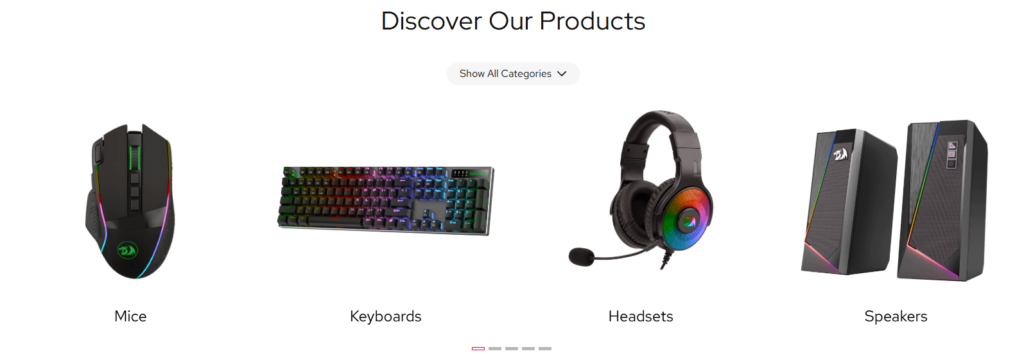
The “Discover Our Products” section comes next because users need a clear map of the store after they see the promotion. Redragon sells multiple gaming product categories, and the design needs to reduce decision fatigue. Instead of forcing users to rely only on dropdown navigation, the homepage presents large category images for mice, keyboards, headsets, and speakers.
As designers, we chose a clean white background here because the products already carry strong visual details: black finishes, RGB lighting, angular shapes, and gaming textures. A busy background would compete with the products. The white space makes each item easier to identify and gives the section a premium catalog feeling.
The centered title, “Discover Our Products,” creates a direct browsing entry point. The “Show All Categories” filter below it adds control without overwhelming users. This small interaction signals that the website contains more product types, but it keeps the first view clean.
Each product image appears large enough to be inspected quickly. Gaming customers often care about form factor, lighting style, and device shape, so image-led navigation works better than text-only category links. The labels underneath each product keep the layout intuitive. Users can move from inspiration to category browsing in one glance.
This section also creates a visual rhythm after the promotional hero. The sale banner feels energetic; the product discovery section feels calm and organized. That contrast improves the browsing experience because users get excitement first, then clarity.
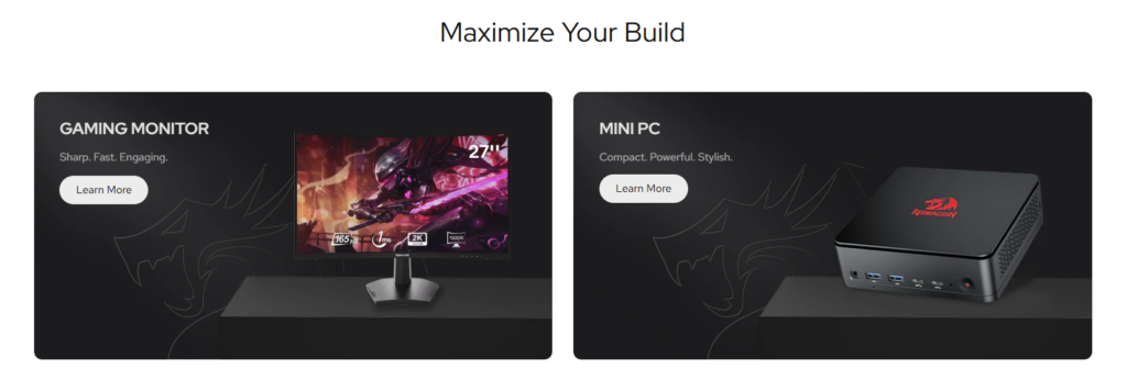
The “Maximize Your Build” section shifts the customer’s mindset from buying one device to imagining a complete gaming environment. This is a strong merchandising strategy for a gaming Shopify website. Many shoppers visit for a keyboard or mouse, but they may also need a monitor, mini PC, speaker, headset, or accessory. The design encourages them to think bigger.
We used two large feature cards instead of a standard product grid because these categories deserve stronger storytelling. A gaming monitor and mini PC are not impulse add-ons in the same way as small accessories. They represent a more complete upgrade. Large cards give these products more status and make them feel like part of a serious build.
The dark card background supports the gaming atmosphere and lets the product photography feel dramatic. The subtle dragon outline in the background strengthens brand recognition without distracting from the products. This is a smart use of brand identity: visible enough to create personality, quiet enough to keep the products readable.
Each card uses a short title, a compact benefit line, and a “Learn More” button. “Sharp. Fast. Engaging.” communicates monitor value quickly. “Compact. Powerful. Stylish.” gives the mini PC a clear positioning. These short phrases work because they match how gaming shoppers compare benefits. They want speed, power, compactness, clarity, and style.
The white buttons create contrast against the dark cards and guide users toward deeper product exploration. This section does not push an immediate cart action; it invites learning. That softer call-to-action fits the product type and helps the customer move through the site at the right pace.
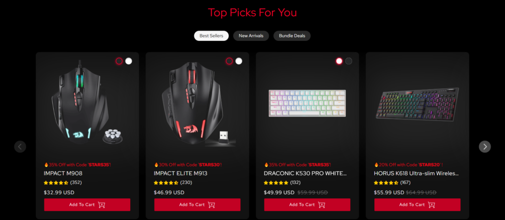
The “Top Picks For You” section brings the user back into direct shopping mode. After category browsing and setup inspiration, the site presents specific products with prices, reviews, discount codes, variants, and “Add To Cart” buttons. This is where the design becomes highly conversion-focused.
We used a black background because it fits the Redragon gaming identity and makes RGB product visuals stand out. The red title creates energy and connects directly with the brand’s color language. The section feels more intense than the white category area, which helps signal that the user has moved from browsing into buying.
The tabs, including “Best Sellers,” “New Arrivals,” and “Bundle Deals,” organize products around customer intent. Some users want proven items. Some want the latest releases. Others want value bundles. By placing these tabs above the product cards, the design lets users change direction without leaving the homepage.
Each product card includes many conversion elements, but the layout keeps them ordered. The product image appears first because appearance drives gaming gear interest. Color swatches appear near the image because visual customization matters in this category. Discount codes add urgency. Product names identify the item. Star ratings and review counts add social proof. Prices show value clearly, especially when sale pricing appears beside original pricing. The red “Add To Cart” button finishes the card with a clear action.
This structure works because it gives the user enough information to act without opening every product page. In Shopify design, homepage product cards can either be decorative or functional. Here, they are functional. They support fast comparison and quick purchase decisions.
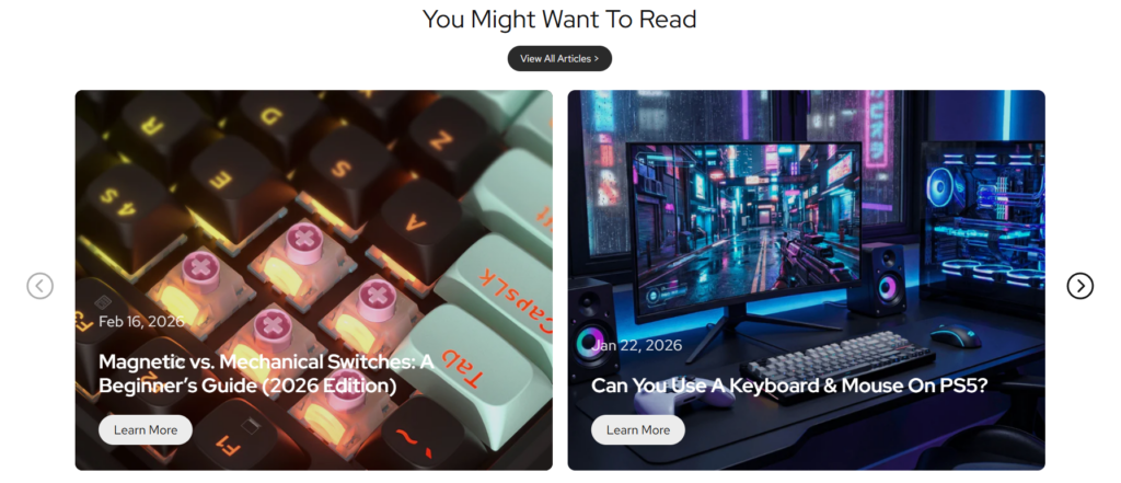
The “You Might Want To Read” section adds depth to the shopping journey. Gaming buyers often research before purchasing. They compare switches, keyboard sizes, connectivity options, compatibility, and setup ideas. A blog area gives the brand a chance to guide those decisions while keeping users inside the website.
We placed this module after product-focused sections because the user has already seen the store’s main categories and recommendations. At this stage, educational content feels helpful rather than distracting. It answers questions that may stop a purchase: Which switch type should I choose? Can I use a keyboard and mouse with a console? What setup works for my needs?
The two large article cards use immersive visuals instead of plain blog thumbnails. The keyboard switch close-up immediately communicates technical detail, while the gaming desk image connects to real gameplay context. This makes the blog feel relevant to the store, not like a separate content area.
The date, headline, and “Learn More” button sit directly over the images. We used overlay text to keep the cards compact and visually strong. The dark overlay improves readability without hiding the image atmosphere. Rounded corners keep the cards modern and polished, while carousel arrows show that more articles are available.
This section helps the brand act like an advisor. It supports SEO, builds trust, and gives uncertain users a reason to stay longer. From a design standpoint, the blog module turns information into a conversion support tool.
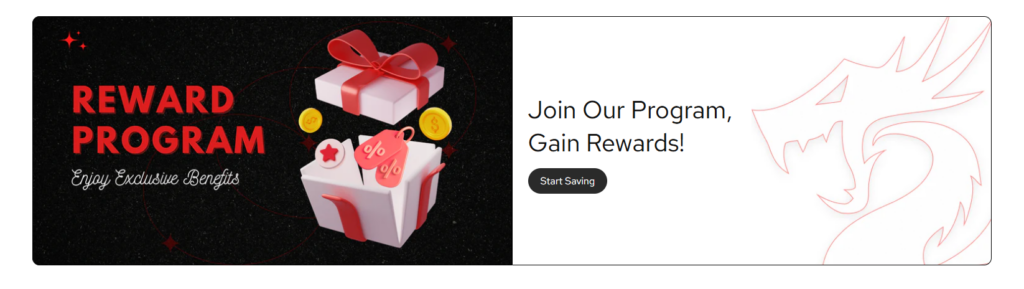
The reward program section uses a clear split-screen design. The left side delivers a strong promotional graphic, while the right side presents the action message: “Join Our Program, Gain Rewards!” This layout works because loyalty programs need both emotion and clarity. Customers should feel that rewards are valuable, but they also need a simple next step.
On the left, the dark textured background makes the red “Reward Program” headline feel bold and premium. Gift boxes, discount tags, coins, and benefit icons visually communicate savings before the user reads the supporting text. This immediate symbolism helps users understand the offer quickly.
The right side uses a clean white background, which creates breathing room after the darker promotional graphic. The subtle dragon outline reinforces brand identity, but it stays light enough to avoid competing with the call-to-action. The black “Start Saving” button stands out clearly and feels more refined than a loud red button in this specific context.
As designers, we use this section to extend the relationship beyond one purchase. Gaming customers often return for accessories, switches, keycaps, mice, headsets, and upgrades. A reward program gives them a reason to stay connected to the brand. The design makes that invitation feel simple, official, and valuable.
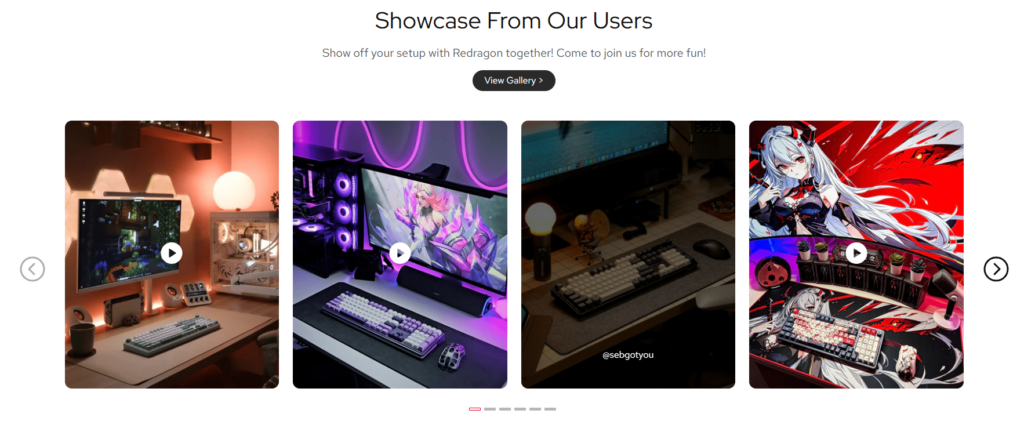
The “Showcase From Our Users” section brings community into the shopping experience. Official product images are important, but user-generated setup photos create a different kind of confidence. They show how products look in real rooms, on real desks, under different lighting styles, and inside personal gaming environments.
We placed this section in a clean white area because the user images already contain strong color and atmosphere. Purple lighting, warm desk setups, anime-style desk mats, RGB PCs, keyboards, monitors, and accessories all bring visual richness. A dark or overly designed background would make the section feel heavy. White space allows each setup image to speak for itself.
The title and supporting line invite users to show off their setup with Redragon. This makes the section feel participatory instead of purely promotional. The “View Gallery” button gives users a clear next step, while the carousel layout suggests an ongoing community rather than a fixed gallery.
The play icons on the images suggest video content, which adds movement and authenticity. Video-style proof feels especially valuable in gaming because users want to see lighting, desk arrangement, sound, and product scale in real use. This section strengthens emotional connection by showing that other gamers already use and enjoy the brand.
From a conversion perspective, user showcases reduce uncertainty. A shopper can imagine how the product might look in their own setup. That imagination often moves them closer to purchase.
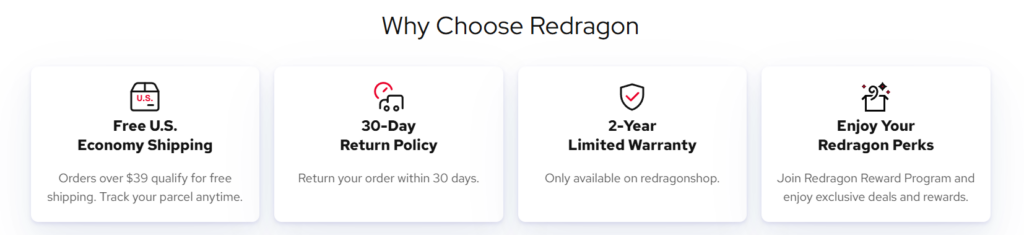
The “Why Choose Redragon” section organizes practical reassurance into four simple cards: free U.S. economy shipping, a 30-day return policy, a 2-year limited warranty, and Redragon perks. These are not decorative messages. They answer the hidden questions shoppers ask before checkout.
Will shipping cost too much? Can I return it if it does not fit my needs? Does the brand support the product after purchase? Are there extra benefits if I join the program? By presenting these answers in one row, the design removes friction before users reach the cart.
The white cards, soft shadows, and simple black-and-red icons create a calm, reliable feeling. This matters because the previous sections use bold gaming visuals, dark backgrounds, and energetic product cards. The trust section needs to feel stable and clear.
Each card follows the same structure: icon, bold heading, short supporting sentence. This consistency helps users scan quickly. The headings carry the main promise, while the small copy adds clarity. We keep the text short because policy details can overwhelm users if they appear too early in the journey.
This module turns service information into visible brand value. Instead of hiding shipping, returns, warranty, and rewards in footer links, the design brings them into the homepage as reasons to buy.
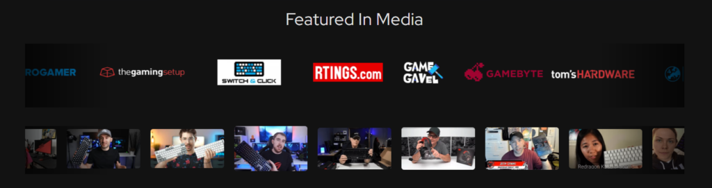
The “Featured In Media” section adds another layer of credibility. Gaming customers often rely on reviews, media coverage, and creator opinions before buying hardware. They want to know whether a product has been tested, discussed, or recommended outside the brand’s own website.
We used a dark background here to match the gaming identity and make the media logos feel more prominent. The logos sit in a horizontal strip, creating a quick credibility scan. Users do not need to read long explanations; they can recognize the presence of media and review platforms immediately.
Below the logos, the row of creator thumbnails adds a human layer of proof. This is important because media logos create authority, while reviewer faces and video thumbnails create relatability. Together, they show that the brand exists in both professional review spaces and everyday gaming communities.
The horizontal layout also keeps the section efficient. It does not interrupt the shopping journey with long testimonials. Instead, it provides fast evidence: people talk about these products, review them, and show them in use. That evidence supports the brand without slowing the page down.
As designers, we see this section as a trust accelerator. It gives shoppers a reason to feel that Redragon is established, visible, and active in the gaming hardware conversation.
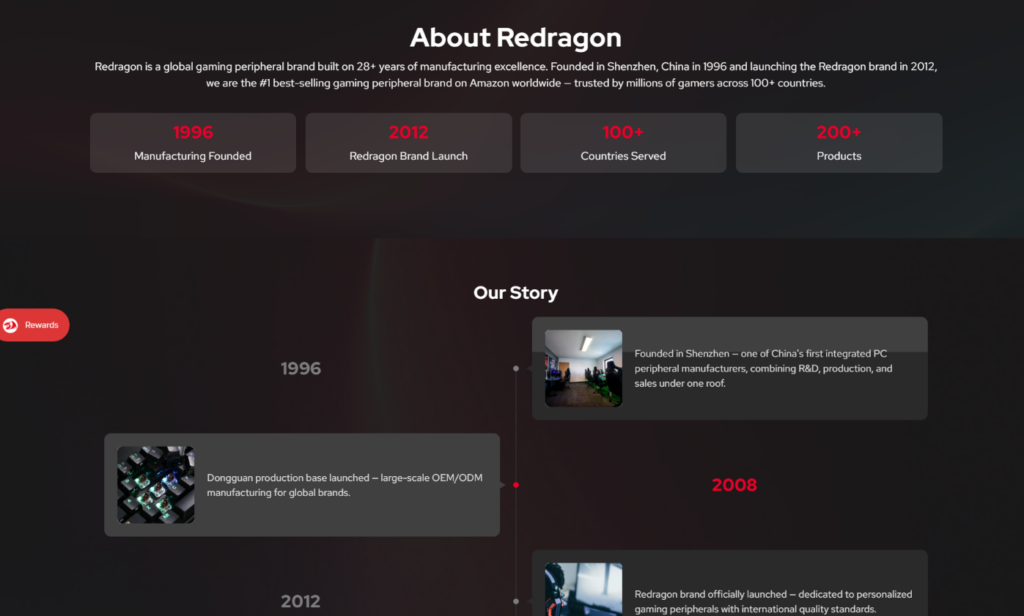
The About Redragon page completes the trust story. While the homepage focuses on shopping, the About page explains who the brand is, where it came from, what it represents, and why customers can buy from the official store with confidence.
The page uses a dark visual system with red highlights because this matches the Redragon brand personality. The background feels modern, gaming-focused, and slightly cinematic. Red accents guide attention to important years, numbers, icons, and brand elements. This creates consistency with the homepage while giving the About page a more editorial feeling.
At the top, the page introduces Redragon and immediately shows key numbers, including manufacturing history, brand launch, countries served, and product count. This is a strong design decision because users visiting an About page often want proof of legitimacy. Numbers make the brand feel established before the user reads the full story.
The metric cards are short and easy to scan. They turn brand scale into a visual summary. Instead of asking users to read several paragraphs first, the page gives them immediate signals: this brand has history, reach, and product depth.
The “Our Story” timeline transforms company history into a structured visual path. We designed the timeline to avoid the feeling of a long corporate paragraph. Each year becomes a milestone, and each milestone includes a short explanation and supporting image.
This structure helps users understand progress over time. The page moves from manufacturing origins to brand launch, global growth, recognition, and the present. The central timeline line creates continuity, while alternating content cards keep the section visually active. Red year markers highlight key moments and keep the eye moving down the page.
For a gaming brand, this matters because customers often want both innovation and reliability. A timeline shows that the brand did not appear overnight. It has a production background, a development path, and a growing market presence.
The “Who We Are” section gives the brand a more serious foundation. Gaming websites often focus heavily on visual excitement, but buyers also care about product reliability. By explaining manufacturing, product development, and international operations, the page shows that Redragon has a real operational base behind the storefront.
The product lifestyle image on the left supports this message visually. It shows a complete gaming setup with keyboard, mouse, and headset, reminding users that the brand’s manufacturing story connects directly to the products they use. The text on the right explains the company in a compact, structured way.
The copy focuses on delivering pro-grade gaming peripherals at a practical price point. This positioning matters because Redragon often appeals to gamers who want performance and style without paying ultra-premium prices. The design supports that message by staying polished but not overly luxurious. It feels capable, accessible, and performance-driven.
The section also uses clear text hierarchy. The heading identifies the topic, bold phrases emphasize important brand facts, and the paragraph explains the value proposition. This keeps a dense business message readable.
The “What ‘Redragon’ Means” section moves from business facts into brand symbolism. This is important because gaming customers often connect emotionally with brand names, logos, colors, and identity systems. Redragon’s name carries visual power, and the page uses this section to explain that meaning.
The text explains the cultural and symbolic ideas behind “red” and “dragon,” while the 3D dragon visual reinforces the message. This combination makes the brand feel more memorable. Users can connect the logo and name with values like energy, power, celebration, protection, and performance.
The 3D dragon display gives the section a tactile, premium feeling. It looks like a brand artifact, almost like a sculpture or production piece. This helps the About page avoid becoming text-heavy. The visual breaks the layout and gives users a reason to pause.
As designers, we use this section to humanize the brand. A good About page should not only answer “Who owns this?” or “Where is it made?” It should also answer “What does this brand stand for?” This section gives Redragon a stronger identity beyond product specifications.
The FAQ section addresses practical questions that many customers may search for before buying. Is Redragon a Chinese brand? Who owns Redragon? Is it safe to buy from the website? Does Redragon ship to the USA? Where is it manufactured? Is Redragon a good brand?
These questions are trust-related, so placing them on the About page makes sense. Users who visit this page are already evaluating legitimacy. The FAQ gives them direct answers in a structured format.
The accordion layout keeps the page clean. Instead of showing every answer at once, the design lets users open the questions that matter to them. This reduces visual weight while still providing depth. The dark panels match the page style, and the small red plus icons maintain brand consistency.
This section also supports SEO because FAQ-style content often matches how users search online. More importantly, it supports conversion because it handles objections before checkout.
Near the bottom of the About page, the “Why Buy from redragonshop.com” section brings the message back to purchase confidence. After the page explains history, identity, and FAQ answers, it gives users concrete reasons to buy from the official store.
The benefit cards cover official Redragon products, secure checkout and payment processing, shipping support, product updates, new releases, exclusive offers, and customer support. This mirrors the practical concerns users have before placing an order.
The card layout makes each benefit feel equal and easy to scan. Red icons provide visual consistency, while the dark cards fit the About page environment. The section does not over-explain. It gives users enough information to feel safer and then lets the footer provide deeper navigation.
This is smart conversion design. The About page does not need to push products aggressively. Instead, it should make users feel that buying from the official store is reliable, protected, and worthwhile.
The footer is more than a navigation ending. On a Shopify store, the footer often holds critical trust and support paths. Redragon’s footer includes product links, gaming programs, support resources, company pages, newsletter signup, social icons, language selection, and payment icons.
This structure helps different users find what they need. Product-focused users can continue browsing categories. Support-focused users can find order tracking, shipping, returns, warranty, and help center links. Community-focused users can explore programs and social channels. The newsletter form keeps the relationship open after the visit.
The dark footer keeps the design consistent with the brand. Red headings organize the columns, and payment icons reassure users that the store supports familiar checkout methods. The subtle dragon background adds identity without reducing readability.
A strong footer matters because not every user converts from the first screen. Some scroll to the bottom looking for signs of legitimacy. The footer gives them those signals: support, policies, social channels, payment methods, and official navigation.
그만큼 Redragon Shopify website works because it treats design as a full customer journey, not just a visual style. The homepage begins with urgency, then organizes the product catalog, inspires complete gaming builds, recommends popular products, educates shoppers through content, promotes loyalty, highlights real user setups, builds service trust, and reinforces authority through media proof. The About page then deepens that trust with company history, milestones, brand meaning, FAQ answers, and official-store reassurance.
As designers, we see a clear strategy across the entire experience. Every section has a job. The hero banner drives attention. The category module improves browsing. The build section increases product imagination. The recommendation cards support fast buying. The blog area answers questions. The reward program encourages repeat purchases. The user gallery builds community. The trust cards reduce hesitation. The media section adds authority. The About page turns brand background into confidence.
This is the kind of design approach that helps a gaming eCommerce website feel energetic, credible, and easy to shop. It combines strong visual identity with practical conversion structure, which is exactly what a competitive Shopify store needs. For brands that want to build a similar high-converting, trust-driven online store, this design direction shows how product storytelling, community proof, and purchase reassurance can work together. At AIRSANG, this is the kind of cross-border eCommerce website design thinking we focus on.


