


 Japanese
In オゾン’s highly competitive marketplace, a vacuum cleaner main image must communicate power, functionality, and trust within seconds. When we design a main image for a vacuum cleaner listing, we do more than display the product — we structure visual hierarchy, highlight measurable performance, and build an emotional home environment that supports conversion.
For this project, we developed a series of vacuum cleaner main image concepts tailored to different positioning angles: corded power, cordless convenience, wet-and-dry cleaning, battery endurance, multi-attachments, and intelligent motor technology. Each visual follows Ozon’s marketplace logic — bold typography, measurable specs, clear feature blocks, and strong product dominance.
Below is a detailed breakdown of each image and the strategic thinking behind our design decisions.
| 配達時間 | カテゴリ | アプリケーションプラットフォーム |
| 9日間 | Vacuum cleaner | オゾン |
| 関与するデザイナー | 料金 | 効果 |
| リン・チャン | $160 | Store traffic📈260% |
Image 1: 3000W Corded Vertical Vacuum – Power and Capacity Focus
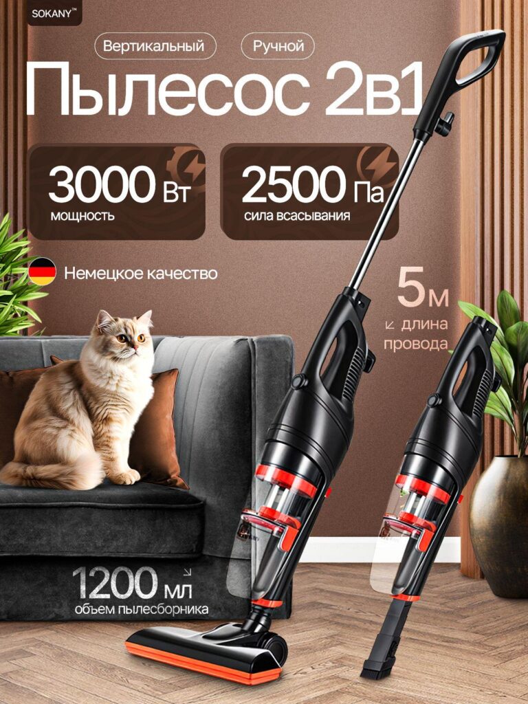
The first image emphasizes raw performance. We prominently display “3000W” and “2500 Pa suction power” in large numeric blocks because Ozon buyers often scan specifications before reading descriptions. Strong numerical anchors immediately communicate strength and efficiency.
We position the vacuum cleaner diagonally to create dynamic movement while keeping the floor brush flat and grounded to suggest stability. The 5-meter cord length is highlighted to reassure users about extended cleaning range. We also include the 1200ml dust container capacity to communicate fewer emptying interruptions.
The warm brown background paired with a domestic living room scene — including a sofa and a cat — adds emotional relatability. Pet owners are a key target audience. By placing the cat in frame, we subtly reinforce the vacuum’s suitability for pet hair removal without overcrowding the composition.
The result is a performance-driven, trust-building image tailored for power-conscious buyers.
Image 2: 2-in-1 Vertical and Handheld – Versatility Emphasis
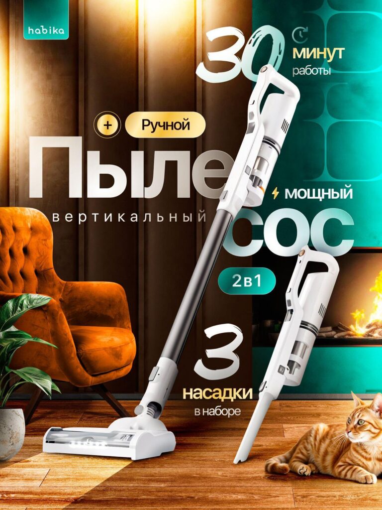
In the second image, we shift the focus from pure power to flexibility. We highlight “2 in 1” functionality and present both the upright and handheld configurations.
We intentionally enlarge the “30 minutes runtime” message and add “3 attachments included” to attract buyers seeking multi-purpose cleaning tools. The product is displayed against a warm home setting with fireplace lighting and a relaxed interior. This reinforces daily usability rather than industrial strength.
We tilt the vacuum at an angle that visually connects both configurations, creating a sense of modular transformation. The handheld version appears slightly elevated, visually separating it to emphasize portability.
This image targets urban apartment dwellers who value compact storage and multi-functionality over maximum wattage.
Image 3: Brushless Motor and Dust Vortex Technology
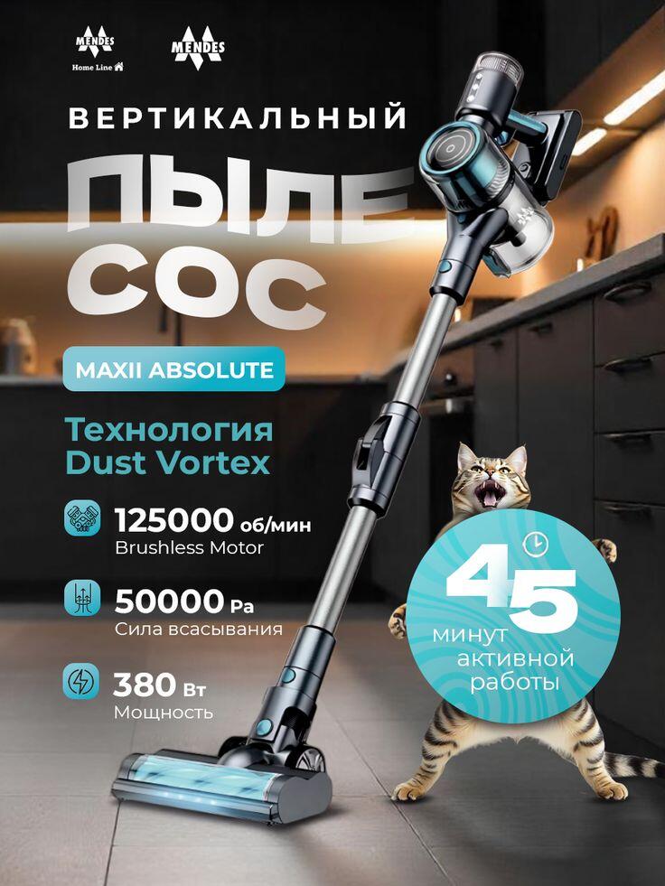
For the third design, we shift into a premium technology narrative. We highlight “125000 RPM Brushless Motor” and “50000 Pa suction power” with icon-based feature blocks.
Here, we use a darker, more dramatic kitchen background. The lighting creates a premium tone while spotlighting the vacuum’s modern engineering. The product angle is steeper, almost heroic, to elevate perceived performance.
We introduce technical icons to visually organize information. Instead of cluttering the frame with excessive text, we structure data in a vertical column to mirror professional product datasheets.
A playful cat interacting in the scene injects emotional warmth and prevents the visual from feeling too industrial. This balance allows us to communicate both technical superiority and family suitability.
Image 4: Wet and Dry Self-Cleaning Model
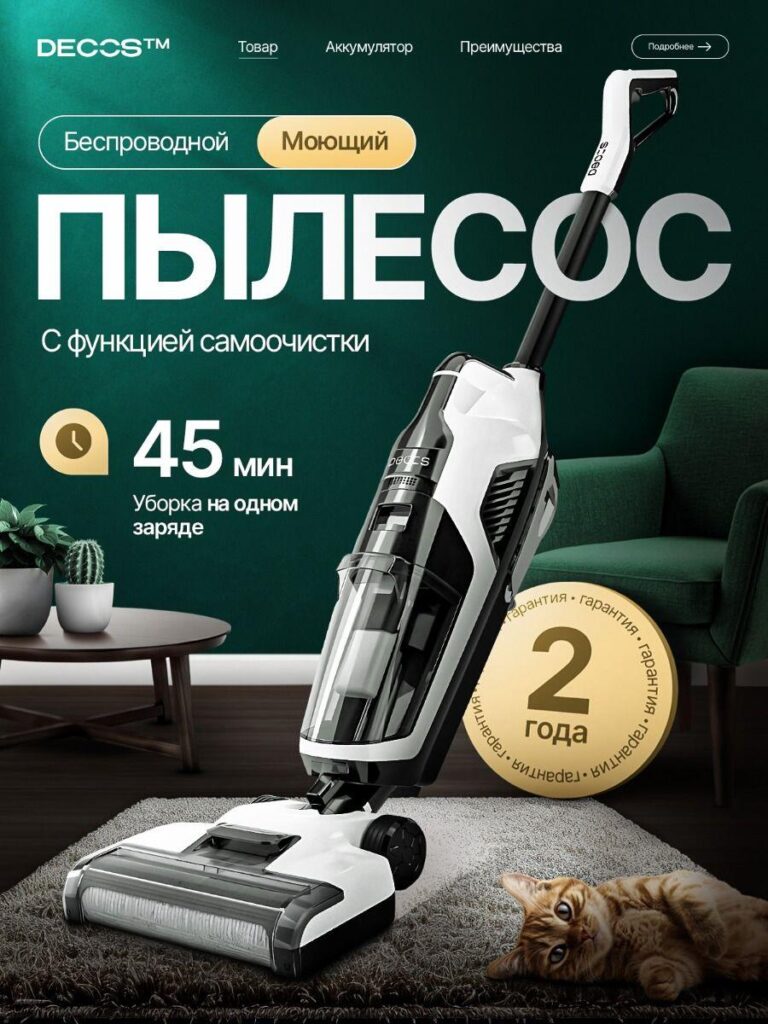
In the fourth image, we emphasize innovation: cordless, washing function, and self-cleaning capability. The headline is large and centered because this model’s differentiation lies in functionality rather than raw suction.
We highlight “45 minutes on one charge” and display a gold “2-year warranty” badge to build trust. Warranty badges are particularly important on Ozon, where product durability influences purchasing decisions.
The green-toned interior background signals freshness and cleanliness, aligning with the washing function narrative. The vacuum is positioned upright, slightly forward-facing, to convey confidence and advanced engineering.
This design appeals to families looking for both vacuuming and mopping in one machine.
Image 5: Mountain Performance Concept – Battery and Coverage
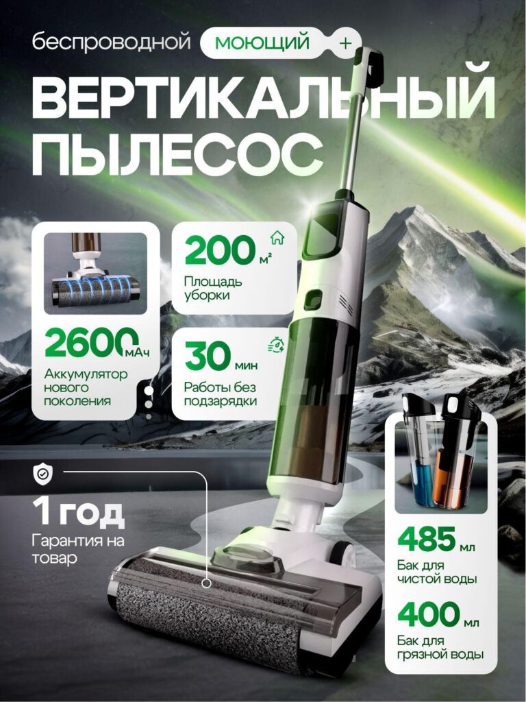
The fifth image adopts a bold conceptual background — mountain scenery with green aurora tones. This symbolic environment suggests power, endurance, and new-generation battery strength.
We highlight:
- 2600 mAh battery
- 200㎡ cleaning coverage
- 30 minutes runtime
- Dual water tanks (485ml clean / 400ml dirty)
Instead of a typical living room, we use a dramatic natural landscape to differentiate the listing visually among competitors. Ozon listings often look similar; this bold creative approach increases click-through rate.
The specification blocks are contained within white rounded rectangles for readability. We use green accents to reinforce energy efficiency and modern technology.
This image positions the vacuum cleaner as durable and future-ready.
Image 6: Safety Protection and Attachments
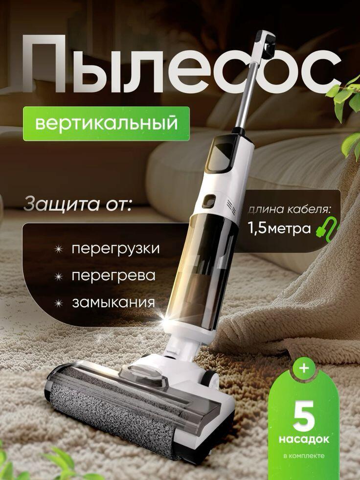
The sixth design emphasizes safety and versatility. We list protections against overload, overheating, and short circuit to reassure cautious buyers.
We intentionally show the vacuum operating on a carpeted bedroom floor. Soft textile backgrounds communicate quiet operation and suitability for delicate surfaces.
The 1.5-meter cable length and “5 attachments included” are displayed in distinct colored tags for easy scanning. The green callout badge creates a strong visual anchor in the lower-right corner.
This image targets families who prioritize safe home usage.
Image 7: Lightweight Cordless with 4 Attachments
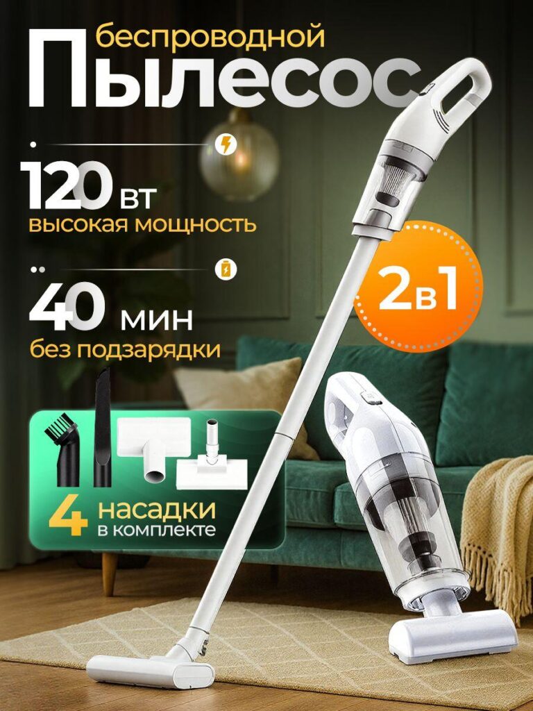
In the final image, we simplify the narrative. The design focuses on lightweight cordless convenience with “120W high power” and “40 minutes runtime.”
We present attachment tools clearly inside a boxed section to visually show included value. Buyers often compare accessory quantity across listings; making attachments visible improves perceived value.
The green-and-orange color contrast builds attention while maintaining warmth. The upright and handheld models are both visible to reiterate 2-in-1 functionality.
This clean and accessible design appeals to first-time vacuum buyers looking for affordability and simplicity.
Visual Strategy Across All Designs
Although each image presents a different positioning angle, we maintain consistent design principles:
- Large numeric hierarchy – Performance numbers dominate visual space.
- Clear iconography – Technical specs are organized with minimal cognitive load.
- Emotional home environments – Realistic interiors increase relatability.
- Product-first dominance – The vacuum always occupies the largest visual area.
- Color-coded differentiation – Each model’s strengths are visually reinforced by color palette.
On Ozon, main images function as conversion triggers. Buyers scroll quickly. We design each frame to communicate a core benefit within three seconds.
このアプローチがオゾンで機能する理由
Ozon customers are data-driven but emotionally influenced. They want measurable specs, but they also want reassurance that the product fits into their home.
By combining:
- Bold wattage and suction claims
- Runtime and battery visibility
- Attachment quantity display
- Warranty assurance
- Pet-friendly context
we create layered persuasion.
Each image answers a different buyer motivation:
- Power seekers
- Apartment dwellers
- Tech enthusiasts
- Families
- Pet owners
- Budget buyers
This multi-angle visual strategy increases the listing’s adaptability across advertising campaigns and A/B tests.
結論
Designing a vacuum cleaner main image for オゾン requires more than attractive rendering. It requires conversion logic, marketplace behavior understanding, and structured visual hierarchy.
Through performance-focused layouts, emotional lifestyle integration, and strong numerical communication, we transform product specifications into compelling visual assets.
At the end of this project, we delivered not just images, but strategic conversion tools engineered to perform inside Ozon’s ecosystem.
This is how we approach Ozon main image design — combining clarity, persuasion, and marketplace precision — crafted with expertise by エアサン.


WordPressのウェブサイトや、完全なeコマースシステムを備えたコーポレートサイトをデザイン・構築します。.
価格帯$200.00~$2,500.00カスタム要件または特別見積もり
元価格は$2.00。.$1.00現在の価格は$1.00。. Amazonホーム理学療法機器のメイン画像デザイン解説
はじめにAmazonで家庭用治療器の信頼できるイメージを構築する Amazonで家庭用治療器のメインイメージをデザインする際、私たちが最も重視するのは...

Amazon リップスティックコンバージョンのメイン画像デザイン
はじめにアマゾンで売れる口紅のメイン画像をデザインする アマゾンの口紅のメイン画像をデザインするとき、私たちの責任は...

Amazonのリキッドファンデーションのメイン画像がコンバージョンにつながる理由
はじめに Amazonリキッドファンデーションのメイン画像デザインは、単に商品を美しく見せるだけではありません。Amazonでは、メイン画像と….

フィルターカートリッジの効果的なAmazonメインイメージのデザイン
はじめに Amazonのメイン画像をデザインする上で、商品を魅力的に見せることは決して重要ではありません。明確さ、信頼性、そして瞬時に理解できることが何よりも重要です。特に….

ペット向けWordPressテーマ5選を比較
はじめに ペット関連のWordPressテーマを適切に選ぶことは、単なるデザイン上の決定ではありません。使いやすさ、拡張性、そして長期的なビジネスの成長に直接影響します。ペットケアとペット...

科学主導のブランドのためのスケーラブルなWordPressウェブサイトの構築:AminoUSAプロジェクト
はじめに 今日のデジタル環境において、ウェブサイトは単なる製品リストを掲載する場所ではありません。規制の厳しい業界や研究重視の業界で事業を展開する科学主導のブランドにとって、ウェブサイトは….

グローバルブレードブランドのためのスケーラブルなShopifyストアの構築:CoolKatanaプロジェクト
はじめに 越境電子商取引において、Shopify の Web サイトは単なる店舗ではありません。ニッチで文化主導のカテゴリーで活動するブランドにとって、Web サイトは単なる店舗以上のものを実現する必要があります...

ポケモンカード向け高コンバージョンShopifyストアの設計
はじめに 収集可能な電子商取引の世界、特にポケモン トレーディング カード ゲーム (TCG) 市場では、Web サイトは単に製品をリストするだけでは不十分です。...

カスタムレンガブランドのための高コンバージョンShopifyデザイン
はじめに 今日の競争の激しいeコマース市場、特にパーソナライズされたギフトやコレクターズアイテムの分野では、Shopifyのウェブサイトは商品を展示する以上の機能を提供する必要があります。それは….

高級花卉ブランド向けShopifyウェブサイトデザイン事例
はじめに 今日の競争の激しいeコマース市場において、Shopifyのウェブサイトは商品を表示する以上の機能を提供する必要があります。ブランド価値を瞬時に伝え、ユーザーを誘導する必要があります….

Shopifyデザインケーススタディ:レトロゲームストア
はじめに 競争の激しいeコマース環境では、視覚的な明瞭さと感情的な繋がりが、訪問者が顧客になるかどうかを左右することがよくあります。これは特に….

Shopifyデザインケーススタディ:タクティカルレスキューブランド
はじめに 優れたShopifyウェブサイトは、商品を展示するだけではありません。ウェブサイトの目的を伝え、信頼を築き、ユーザーが自信を持って購入を決定できるよう導きます。これは特に….

電動自転車ブランド向けShopifyウェブサイトデザイン事例
はじめに 今日の競争の激しい電動自転車市場では、Shopify の Web サイトは製品を表示するだけでなく、ストーリーを伝え、信頼を構築し、ユーザーを誘導する必要があります...

クリエイティブブランドのためのスケーラブルなShopify Eコマース
はじめに クリエイティブなブランドが成長すると、ウェブサイトの維持に苦労することがよくあります。製品ラインの拡大、コンテンツの増加、トラフィックの増加に伴い、多くのビジュアル重視のブランドは….

ホームデコレーションブランド向けShopifyウェブサイトデザイン事例
はじめに 競争の激しいホームデコレーション市場において、ビジュアル・アイデンティティはもはや単なる美観ではなく、信頼、閲覧行動、そして購入決定に直接影響を与えます。例えば….

スケーラブルなWordPressサブスクリプションウェブサイトの構築事例
はじめに 現代のeコマースブランドにとって、ウェブサイトはもはや単なるデジタル店舗ではありません。サブスクリプション、コンテンツストーリーテリング、信頼構築などをサポートするエンジンなのです。.

アダルトブランド向けの高コンバージョンWordPressデザイン
はじめに 競争の激しいeコマース市場では、魅力的なビジュアルだけでは十分ではありません。成功するWordPressウェブサイトは、訪問者を明確かつ意図的なジャーニーへと導く必要があります。.

スケーラブルなWordPressセックスドールEコマースウェブサイト
はじめに 高性能な越境電子商取引 Web サイトを立ち上げるということは、製品をオンラインに掲載するだけでは十分ではありません。競争が激しく、視覚的に重視される市場で事業を展開しているブランドにとって、Web サイトは...