


 Japanese
導入
When shoppers browse オゾン, decisions happen in seconds. A product image must instantly communicate function, mood, and value—without explanation. For this RGB electronic alarm clock, our design goal was clear: transform a compact bedside device into a visually irresistible lifestyle product while remaining fully compliant with Ozon’s main image and gallery logic.
Rather than relying on technical specs alone, we built a visual narrative around light, simplicity, and everyday usability. Each image was designed to answer a specific buyer question: What does it do? How does it look in real life? How easy is it to use? Will it fit my space? This article breaks down how each image contributes to that story and why these decisions matter for conversion on Ozon.
| 配達時間 | カテゴリ | アプリケーションプラットフォーム |
| 7日間 | RGB electronic alarm clock | オゾン |
| 関与するデザイナー | 料金 | 効果 |
| ナンシー | $100 | Purchase rate📈279% |
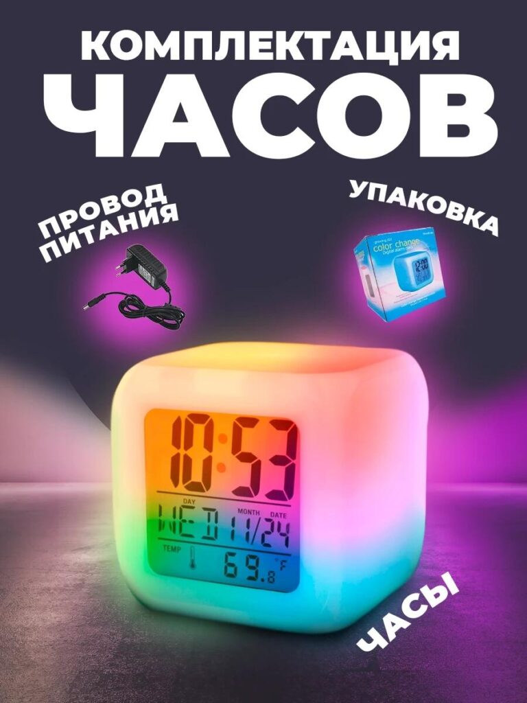
Image 1: Hero Main Image — RGB Light as the Core Selling Point
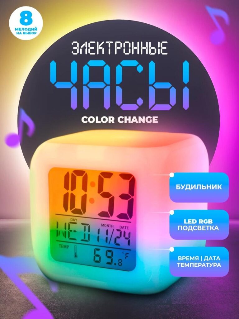
The first image functions as the primary Ozon main image, and its responsibility is to stop the scroll.
We centered the RGB electronic alarm clock against a darkened, gradient-lit background to amplify the LED color-change effect. Instead of showing a flat white product, we highlighted the clock glowing in multiple hues—cyan, pink, yellow, and green—blended smoothly across the body. This immediately communicates the RGB feature without text-heavy explanations.
The clock face remains sharp and readable, displaying time, date, and temperature simultaneously. This balance between ambient lighting and digital clarity reassures buyers that the product is not just decorative, but practical. Supporting callouts reinforce key functions—alarm, RGB LED backlight, and time/date display—positioned to guide the eye without overwhelming the product.
This image establishes three things instantly:
- The product is modern and tech-driven
- The RGB lighting is soft, not harsh
- The clock is designed for nightstand use
For Ozon, where thumbnails matter, this image ensures clarity even at reduced sizes.
Image 2: Size & Proportion Image — Compact Form, Clear Measurements
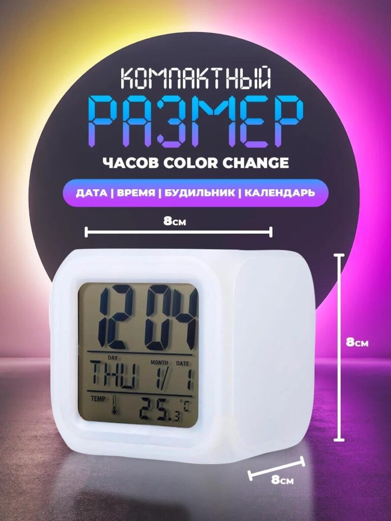
The second image answers a critical buyer concern: How big is it?
We introduced precise measurements—8 cm on each side—over a clean, neutral background. The clock is shown from a slight angle to reveal depth while maintaining accurate proportions. This prevents false expectations and reduces return risk, which is especially important on marketplaces like Ozon.
Instead of cluttering the image with unnecessary elements, we kept the focus on scale. The compact cube shape communicates portability and versatility: suitable for desks, bedside tables, shelves, or even children’s rooms.
By visually reinforcing that the clock is small yet functional, this image builds trust and positions the product as a space-friendly solution for modern interiors.
Image 3: User Interaction & Control Logic — Simplicity in Action
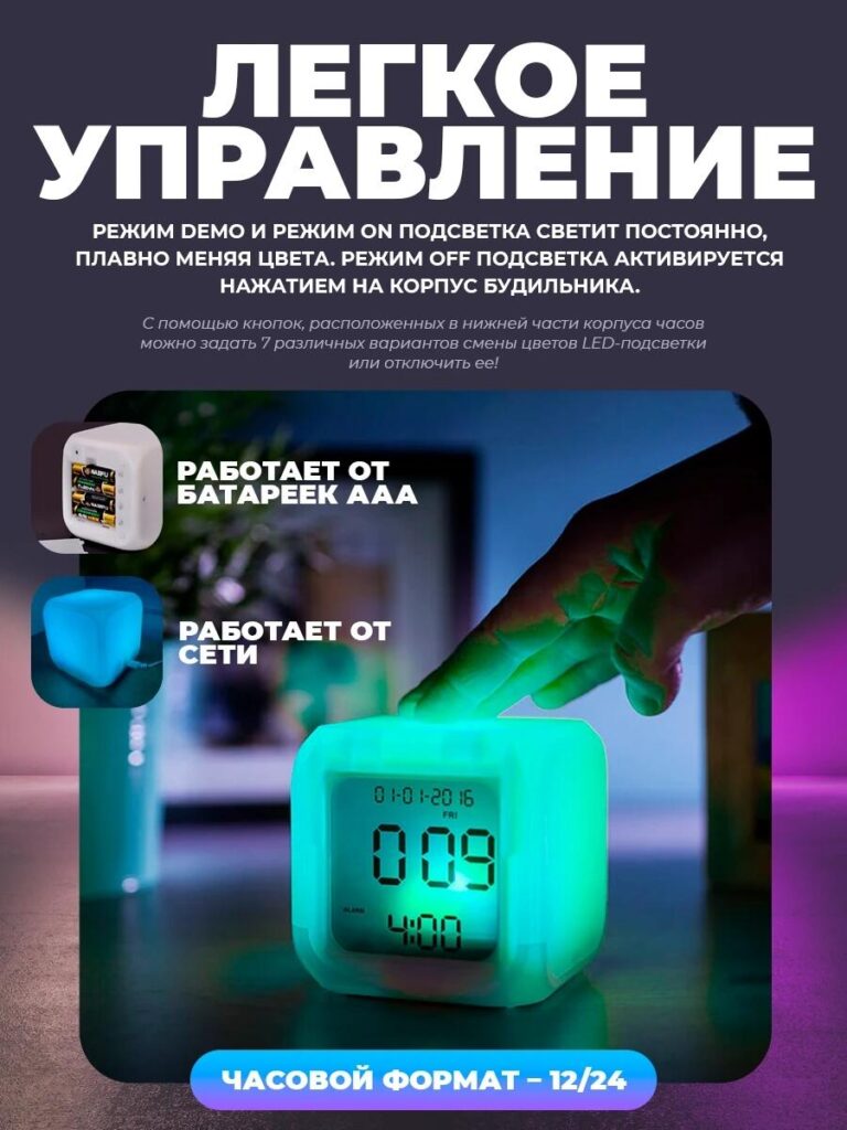
This image shifts from static product presentation to real-world interaction.
We captured a hand gently touching the top of the clock, demonstrating how the lighting modes can be controlled directly from the body. The glowing green tone emphasizes responsiveness, while the environment suggests a calm nighttime setting.
Text overlays explain the lighting modes:
- Demo mode with smooth color transitions
- Constant ON mode
- OFF mode via touch
We also visually introduce dual power options—AAA batteries and wired power—using small inset icons. This reassures buyers that the clock is flexible and reliable in different setups.
This image is crucial because it removes friction. It shows that the RGB electronic alarm clock does not require complex menus or apps. The interaction feels intuitive, which is a strong selling point for all age groups.
Image 4: Lifestyle & Interior Compatibility — Design That Fits Anywhere
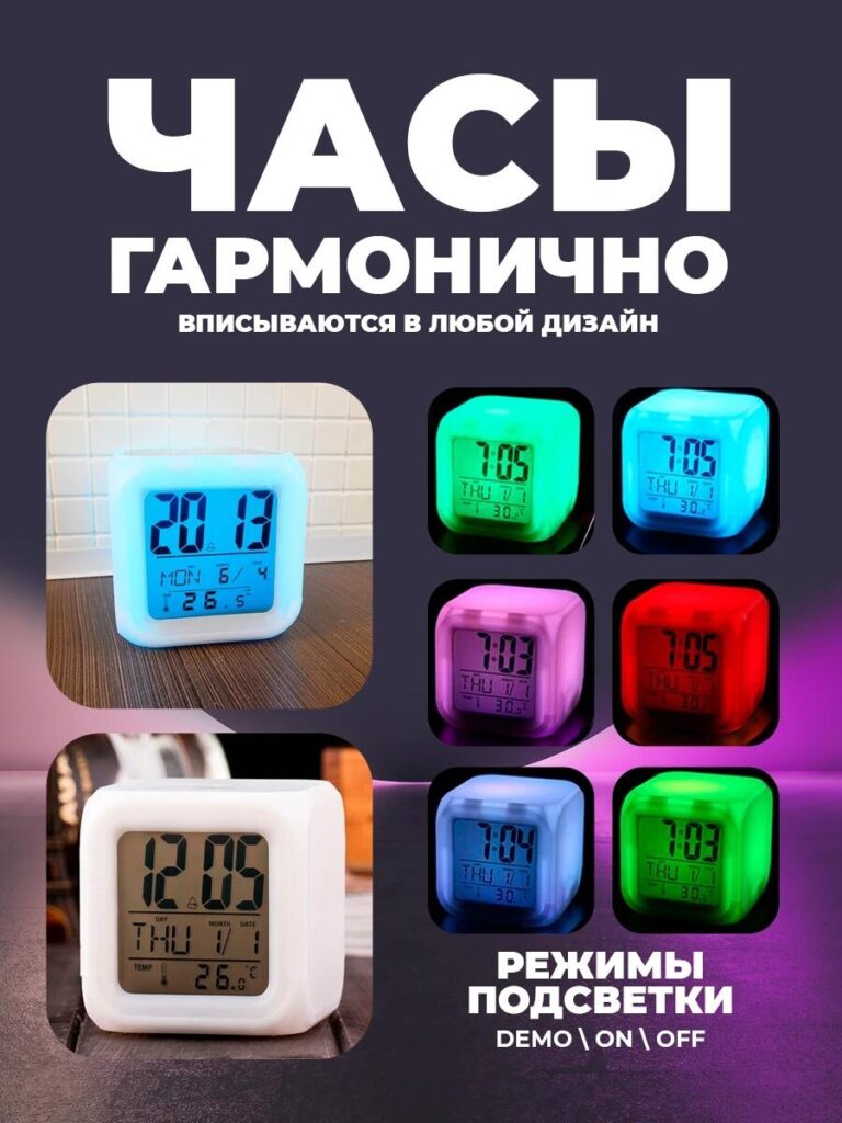
In this image, we focused on aesthetic adaptability.
We placed the clock in realistic interior environments and paired it with a grid of RGB color variations: blue, green, pink, red, and soft white. This instantly communicates that the product is not limited to one mood or style.
The headline emphasizes harmony with any interior design. Instead of technical language, the message is emotional: the clock adapts to you. Whether used as a nightlight, accent lamp, or minimal alarm clock, it blends seamlessly into modern homes.
For Ozon shoppers who often compare multiple products quickly, this image differentiates the clock as both functional and decorative—bridging tech and lifestyle.
Image 5: Packaging & What’s Included — Transparency Builds Trust
The final image addresses the last buyer question before purchase: What do I receive?
We clearly displayed:
- The RGB electronic alarm clock
- 電源ケーブル
- Retail packaging
Each item is visually separated and labeled. The packaging design reinforces that this is a finished consumer product, not a generic gadget. Showing the box also adds perceived value and makes the product feel gift-ready.
This image helps eliminate uncertainty and reduces customer service inquiries, which is especially important for marketplace sales at scale.
Why This Image System Works on Ozon
This image sequence follows a deliberate conversion path:
- Attract attention with RGB lighting
- Build trust through size and clarity
- Demonstrate ease of use
- Show lifestyle fit
- Confirm package contents
Each image has a single, focused job. Together, they form a complete visual sales story that aligns perfectly with Ozon’s browsing behavior and platform requirements.
結論
Effective main image design on オゾン is not about adding more effects—it is about making the product instantly understandable and emotionally appealing. For this RGB electronic alarm clock, we translated technical features into visual experiences that feel intuitive, calm, and modern.
By structuring the image set around user questions and real usage scenarios, we helped the product stand out in a competitive marketplace while maintaining clarity and trust. This is exactly how we approach marketplace visual design—strategically, intentionally, and with conversion in mind.
If you are looking to elevate your Ozon product listings through professional main image design and structured visual storytelling, this is the type of result we create at エアサン.


WordPressのウェブサイトや、完全なeコマースシステムを備えたコーポレートサイトをデザイン・構築します。.
価格帯$200.00~$2,500.00カスタム要件または特別見積もり
元価格は$2.00。.$1.00現在の価格は$1.00。. Amazonホーム理学療法機器のメイン画像デザイン解説
はじめにAmazonで家庭用治療器の信頼できるイメージを構築する Amazonで家庭用治療器のメインイメージをデザインする際、私たちが最も重視するのは...

Amazon リップスティックコンバージョンのメイン画像デザイン
はじめにアマゾンで売れる口紅のメイン画像をデザインする アマゾンの口紅のメイン画像をデザインするとき、私たちの責任は...

Amazonのリキッドファンデーションのメイン画像がコンバージョンにつながる理由
はじめに Amazonリキッドファンデーションのメイン画像デザインは、単に商品を美しく見せるだけではありません。Amazonでは、メイン画像と….

フィルターカートリッジの効果的なAmazonメインイメージのデザイン
はじめに Amazonのメイン画像をデザインする上で、商品を魅力的に見せることは決して重要ではありません。明確さ、信頼性、そして瞬時に理解できることが何よりも重要です。特に….

ペット向けWordPressテーマ5選を比較
はじめに ペット関連のWordPressテーマを適切に選ぶことは、単なるデザイン上の決定ではありません。使いやすさ、拡張性、そして長期的なビジネスの成長に直接影響します。ペットケアとペット...

科学主導のブランドのためのスケーラブルなWordPressウェブサイトの構築:AminoUSAプロジェクト
はじめに 今日のデジタル環境において、ウェブサイトは単なる製品リストを掲載する場所ではありません。規制の厳しい業界や研究重視の業界で事業を展開する科学主導のブランドにとって、ウェブサイトは….

グローバルブレードブランドのためのスケーラブルなShopifyストアの構築:CoolKatanaプロジェクト
はじめに 越境電子商取引において、Shopify の Web サイトは単なる店舗ではありません。ニッチで文化主導のカテゴリーで活動するブランドにとって、Web サイトは単なる店舗以上のものを実現する必要があります...

ポケモンカード向け高コンバージョンShopifyストアの設計
はじめに 収集可能な電子商取引の世界、特にポケモン トレーディング カード ゲーム (TCG) 市場では、Web サイトは単に製品をリストするだけでは不十分です。...

カスタムレンガブランドのための高コンバージョンShopifyデザイン
はじめに 今日の競争の激しいeコマース市場、特にパーソナライズされたギフトやコレクターズアイテムの分野では、Shopifyのウェブサイトは商品を展示する以上の機能を提供する必要があります。それは….

高級花卉ブランド向けShopifyウェブサイトデザイン事例
はじめに 今日の競争の激しいeコマース市場において、Shopifyのウェブサイトは商品を表示する以上の機能を提供する必要があります。ブランド価値を瞬時に伝え、ユーザーを誘導する必要があります….

Shopifyデザインケーススタディ:レトロゲームストア
はじめに 競争の激しいeコマース環境では、視覚的な明瞭さと感情的な繋がりが、訪問者が顧客になるかどうかを左右することがよくあります。これは特に….

Shopifyデザインケーススタディ:タクティカルレスキューブランド
はじめに 優れたShopifyウェブサイトは、商品を展示するだけではありません。ウェブサイトの目的を伝え、信頼を築き、ユーザーが自信を持って購入を決定できるよう導きます。これは特に….

電動自転車ブランド向けShopifyウェブサイトデザイン事例
はじめに 今日の競争の激しい電動自転車市場では、Shopify の Web サイトは製品を表示するだけでなく、ストーリーを伝え、信頼を構築し、ユーザーを誘導する必要があります...

クリエイティブブランドのためのスケーラブルなShopify Eコマース
はじめに クリエイティブなブランドが成長すると、ウェブサイトの維持に苦労することがよくあります。製品ラインの拡大、コンテンツの増加、トラフィックの増加に伴い、多くのビジュアル重視のブランドは….

ホームデコレーションブランド向けShopifyウェブサイトデザイン事例
はじめに 競争の激しいホームデコレーション市場において、ビジュアル・アイデンティティはもはや単なる美観ではなく、信頼、閲覧行動、そして購入決定に直接影響を与えます。例えば….

スケーラブルなWordPressサブスクリプションウェブサイトの構築事例
はじめに 現代のeコマースブランドにとって、ウェブサイトはもはや単なるデジタル店舗ではありません。サブスクリプション、コンテンツストーリーテリング、信頼構築などをサポートするエンジンなのです。.

アダルトブランド向けの高コンバージョンWordPressデザイン
はじめに 競争の激しいeコマース市場では、魅力的なビジュアルだけでは十分ではありません。成功するWordPressウェブサイトは、訪問者を明確かつ意図的なジャーニーへと導く必要があります。.

スケーラブルなWordPressセックスドールEコマースウェブサイト
はじめに 高性能な越境電子商取引 Web サイトを立ち上げるということは、製品をオンラインに掲載するだけでは十分ではありません。競争が激しく、視覚的に重視される市場で事業を展開しているブランドにとって、Web サイトは...