


 Japanese
導入
競争の激しい市場では オゾン, product success is rarely determined by specifications alone. Visibility, clarity, and trust are shaped within seconds, and the main image plays the most critical role in that decision-making process. For a product such as a car wash gun, where power, portability, and convenience must be instantly understood, visual communication becomes even more important.
This project focuses on the main image design for an Ozon car wash gun, created to clearly communicate performance, usage scenarios, and value at a glance. From lighting and composition to information hierarchy and scene selection, every visual decision was made to align with Ozon’s marketplace logic and real user behavior. Below, we break down each image and explain how the design strategy transforms product features into conversion-driven visuals.
| 配達時間 | カテゴリ | アプリケーションプラットフォーム |
| 8日間 | Car wash gun | オゾン |
| 関与するデザイナー | 料金 | 効果 |
| ナンシー | $150 | Sales volume📈285% |
Understanding Ozon Main Image Design Logic
Before discussing the images themselves, it’s important to understand how Ozon users browse.
Most buyers on Ozon:
- Scan listings quickly
- Compare visually before reading details
- Trust images more than text descriptions
- Expect technical products to “explain themselves” visually
For this reason, Ozon main image design must achieve three goals simultaneously:
- Immediate recognition of product type
- Clear presentation of key benefits
- Emotional reinforcement of power, reliability, and ease of use
The car wash gun images were designed with this exact logic in mind.
Image 1: Hero Product Shot Emphasizing Power and Completeness
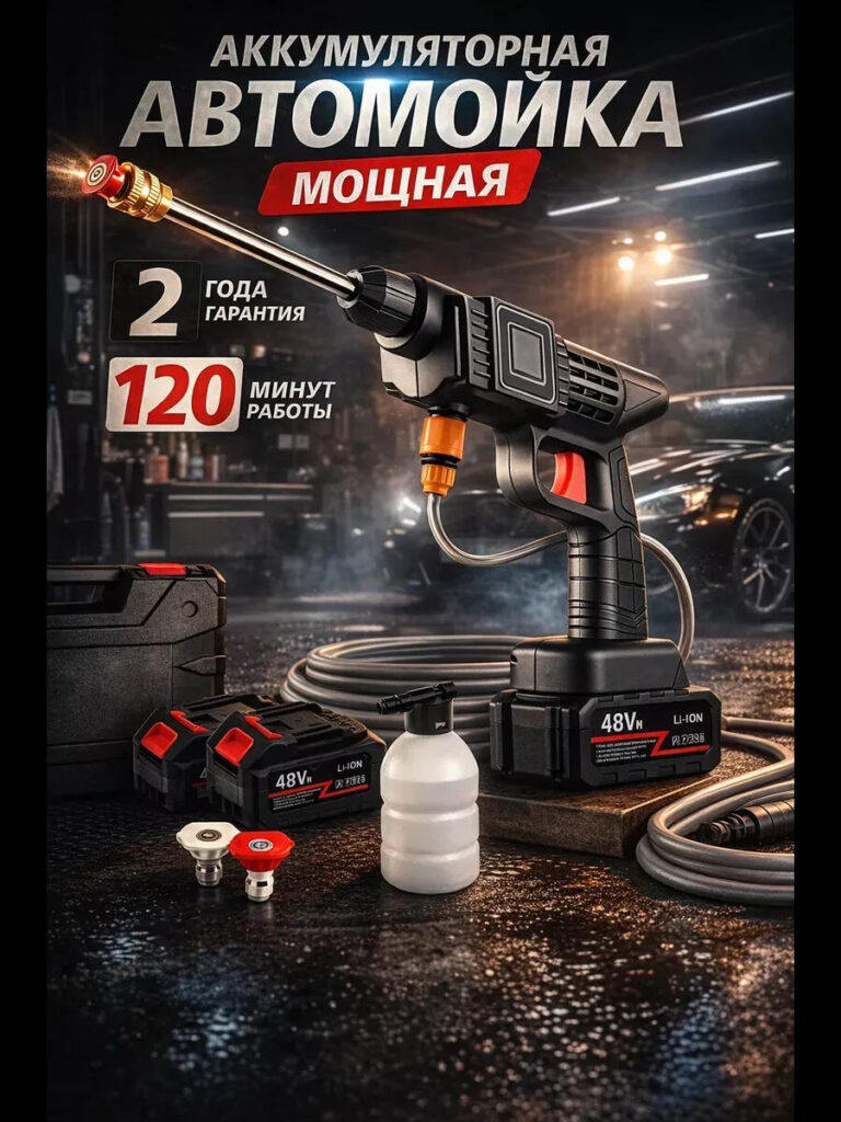
The first image establishes the product’s identity instantly.
The car wash gun is positioned centrally, angled slightly forward to create a sense of motion and strength. This angle is intentional—it avoids a flat catalog look and instead suggests active use. The dark workshop-style background contrasts sharply with the product’s black-and-orange color scheme, ensuring high visibility even in thumbnail size.
この画像における主要な設計上の決定は次のとおりです。
- A clean, dominant product silhouette
- Clear visibility of the battery base
- Accessories placed neatly around the product to show completeness
- Controlled reflections to enhance a premium, durable feel
This image answers a critical buyer question within seconds:
“What exactly am I getting?”
By visually presenting the gun, batteries, hose, foam bottle, and case together, the image removes uncertainty and builds immediate trust.
Image 2: Highlighting High Pressure and Performance Capability
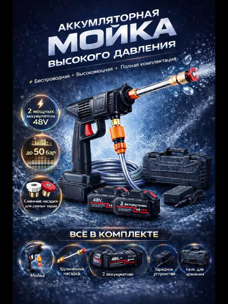
The second image shifts focus from appearance to performance.
Here, the visual environment becomes more dynamic, with water splash effects and a cooler blue color palette. This contrast from the warmer first image helps guide the viewer through a visual story rather than showing repetitive layouts.
デザインのハイライト:
- The spray nozzle is emphasized with directional water flow
- Circular icons isolate key technical advantages
- Pressure capability is visually reinforced rather than just stated
- The background suggests force and motion without distracting from the product
This image is designed for buyers who already recognize the product and now want reassurance of cleaning strength. Instead of overwhelming users with numbers, visual cues communicate power intuitively.
Image 3: Demonstrating Cordless and Water-Independent Use
One of the biggest selling points of this car wash gun is independence from traditional water sources. This image exists specifically to address that.
The gun is shown drawing water directly from a bucket, clearly illustrating that:
- No fixed water connection is required
- The product can be used anywhere
- Portability is a real, practical advantage
From a design perspective:
- The bucket is deliberately placed in the foreground
- The hose path is clearly visible
- The car in the background reinforces real-life application
- Water spray direction leads the eye back to the product
This image reduces perceived usage limitations and expands the buyer’s imagination—camping, outdoor cleaning, remote washing, or emergency use all become instantly plausible.
Image 4: Feature-Focused Layout with Clear Numeric Benefits
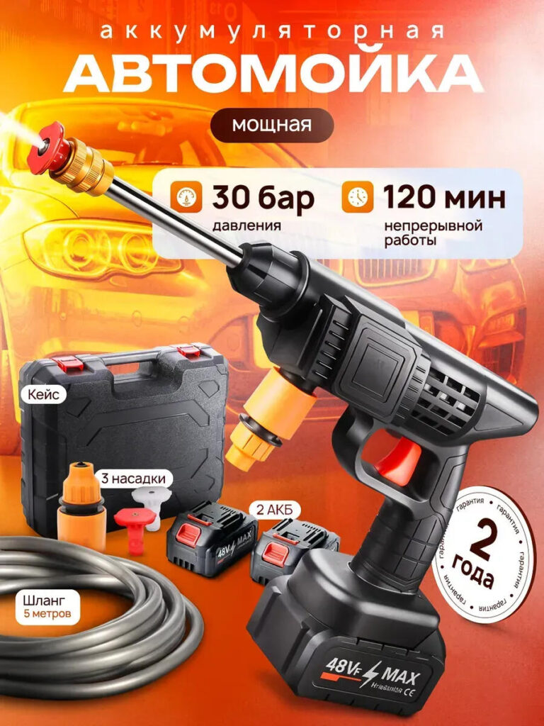
This image adopts a more commercial, data-driven style while still remaining visually engaging.
Instead of lifestyle storytelling, it focuses on quantified benefits, such as:
- Pressure level
- Runtime duration
- Warranty period
- Included accessories
The orange background creates strong contrast, ensuring the product stands out even when displayed among competing listings. Rounded labels and icons make technical information easy to digest, especially on mobile screens.
Design logic here emphasizes:
- Fast comprehension
- Reduced cognitive load
- 明確さによる信頼
This image is particularly effective for comparison shoppers who jump between listings and rely on visible specs to make quick decisions.
Image 5: Portability and Physical Dimensions Explained Visually
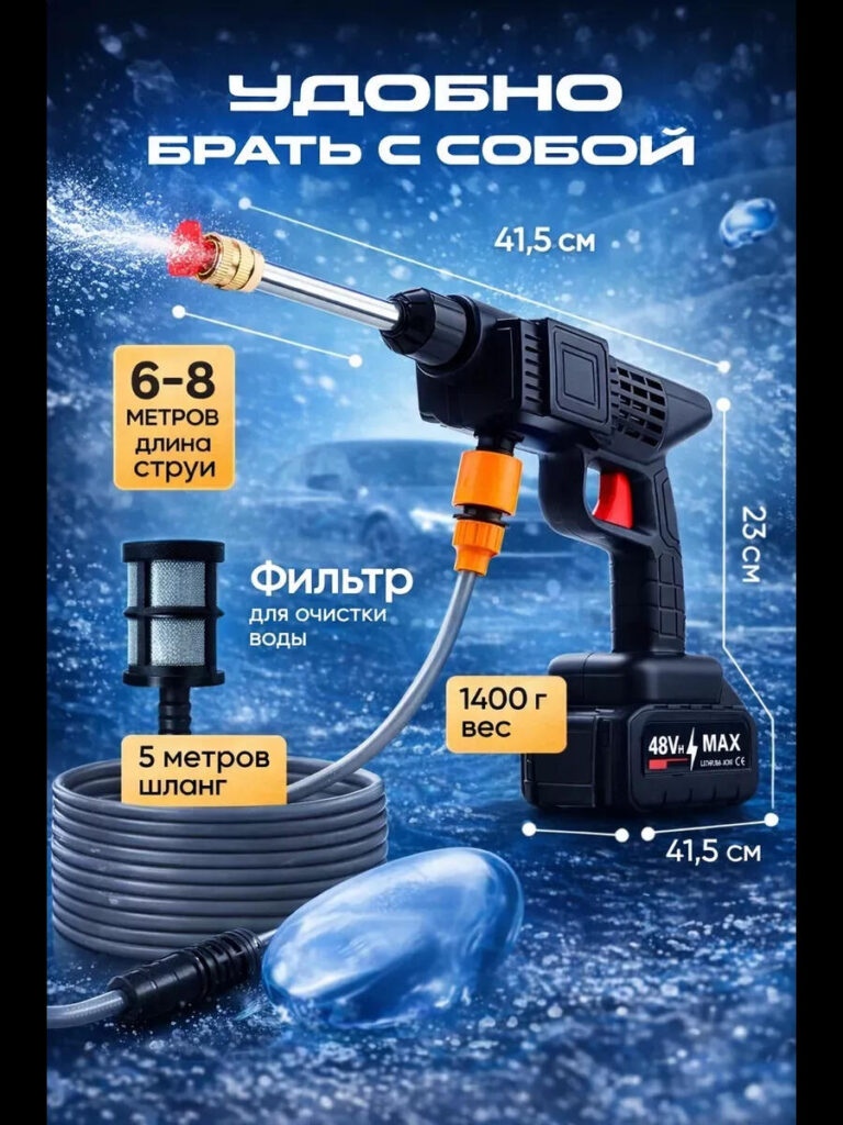
Buyers often hesitate when they cannot visualize a product’s size or weight. This image eliminates that concern.
By showing measurements directly alongside the product, the design:
- Removes ambiguity
- Helps users imagine storage and handling
- Reinforces portability claims
主な設計上の選択肢は次のとおりです。
- Clean measurement lines
- Minimal text
- Balanced spacing to avoid clutter
- Neutral blue background to maintain consistency with water themes
Instead of forcing users to read specifications in the description, this image visually answers practical questions upfront.
Image 6: Internal Structure and Performance Visualization
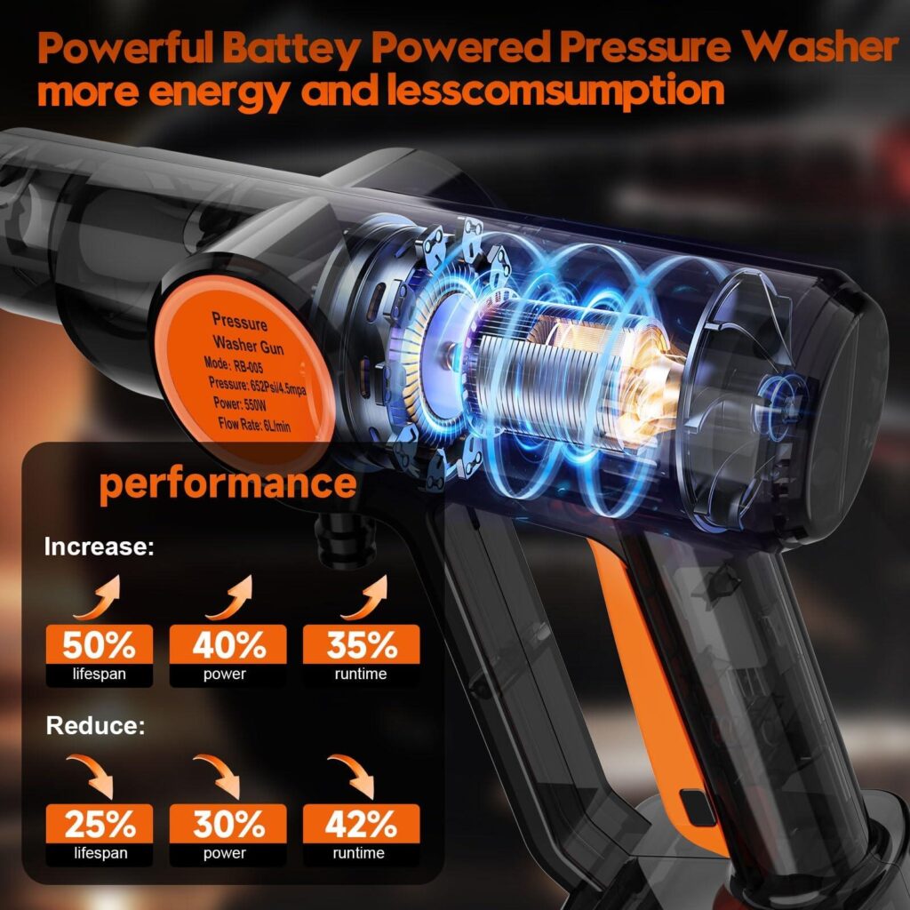
The final image uses a transparent cutaway style to highlight internal components and performance improvements.
This type of image is especially effective for technical products because it:
- Suggests engineering credibility
- Differentiates the product from generic alternatives
- Builds confidence in durability and efficiency
Design elements such as glowing energy lines and labeled performance improvements visually communicate:
- Enhanced motor efficiency
- Improved runtime
- Better energy utilization
Even for users who don’t fully understand the mechanics, the image creates a strong impression of advanced technology and thoughtful engineering.
Visual Consistency Across All Images
While each image serves a different purpose, consistency ties them together.
Key consistency elements include:
- Unified color palette (black, orange, blue)
- Consistent product angles and proportions
- Repeated emphasis on battery base
- Clear separation between product and background
This ensures that when images are viewed together on an Ozon listing, they feel like a cohesive system rather than unrelated graphics.
このメイン画像デザインがOzonで機能する理由
This car wash gun image set succeeds because it aligns with how Ozon users actually shop.
It:
- Prioritizes visual explanation over long text
- Balances emotional appeal with technical clarity
- Adapts well to both desktop and mobile viewing
- Builds trust through completeness and transparency
Most importantly, the images do not compete with each other. Each one answers a specific buyer question, guiding the user step-by-step from curiosity to confidence.
結論
Effective main image design on オゾン is not about making images look “cool.” It’s about making them work. For this car wash gun, every visual decision was driven by user behavior, marketplace rules, and conversion psychology.
By combining strong hero shots, performance storytelling, real usage scenarios, and technical clarity, the final image set transforms a functional product into a compelling, easy-to-understand offer. This is how design turns visibility into trust—and trust into sales.
This approach reflects the way we handle cross-border marketplace design projects, ensuring that products don’t just get seen, but get chosen. That is the design philosophy behind our work at エアサン.


WordPressのウェブサイトや、完全なeコマースシステムを備えたコーポレートサイトをデザイン・構築します。.
価格帯$200.00~$2,500.00custom-requirements-or-special-quotations
元価格は$2.00。.$1.00現在の価格は$1.00。. Amazonホーム理学療法機器のメイン画像デザイン解説
はじめにAmazonで家庭用治療器の信頼できるイメージを構築する Amazonで家庭用治療器のメインイメージをデザインする際、私たちが最も重視するのは...

Amazon リップスティックコンバージョンのメイン画像デザイン
はじめにアマゾンで売れる口紅のメイン画像をデザインする アマゾンの口紅のメイン画像をデザインするとき、私たちの責任は...

Amazonのリキッドファンデーションのメイン画像がコンバージョンにつながる理由
はじめに Amazonリキッドファンデーションのメイン画像デザインは、単に商品を美しく見せるだけではありません。Amazonでは、メイン画像と….

フィルターカートリッジの効果的なAmazonメインイメージのデザイン
はじめに Amazonのメイン画像をデザインする上で、商品を魅力的に見せることは決して重要ではありません。明確さ、信頼性、そして瞬時に理解できることが何よりも重要です。特に….

ペット向けWordPressテーマ5選を比較
はじめに ペット関連のWordPressテーマを適切に選ぶことは、単なるデザイン上の決定ではありません。使いやすさ、拡張性、そして長期的なビジネスの成長に直接影響します。ペットケアとペット...

科学主導のブランドのためのスケーラブルなWordPressウェブサイトの構築:AminoUSAプロジェクト
はじめに 今日のデジタル環境において、ウェブサイトは単なる製品リストを掲載する場所ではありません。規制の厳しい業界や研究重視の業界で事業を展開する科学主導のブランドにとって、ウェブサイトは….

グローバルブレードブランドのためのスケーラブルなShopifyストアの構築:CoolKatanaプロジェクト
はじめに 越境電子商取引において、Shopify の Web サイトは単なる店舗ではありません。ニッチで文化主導のカテゴリーで活動するブランドにとって、Web サイトは単なる店舗以上のものを実現する必要があります...

ポケモンカード向け高コンバージョンShopifyストアの設計
はじめに 収集可能な電子商取引の世界、特にポケモン トレーディング カード ゲーム (TCG) 市場では、Web サイトは単に製品をリストするだけでは不十分です。...

カスタムレンガブランドのための高コンバージョンShopifyデザイン
はじめに 今日の競争の激しいeコマース市場、特にパーソナライズされたギフトやコレクターズアイテムの分野では、Shopifyのウェブサイトは商品を展示する以上の機能を提供する必要があります。それは….

高級花卉ブランド向けShopifyウェブサイトデザイン事例
はじめに 今日の競争の激しいeコマース市場において、Shopifyのウェブサイトは商品を表示する以上の機能を提供する必要があります。ブランド価値を瞬時に伝え、ユーザーを誘導する必要があります….

Shopifyデザインケーススタディ:レトロゲームストア
はじめに 競争の激しいeコマース環境では、視覚的な明瞭さと感情的な繋がりが、訪問者が顧客になるかどうかを左右することがよくあります。これは特に….

Shopifyデザインケーススタディ:タクティカルレスキューブランド
はじめに 優れたShopifyウェブサイトは、商品を展示するだけではありません。ウェブサイトの目的を伝え、信頼を築き、ユーザーが自信を持って購入を決定できるよう導きます。これは特に….

電動自転車ブランド向けShopifyウェブサイトデザイン事例
はじめに 今日の競争の激しい電動自転車市場では、Shopify の Web サイトは製品を表示するだけでなく、ストーリーを伝え、信頼を構築し、ユーザーを誘導する必要があります...

クリエイティブブランドのためのスケーラブルなShopify Eコマース
はじめに クリエイティブなブランドが成長すると、ウェブサイトの維持に苦労することがよくあります。製品ラインの拡大、コンテンツの増加、トラフィックの増加に伴い、多くのビジュアル重視のブランドは….

ホームデコレーションブランド向けShopifyウェブサイトデザイン事例
はじめに 競争の激しいホームデコレーション市場において、ビジュアル・アイデンティティはもはや単なる美観ではなく、信頼、閲覧行動、そして購入決定に直接影響を与えます。例えば….

スケーラブルなWordPressサブスクリプションウェブサイトの構築事例
はじめに 現代のeコマースブランドにとって、ウェブサイトはもはや単なるデジタル店舗ではありません。サブスクリプション、コンテンツストーリーテリング、信頼構築などをサポートするエンジンなのです。.

アダルトブランド向けの高コンバージョンWordPressデザイン
はじめに 競争の激しいeコマース市場では、魅力的なビジュアルだけでは十分ではありません。成功するWordPressウェブサイトは、訪問者を明確かつ意図的なジャーニーへと導く必要があります。.

スケーラブルなWordPressセックスドールEコマースウェブサイト
はじめに 高性能な越境電子商取引 Web サイトを立ち上げるということは、製品をオンラインに掲載するだけでは十分ではありません。競争が激しく、視覚的に重視される市場で事業を展開しているブランドにとって、Web サイトは...