In the Coupang primary and secondary product images design of LUMAX folding camping lamp, we organized the content around the folding structure and multi-scene lighting. Through the cream white body, black function pages, and warm outdoor lighting, product identification, partial descriptions, and scene information are arranged at different levels, allowing readers to continue to understand the product in a clear sequence.
| サービス | Industry | プラットフォーム |
|---|---|---|
| Coupang primary and secondary product images design | Sports and outdoor | Coupang |
| Project requirements | target market | design style |
| Folding structure and multi-scene lighting | Korean content display | Cream white body, black function page, warm outdoor light |
| Project quotation | Delivery content | Delivery time |
| ¥700 | 10 product primary and secondary product images | 4 days |
Design challenge: Separate different reading tasks
This set of primary and secondary product images should not only retain the identity of the LUMAX folding camping lamp, but also accommodate different themes such as folding structure and multi-scene lighting. Instead of letting each picture carry all the information repeatedly, we separated the whole, parts and scenes, and controlled the distance between titles, pictures and descriptions.
Our design strategy
We use a cream white body, black function pages, and warm outdoor light to establish a continuous visual language so that the subject can be clearly identified from the background. The title uses an obvious font size and weight hierarchy, and the supplementary description is relegated to the next level to avoid decoration, photos and text competing for attention at the same time.
In terms of content organization, we divide chapters according to the themes of real works: use larger pictures to establish overall relationships, use parts and diagrams to explain details, and then use bounded text areas or lists to organize supplementary information. Each image has different responsibilities, and consistent margins and information placement maintain the continuity of the entire set.
Folded Appearance: Build the full outline first
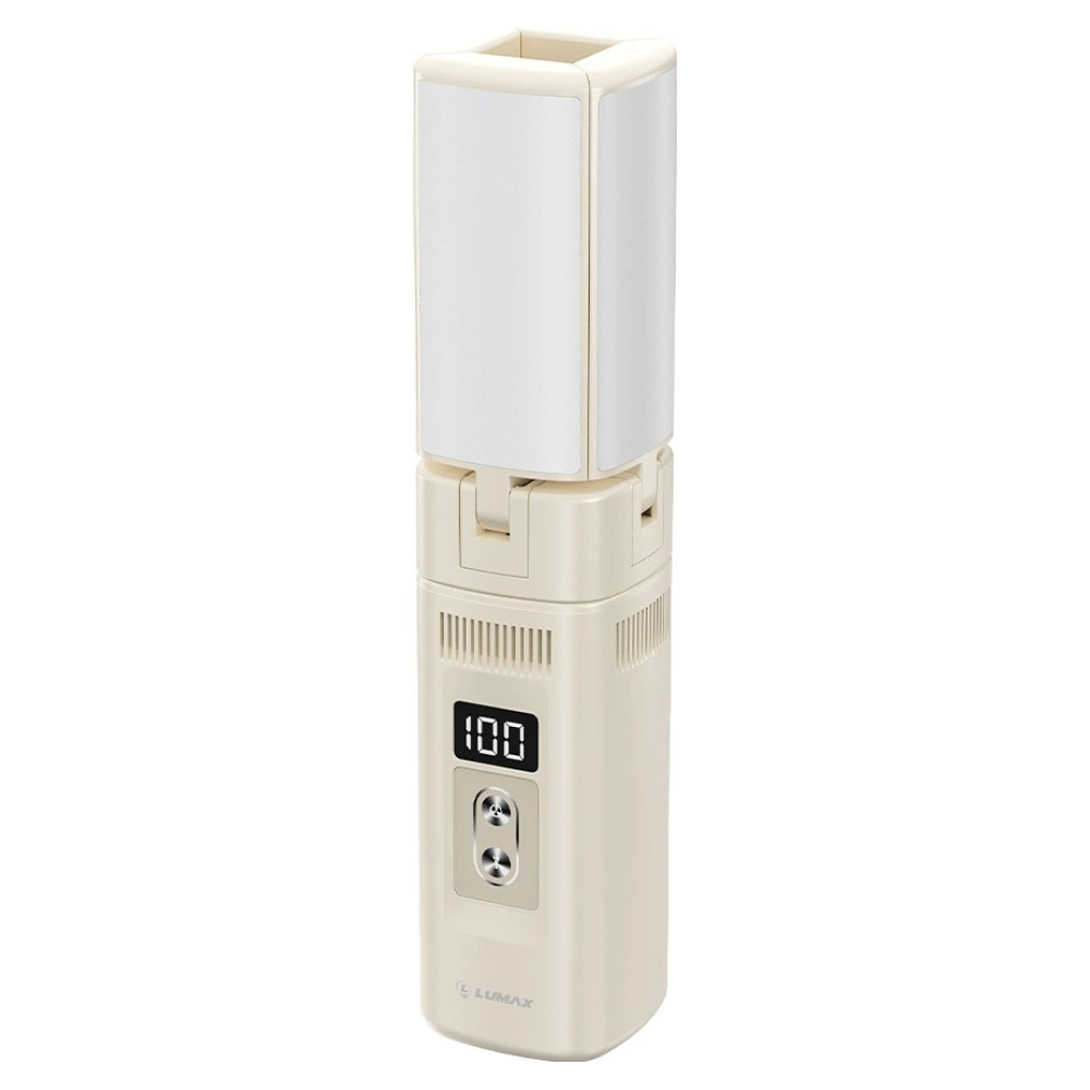
We use a white background to present the collapsed lamp body, and the handle, panel and luminous surface are unfolded along the central axis. There is plenty of white space around the body, and the slender shape remains clear in the thumbnails.
Unfolded state: explaining structure in hanging position
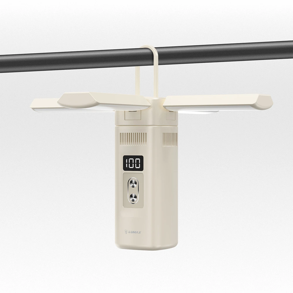
We unfolded the four lamp surfaces and retained the relationship between the handle and the crossbar. The light gray background reduces distractions and allows the unfolding angle and support position to become the center of the picture.
Night scene: use light and darkness to highlight the luminous surface
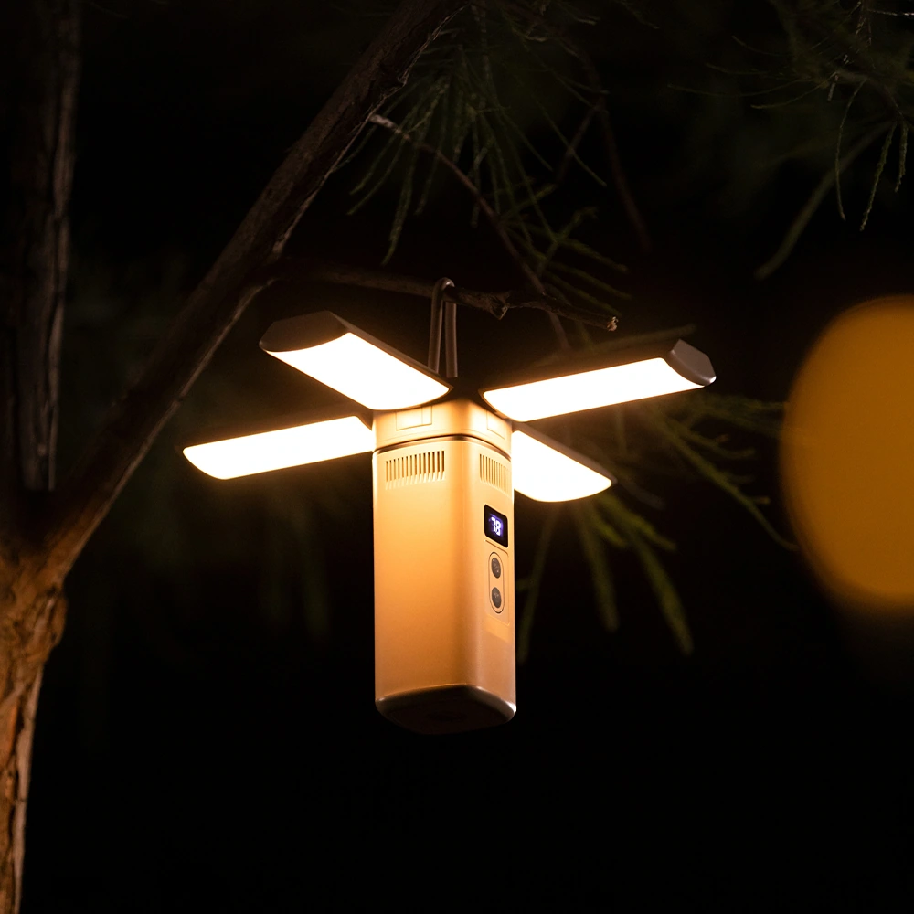
We placed the unfolded lamp body in a dark outdoor environment, and the warm glossy surface contrasted with the dark leaves. Background details are set back appropriately, and the subject can be identified without relying on a large amount of text.
Portable scene: giving intuitive scale reference
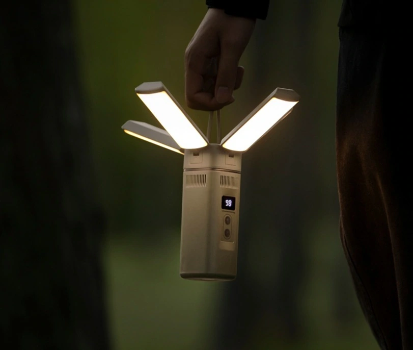
We let the hand and the lamp body enter the mirror together, retaining the relationship between holding and hanging. The closer framing allows the angle of the light surface, the body size and the usage situation to be concentrated in one picture.
Multiple statuses: divide operation topics by cards
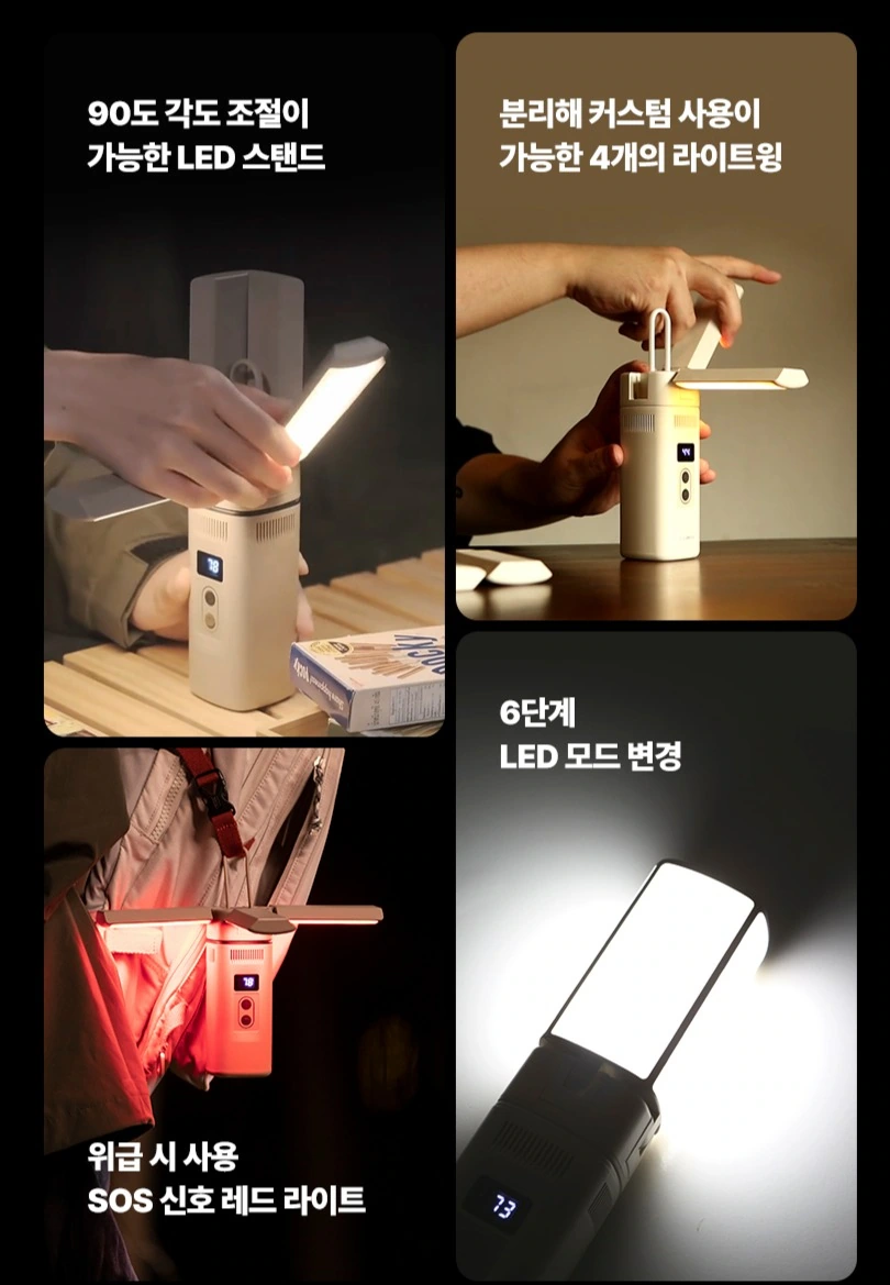
We use photo cards of different sizes to show the adjustment, lifting and lighting status. The title is placed in a clean area of each photo, and the black background unifies the partition boundaries to prevent text from crossing key components.
Function index: collect different scenes into the grid
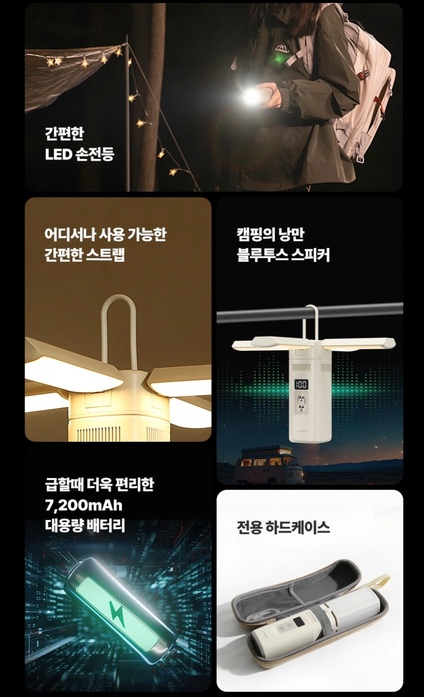
We arranged lighting, hanging, sound themes and storage images into groups. Dark and light cards are organized with common margins, allowing multiple topics to be read one by one.
Color temperature theme: side-by-side comparison from the same camera
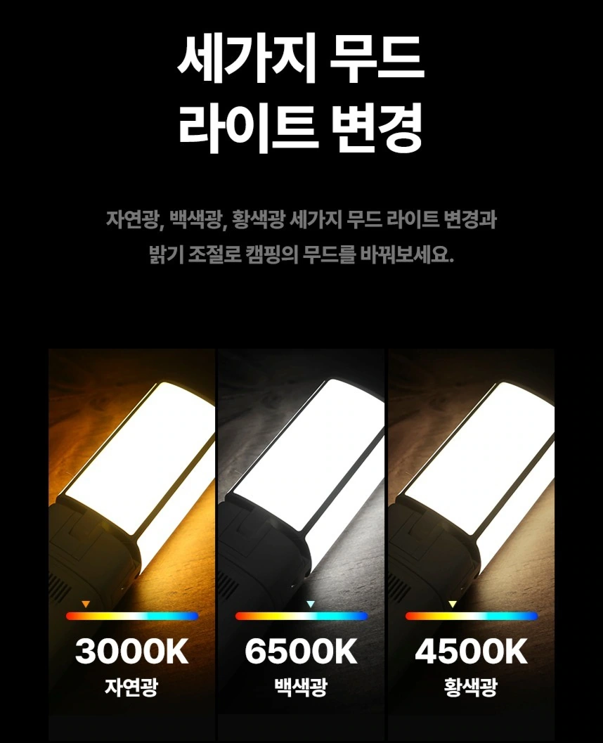
We arrange the three lighting images horizontally, with labels and ribbons next to the corresponding lighting surfaces. Identical crops allow for easy comparison of visual tones, and titles and descriptions remain separate levels above.
Powered theme: presenting graphics and scenes separately
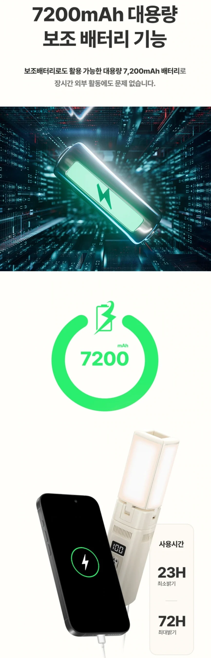
We layered battery graphics, circular number areas, and device groups vertically. The white background creates a pause for reading, with numbers and photos occupying their own spaces. The entire picture will not be filled with a single parameter.
Accessories list: each item has its own separate compartment
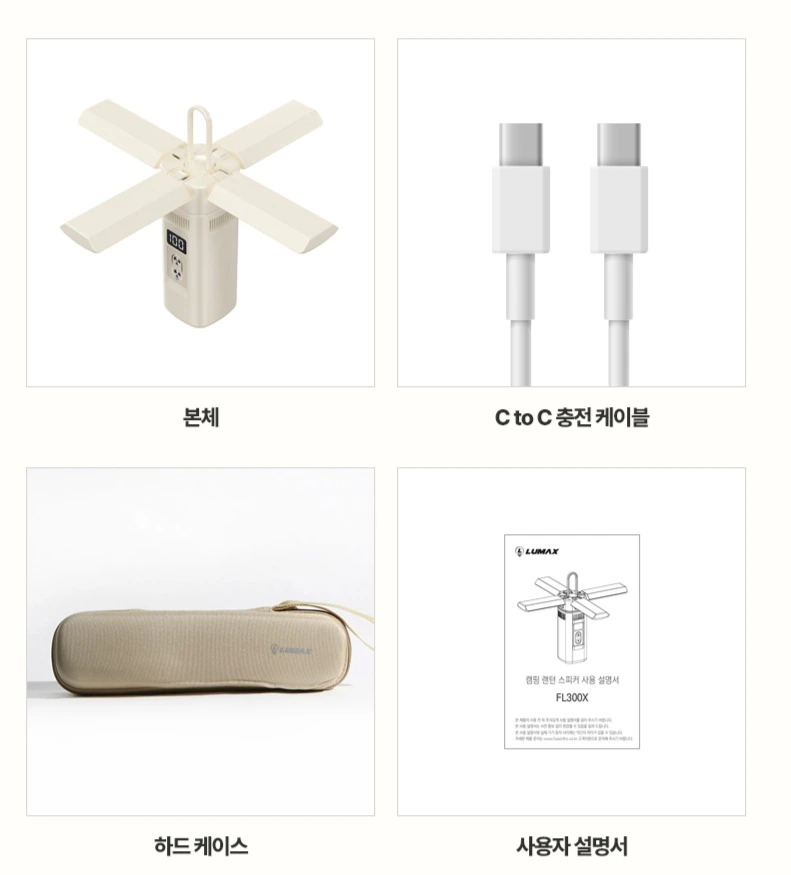
We use four grids to display the lamp body, wires, storage box and instructions, with the names placed under each grid. Uniform margins allow objects of different sizes to still have a neat basis for comparison.
Dimensions page: Markings extend along the outside of the fuselage
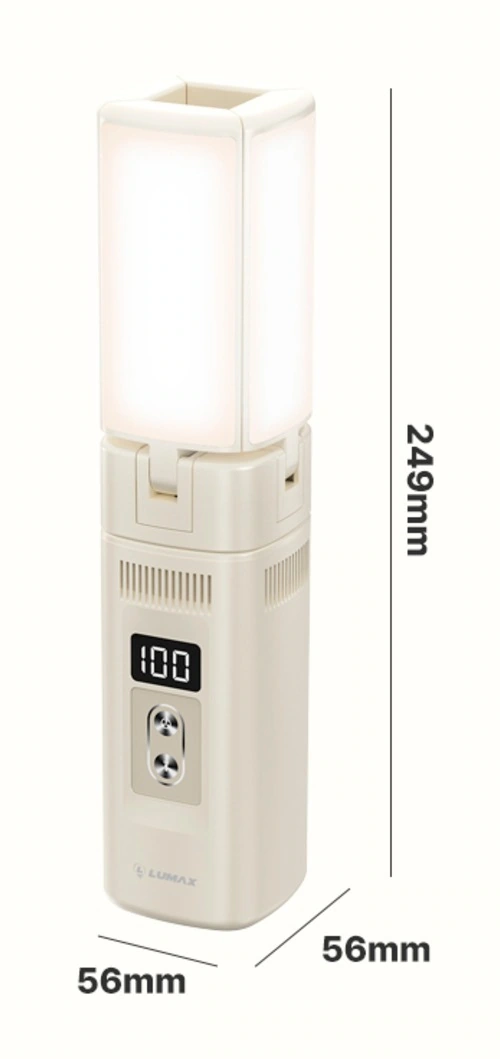
We keep the gathered outline intact, with the width and height lines close to the outer edge. The shallow bottom and thin line markings clearly explain the volume information and reserve space for product details.
Deliver and design value
Through this set of 10 product images, we establish a continuous reading path around the folding structure and multi-scene lighting. The creamy white body, black functional pages, and warm outdoor light connect different chapters. The image scale, text level, and white space jointly distinguish the priorities, allowing the product overview and local descriptions to complement each other.
Develop a clear Coupang visual expression for your product
You can provide us with product links, existing materials, and key points that need clarification. We will combine the product structure, style and usage scenarios to plan the appropriate picture group or product detail page content and layout.