


 Japanese
導入
今日の競争の激しいeコマース業界、特にパーソナライズされたギフトやコレクター向け商品を扱う業界では、 Shopify ウェブサイトは、商品を表示する以上の役割を果たさなければなりません。感情的なつながりを生み出し、カスタマイズを簡素化し、複雑な選択をユーザーに導き、インスピレーションを行動へと変える必要があります。.
マインブリック 視覚的な要素を重視するニッチな分野で事業を展開しています。顧客の写真からカスタムメイドのブロック人形を製作するのです。遊び心があり、個性的で、ギフト志向が高いこれらの製品は、同時に独特のデザイン上の課題も抱えています。顧客は購入前に、プロセスを理解し、結果を信頼し、結果を視覚化し、自信を持つ必要があります。.
このプロジェクトは、開発やカスタムコードではなく、Shopifyウェブサイトのデザインに特化していました。私たちの役割は、価値を明確に伝え、摩擦を軽減し、季節ごとのプロモーションや新商品の発売に合わせて拡張できる、構造化されたコンバージョン重視のShopifyエクスペリエンスを設計することでした。.
このケーススタディでは、思慮深いShopifyのページデザインがどのように役立ったかを探ります。 マインブリック クリエイティブな製品を、明確でコンバージョン率の高いオンライン エクスペリエンスに変換します。.
| 配達時間 | カテゴリ | アプリケーションプラットフォーム |
| 29日間 | カスタムブリックフィギュア | Shopify |
| 関与するデザイナー | 料金 | 効果 |
| ナンシー・ペッター | $3700 | 訪問者率📈374% |
プロジェクト概要: マインブリックブランドの理解
マインブリックとは
Minebrick は、Shopify ベースの e コマース ブランドであり、以下を提供しています。
- 顧客がアップロードした写真から作成されたカスタムレンガフィギュア
- カップル、家族、ペット、特別な機会のためのパーソナライズされたギフト
- 視覚的に魅力的なコレクターズアイテム
このブランドは、パーソナライゼーション、ギフト、コレクターアイテムの交差点に位置しており、デザインの明瞭さと感情的なストーリーテリングが重要になります。.
このカテゴリー特有の設計上の課題
標準的な e コマース製品とは異なり、カスタム レンガ フィギュアにはいくつかの課題があります。
- 顧客は複数段階のカスタマイズプロセスを理解する必要がある
- 最終製品はすぐには実体がない
- 信頼と期待の管理が不可欠
- 視覚的な証拠は技術仕様よりも重要
私たちの目標は、Shopify ページのデザイン、レイアウト、コンテンツ構造を通じてこれらの課題を解決することでした。.
設計目標と目的
設計プロセスを開始する前に、いくつかの明確な目標を定義しました。
主な設計目標
- カスタマイズのプロセスを簡素化
- ユーザーを圧倒することなく「仕組み」を明確に伝える
- パーソナライゼーションをコアバリューとして強調する
- ホームページと商品ページをコンバージョンのために最適化する
- ビジュアル、社会的証明、構造を通じて信頼を築く
ビジネス指向の成果
- カートに追加する信頼性を高める
- カスタマイズ時のユーザーの混乱を軽減
- 季節のキャンペーン(クリスマス、ギフトなど)をサポートする
- 将来の製品向けにスケーラブルなデザインシステムを構築する
プロジェクト全体にわたるすべての決定は、これらの目標に照らして評価されました。.
Shopifyのデザインアプローチ
コードファーストではなくデザインファースト
このプロジェクトは、技術的な構築ではなく、デザインと UX の課題としてアプローチされました。.
開発機能やカスタム コードに重点を置くのではなく、次の点に重点を置きました。
- ページ階層
- 視覚的な流れ
- コンテンツの優先順位付け
- ユーザー心理と購買行動
Shopifyはすでに堅牢なプラットフォームを提供しています。私たちの責任は、ユーザー体験を設計することでした。.
ホームページデザイン戦略
強い第一印象を与える
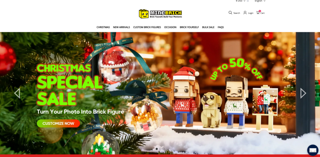
ホームページは新規ユーザーにとって主要なエントリーポイントとして機能します。Minebrickでは、以下の3つの質問に即座に答える必要がありました。
- この商品は何ですか?
- カスタマイズはどのように機能しますか?
- なぜこのブランドを信頼すべきなのでしょうか?
ヒーロー セクションでは、特にクリスマスなどのギフトが中心となる時期に、季節感あふれる大胆なビジュアルとプロモーション メッセージを使用して、すぐに関連性を確立します。.
セクションを通して視覚的に物語を伝える
ホームページは、テキストでユーザーを圧倒するのではなく、視覚的に区別されたセクションに分かれています。
- ステップバイステップの「仕組み」ブロック
- おすすめのカスタマイズ例
- ベストセラー製品のハイライト
- 実際の顧客のビジュアルとレビュー
このモジュール構造により、ユーザーは自分のペースでスキャン、理解、関与することができます。.
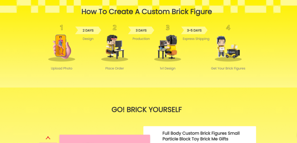
カスタマイズの旅の設計
カスタマイズをシンプルに
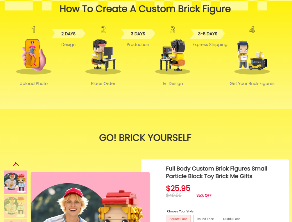
カスタマイズは明確に提示されなければ、ユーザーを不安にさせる可能性があります。私たちはデザインを通してこの問題に対処しました。
- アイコンベースの手順を使用してプロセスを説明する
- 説明を短く、視覚的にわかりやすくする
- 安心感を与えるメッセージをCTAの近くに配置する
各ステップは、初めて購入する人でも簡単に実行できるように設計されています。.
ユーザーを行動へと導く
戦略的なCTAの配置により、ユーザーは次に何をすべきかを常に把握できます。「カスタマイズ」などのボタンは、押し付けがましさを感じさせずに視覚的に強調されており、親しみやすく直感的なエクスペリエンスを維持しています。.
商品ページのデザイン:信頼の構築
技術的な詳細よりも視覚的な優先
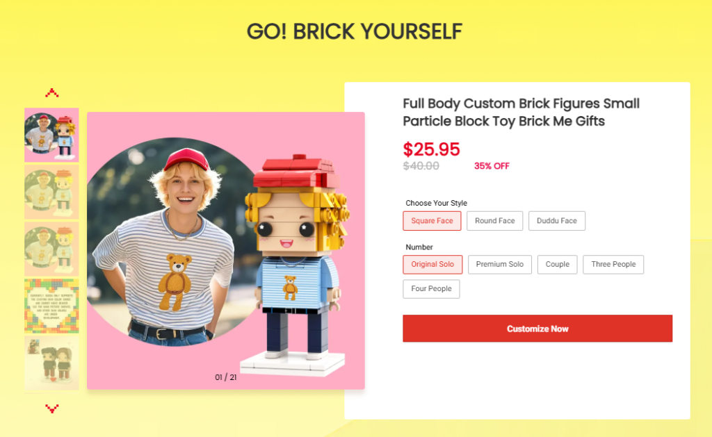
マインブリックにとって、ビジュアルは仕様よりも効果的に製品を販売します。.
製品ページでは以下を優先します:
- 大きくて高品質な製品画像
- ビフォーアフターの例
- ライフスタイルと贈り物の文脈
これにより、顧客は抽象的な詳細に焦点を当てるのではなく、最終結果を想像することができます。.
レイアウトを通じて信頼をサポート
信頼を築くための重要な要素がデザインに織り込まれています。
- 明確な価格表示
- 透明なカスタマイズ手順
- 品質と納品に関する安心感
長い段落の代わりに、情報は現代のブラウジング動作を尊重したスキャン可能なセクションに分割されます。.
コレクションとカテゴリーデザイン
ユーザーが簡単に探索できるように支援する
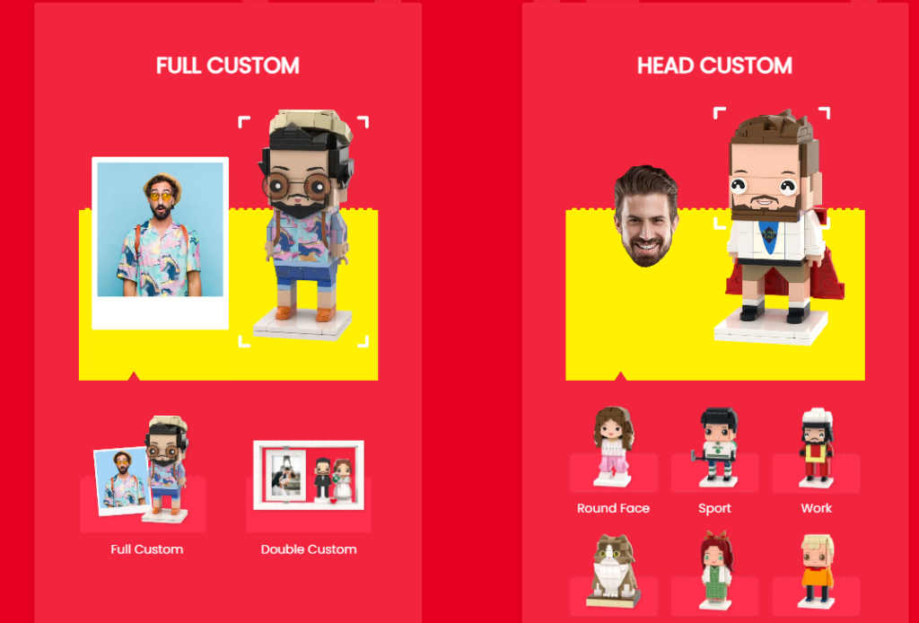
Minebrickは、多様なカスタマイズスタイルとユースケースを提供しています。混乱を避けるため、コレクションは以下の項目で視覚的にグループ化されています。
- 用途(カップル、ペット、家族)
- カスタム レベル (フル カスタム vs. ヘッドのみ)
- 人気商品やギフトに最適な商品
これにより、ユーザーは複雑なフィルターに頼ることなく直感的に閲覧できるようになります。.
コレクション間の視覚的な一貫性
一貫したカードレイアウト、画像の比率、間隔により、統一感のあるプロフェッショナルな閲覧体験が実現し、ブランドの信頼が強化されます。.
プロモーションと季節のデザイン要素
キャンペーンの柔軟性を考慮した設計
ギフトブランドは季節ごとのトラフィックに大きく依存しています。サイトデザインでは、以下の点を考慮しています。
- レイアウトを崩さずにバナーを交換
- 強調表示された割引と緊急メッセージ
- 季節限定商品特集
これにより、Web サイトを完全に再設計することなく、迅速に適応できるようになります。.
社会的証明と信頼性
信頼シグナルを追加するだけでなく、設計する
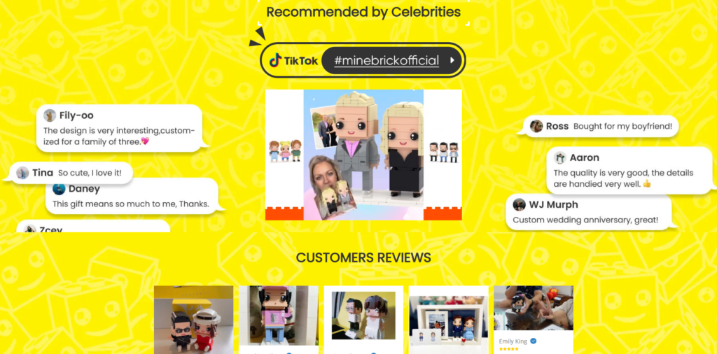
レビューを後付けとして扱うのではなく、レイアウトに社会的証明を意図的に組み込んでいます。
- 顧客の写真レビュー
- ビジュアル証言
- インフルエンサースタイルの言及
これらの要素はページフローに自然に表示され、ショッピング体験を中断することなく信頼性を強化します。.
直面した課題
遊び心と明瞭さのバランス
製品自体は楽しく遊び心のあるものですが、視覚的なノイズが多すぎると鮮明さが損なわれる可能性があります。そこで、以下の点に課題がありました。
- 遊び心のある口調を維持する
- UIをすっきりと読みやすく保つ
- 購入の決定を妨げないようにする
情報密度の管理
カスタム製品には説明が必要です。私たちはこれを次のように解決しました。
- 情報を積み重ねるのではなく、重ねる
- ビジュアルを優先し、テキストを後回しにする
- 必要な場合にのみユーザーがより深く掘り下げられるようにする
当社のデザインソリューション
構造化された視覚的階層
明確な間隔、一貫したタイポグラフィ、色の階層により、認識から行動へと注意が自然に導かれます。.
モジュラーShopifyセクション
モジュール式のセクションを設計することで、サイトの柔軟性と拡張性を維持できます。全体的なエクスペリエンスを損なうことなく、新商品やキャンペーンを追加できます。.
結果と影響
このケーススタディは分析よりもデザインに重点を置いていますが、ビジュアルと UX の改善によっていくつかの重要な成果が達成されました。
- より明確なカスタマイズの旅
- 初回ユーザーへの理解を深める
- ビジュアルとレイアウトによる信頼性の向上
- 将来の成長を見据えたスケーラブルなShopifyデザインシステム
このウェブサイトは、店舗としてだけでなく、ガイド付きの体験としても機能するようになりました。.
結論
マインブリック’の Shopify このウェブサイトは、思慮深いページ デザインによって、パーソナライズされた製品を目新しいものから、自信に満ちた、コンバージョンにつながるブランド エクスペリエンスへと高めることができることを示しています。.
このサイトは、技術的な複雑さではなく、視覚的な階層、ユーザーフロー、感情的なストーリーテリングに重点を置くことで、価値を伝え、信頼を構築し、長期的な成長をサポートすることに成功しています。.
このプロジェクトは、Shopifyデザインに対する私たちの幅広いアプローチを反映しています。それは、実際のビジネス目標に合わせて、構造化され、拡張可能で、コンバージョンに重点を置いたエクスペリエンスを作成することです。 エアサン, 弊社は、競争の激しいグローバル市場で目立つためにストーリーテリング、カスタマイズ、視覚的なインパクトを重視するブランド向けの Shopify ウェブサイト デザインを専門としています。.
Shopify ストアを構築または再設計していて、見た目だけでなく成長をサポートするデザインが必要な場合、これはまさに私たちが行っている仕事です。.


WordPressのウェブサイトや、完全なeコマースシステムを備えたコーポレートサイトをデザイン・構築します。.
価格帯$200.00~$2,500.00カスタム要件または特別見積もり
元価格は$2.00。.$1.00現在の価格は$1.00。. Amazonホーム理学療法機器のメイン画像デザイン解説
はじめにAmazonで家庭用治療器の信頼できるイメージを構築する Amazonで家庭用治療器のメインイメージをデザインする際、私たちが最も重視するのは...

Amazon リップスティックコンバージョンのメイン画像デザイン
はじめにアマゾンで売れる口紅のメイン画像をデザインする アマゾンの口紅のメイン画像をデザインするとき、私たちの責任は...

Amazonのリキッドファンデーションのメイン画像がコンバージョンにつながる理由
はじめに Amazonリキッドファンデーションのメイン画像デザインは、単に商品を美しく見せるだけではありません。Amazonでは、メイン画像と….

フィルターカートリッジの効果的なAmazonメインイメージのデザイン
はじめに Amazonのメイン画像をデザインする上で、商品を魅力的に見せることは決して重要ではありません。明確さ、信頼性、そして瞬時に理解できることが何よりも重要です。特に….

ペット向けWordPressテーマ5選を比較
はじめに ペット関連のWordPressテーマを適切に選ぶことは、単なるデザイン上の決定ではありません。使いやすさ、拡張性、そして長期的なビジネスの成長に直接影響します。ペットケアとペット...

科学主導のブランドのためのスケーラブルなWordPressウェブサイトの構築:AminoUSAプロジェクト
はじめに 今日のデジタル環境において、ウェブサイトは単なる製品リストを掲載する場所ではありません。規制の厳しい業界や研究重視の業界で事業を展開する科学主導のブランドにとって、ウェブサイトは….

グローバルブレードブランドのためのスケーラブルなShopifyストアの構築:CoolKatanaプロジェクト
はじめに 越境電子商取引において、Shopify の Web サイトは単なる店舗ではありません。ニッチで文化主導のカテゴリーで活動するブランドにとって、Web サイトは単なる店舗以上のものを実現する必要があります...

ポケモンカード向け高コンバージョンShopifyストアの設計
はじめに 収集可能な電子商取引の世界、特にポケモン トレーディング カード ゲーム (TCG) 市場では、Web サイトは単に製品をリストするだけでは不十分です。...

高級花卉ブランド向けShopifyウェブサイトデザイン事例
はじめに 今日の競争の激しいeコマース市場において、Shopifyのウェブサイトは商品を表示する以上の機能を提供する必要があります。ブランド価値を瞬時に伝え、ユーザーを誘導する必要があります….

Shopifyデザインケーススタディ:レトロゲームストア
はじめに 競争の激しいeコマース環境では、視覚的な明瞭さと感情的な繋がりが、訪問者が顧客になるかどうかを左右することがよくあります。これは特に….

Shopifyデザインケーススタディ:タクティカルレスキューブランド
はじめに 優れたShopifyウェブサイトは、商品を展示するだけではありません。ウェブサイトの目的を伝え、信頼を築き、ユーザーが自信を持って購入を決定できるよう導きます。これは特に….

電動自転車ブランド向けShopifyウェブサイトデザイン事例
はじめに 今日の競争の激しい電動自転車市場では、Shopify の Web サイトは製品を表示するだけでなく、ストーリーを伝え、信頼を構築し、ユーザーを誘導する必要があります...

クリエイティブブランドのためのスケーラブルなShopify Eコマース
はじめに クリエイティブなブランドが成長すると、ウェブサイトの維持に苦労することがよくあります。製品ラインの拡大、コンテンツの増加、トラフィックの増加に伴い、多くのビジュアル重視のブランドは….

ホームデコレーションブランド向けShopifyウェブサイトデザイン事例
はじめに 競争の激しいホームデコレーション市場において、ビジュアル・アイデンティティはもはや単なる美観ではなく、信頼、閲覧行動、そして購入決定に直接影響を与えます。例えば….

スケーラブルなWordPressサブスクリプションウェブサイトの構築事例
はじめに 現代のeコマースブランドにとって、ウェブサイトはもはや単なるデジタル店舗ではありません。サブスクリプション、コンテンツストーリーテリング、信頼構築などをサポートするエンジンなのです。.

アダルトブランド向けの高コンバージョンWordPressデザイン
はじめに 競争の激しいeコマース市場では、魅力的なビジュアルだけでは十分ではありません。成功するWordPressウェブサイトは、訪問者を明確かつ意図的なジャーニーへと導く必要があります。.

スケーラブルなWordPressセックスドールEコマースウェブサイト
はじめに 高性能な越境電子商取引 Web サイトを立ち上げるということは、製品をオンラインに掲載するだけでは十分ではありません。競争が激しく、視覚的に重視される市場で事業を展開しているブランドにとって、Web サイトは...
シリコンドールブランド向けShopifyウェブサイトデザイン
はじめに 競争が激しく、視覚的に敏感な e コマース分野では、Web サイトのデザインは見た目の美しさだけではなく、信頼性、明瞭性、感情的な共鳴などが重要になります。.