Project overview
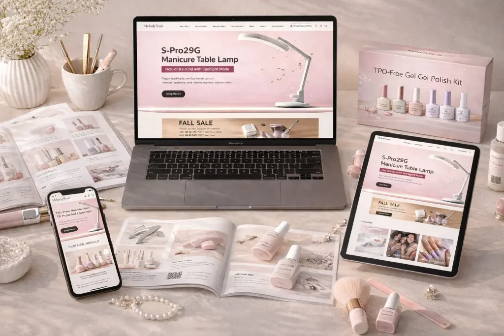
MelodySusie is a brand focusing on manicure and professional nail care products, mainly targeting individual consumers, manicure enthusiasts and professional salon users. As the brand product line continues to enrich, the original website can no longer meet the needs of further improving user experience and conversion rate in terms of visual hierarchy, product display, brand expression and shopping path. Therefore, the customer came to us and hoped to carry out systematic visual optimization and page design of the brand website. The project is based on the Shopify platform. The core requirements include homepage visual upgrade, product classification and product page optimization, brand content presentation, navigation structure sorting and overall purchase path optimization. While maintaining a sense of professionalism, it takes into account the sophistication, fashion and affinity required by the beauty industry, and helps users understand products faster, build trust and complete purchases through clearer visual guidance.
| Servicios | Industry | Plataforma |
| Website design and decoration | Beauty and personal care | shopify |
| Project requirements | target market | design style |
| Strengthen the expression of brand story and core advantages | Global | Exquisite, refreshing and professional |
| project budget | Delivery content | Delivery time |
| ¥16800 | Website construction and full-site page design | 24 working days |
Project Challenges
The core challenge of this project was to find a balance between the professional manicure brand image and the mass consumer experience. The client serves both individual users and professional salons, so the website must reflect professionalism without appearing too complex or technical. At the same time, the original page had problems such as the information level was not clear enough, the product display easily caused visual burden, and the navigation and purchase path were not smooth enough. In the early stage, we focused on target user analysis, research on competing product websites, and sorting out visual trends in the beauty industry. We also re-planned the page hierarchy, content layout, and user browsing paths. We used a wireframe structure to clarify the information priority of the homepage, category pages, and product pages to establish a clear foundation for subsequent visual design and conversion optimization.
Home Page Design Strategy
The homepage is the core page where users form their first impression of the brand, and is also the basis for the user experience of the entire website. Our design idea is to strike a balance between brand narrative and message clarity.
Visual direction and page layout
We adopted a simple yet sophisticated visual style:
- Soft, feminine colors paired with neutral tones
- Use enough white space to reduce the information burden on users when browsing.
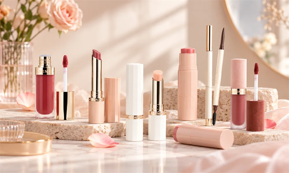
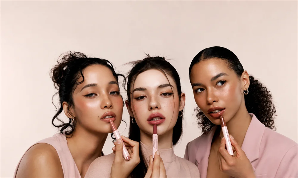
- Enhance the visual value of your products through high-quality product images
The overall page follows a clear visual hierarchy:
- Hero first screen area: brand proposition + core product vision
- Product category navigation: quickly enter the main product series
- Selected product display: layout based on conversion orientation
- Brand Story and Trust Building Module
Hero first screen design: first impression is crucial
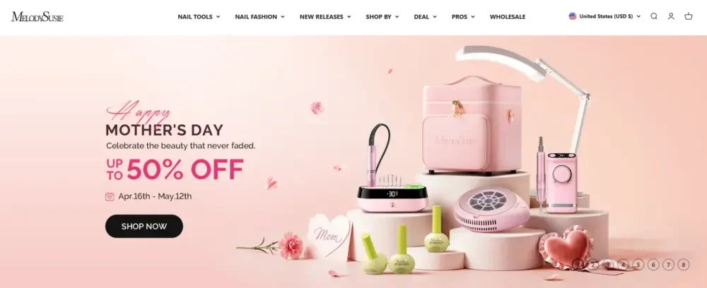
Hero’s above-the-fold area needs to be quickly understood by users within seconds of entering the website:
- What products does the brand offer?
- Which users is the product suitable for?
- Why it’s worth continuing to browse
In order to avoid too much information above the fold, we try to keep the copy as concise as possible and strengthen the visual expression.
Highlights include:
- Simple and clear font design
- Strong product visual images
- Clear action button CTA
In this way, users can understand the brand positioning and product value in a short time.
Product display and conversion design
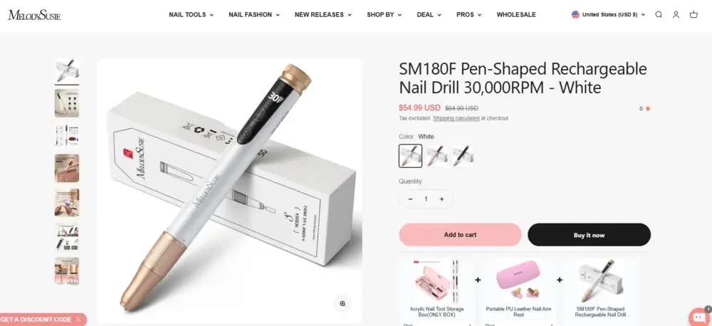
An important part of the entire design strategy is to ensure that the product is not only displayed, but also promotes user purchase through reasonable visual and information design.
Product card design
We’ve re-optimized product cards to balance information clarity with visual appeal:
- Simplify the layout to avoid information congestion
- Unify the display ratio of product images to maintain overall visual coordination
- Clearly display prices and core product information
At the same time, we also ensure:
- Product names maintain good readability while avoiding taking up too much space
- The user’s visual focus is always on the product itself
- Hover interaction improves browsing experience without causing distractions
Product product detail page experience
The product detail page is one of the pages on the website that most directly affects the conversion rate, so the page structure and information display method are particularly important.
Estructura de la página
We plan product detail pages according to users’ natural browsing and purchasing habits:
- Left: Display high-quality product images
- Right side: displays core product information, prices and purchase operations
This layout helps users quickly obtain the information they need to make purchasing decisions.
Visual product expression
Rather than relying solely on a large number of technical parameters and text descriptions, we focus more on using pictures to establish product usage scenarios.
Mainly include:
- lifestyle scene pictures
- Close-up of local product details
- Actual usage scenario display
This content can help users more intuitively imagine how the product is used in real life, thereby enhancing purchase intention.
Trust element design
In order to further enhance users’ trust in the product and brand, we have added to the page:
- Selling point display with product advantages and user benefits as the core
- Clear product classification and information structure
Assisted page design
The homepage is responsible for attracting users and establishing a first impression, while other secondary pages are responsible for completing the entire browsing and purchasing process.
Product collection page
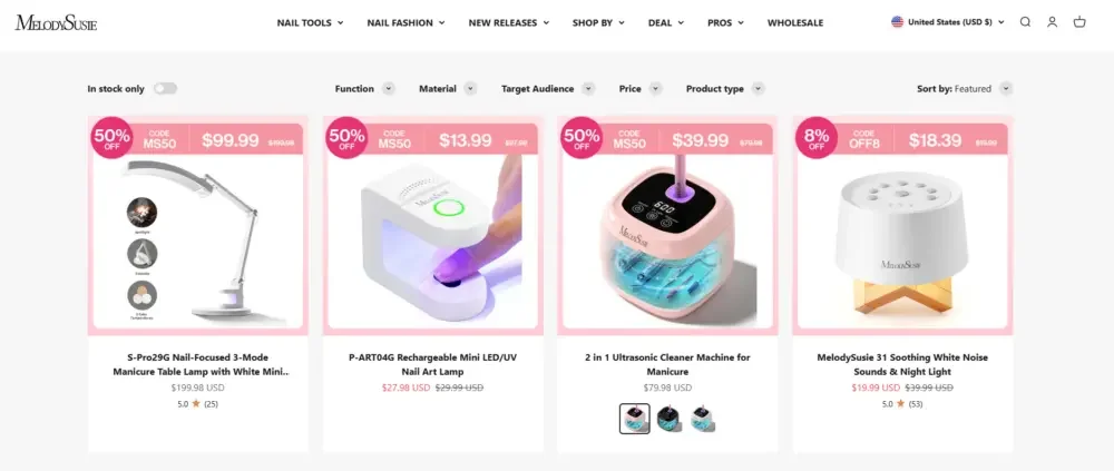
We designed the Collection product collection page to enable users to browse products more efficiently.
Major optimizations include:
- Use a visually unified grid layout
- Set up intuitive and easy-to-use filtering and sorting capabilities
- Reasonably control page spacing to avoid visual fatigue caused by long-term browsing
Our goal is to make the product browsing process easier and more efficient while maintaining the premium feel of the brand.
About us and brand story page
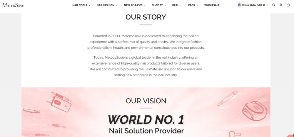
Brand story is an important part of building user trust.
During the design process, we use:
- Clearly structured content modules
- Visual expression of brand story
- Message design that clearly communicates brand values
Rather than using long paragraphs of text, we prefer:
- short content block
- Reasonable visual separation
- Use brand images strategically
This can not only improve users’ reading interest, but also convey brand authenticity and value concepts more naturally.
Navigation and user browsing paths
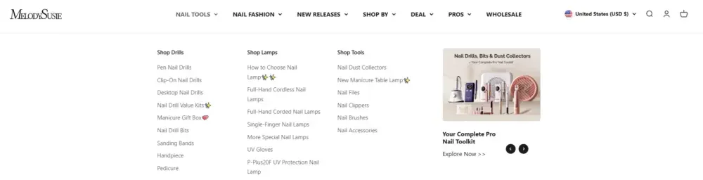
Navigation design is often overlooked, but it actually directly affects user experience and website conversion rates.
We have focused on optimizing:
- Menu structure to make information clearer
- Product classification logic allows users to browse intuitively
- Sticky ceiling navigation keeps important navigation entrances always accessible
The result is a smoother user path, allowing users to transition naturally from entering the website to final checkout.
Our design process
High-quality website design results are inseparable from a clear and systematic workflow. Throughout the project, we focused on design logic, continuous optimization, and brand consistency.
1. Research and analysis
At the beginning of the project, we focused on:
- Browsing and purchasing behavior of target users
- Website Design Approaches for Competing Brands
- Current visual design trends in the beauty industry
These analyzes help us find opportunities for brand differentiation while ensuring that the design meets the usage habits and aesthetic expectations of target users.
2. Wireframe and page structure planning
Before entering the formal visual design, we first plan:
- Website page level
- Content and module location
- User browsing path
By sorting out these structures in advance, you can ensure that every subsequent design decision has a clear purpose and is not just for visual decoration.
3. Visual design execution
After confirming the page structure, we further transformed the overall framework into a complete visual design.
Mainly include:
- Choose fonts based on brand tone and readability
- Establish a color system that matches the emotional expression of the brand
- Plan the visual direction of products and scene images to enhance the overall quality of the product
4. Iteration and detail optimization
Website design is not a one-and-done process.
Throughout the design phase, we continue to adjust and optimize based on the following aspects:
- Overall visual balance of the page
- Design consistency between different pages
- Match between website vision and brand positioning
Through continued iteration, we ended up with a more unified, clear, and conversion-oriented website experience.