


لا توجد منتجات في سلة التسوق.

عندما نصمم الصور الرئيسية لـ الأوزون, we never treat them as simple product photos. We treat them as conversion tools. Every color block, every font weight, every icon, and every angle must answer one question: why should a buyer click this product instead of the next one?
In this orange theme Ozon main image series, we built a unified visual system across multiple categories—hardware tools, automotive accessories, electronics, and household products. Although the products differ, the logic behind each composition remains consistent: high contrast, structured hierarchy, immediate clarity, and emotional impact through color dominance.
Below, we break down each image and explain exactly why we designed it this way.
| التسليم في الوقت المحدد | Style | منصة التطبيقات |
| 8 أيام | Orange theme | الأوزون |
| المصممون المشاركون | يكلف | تأثير |
| نانسي | $150 | Sales volume📈248% |
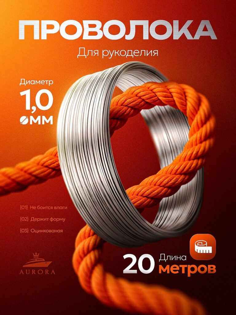
The first image presents galvanized craft wire (1.0 mm, 20 meters). Instead of placing the coil on a plain white background, we built a dramatic orange gradient environment and intertwined it with a thick orange rope.
1. Visual Metaphor of Strength
By threading the steel wire through a bold, textured rope, we visually communicate durability and flexibility at the same time. The rope represents toughness; the wire represents precision. Together, they tell a performance story without excessive text.
2. Orange as an Energy Amplifier
We used a deep-to-bright orange gradient to generate warmth and energy. On Ozon’s marketplace grid, vibrant orange immediately separates the product from neutral competitors.
3. Hierarchical Typography
We intentionally reduce paragraph density. Ozon buyers scan; they don’t read essays.
4. Premium Brand Positioning
The minimal but refined layout communicates reliability. Even low-cost industrial materials can appear premium if structured correctly.
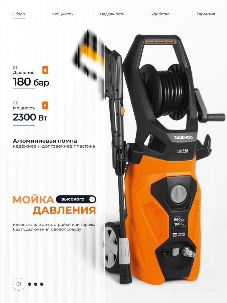
The pressure washer image follows a more technical approach.
1. White-Orange Split Composition
We used a neutral gray-white background on the left for specifications and placed the product on the right. This separation allows breathing space while maintaining bold contrast.
2. Power Metrics as Click Drivers
These numbers are displayed in large, bold typography because Ozon shoppers filter products based on power and pressure. We prioritize numerical dominance.
3. Aluminum Pump Highlight
We clearly emphasize “Алюминиевая помпа” to signal durability. This differentiates it from cheaper plastic pump competitors.
4. Orange Accent Control
We avoid flooding the entire background with orange here. Instead, we use orange selectively—icons, headline emphasis, product body—to guide the eye.
5. Trust Through Structure
Top navigation-like labels (“Обзор”, “Мощность”, etc.) simulate a professional product presentation page inside a single image. This builds subconscious credibility.
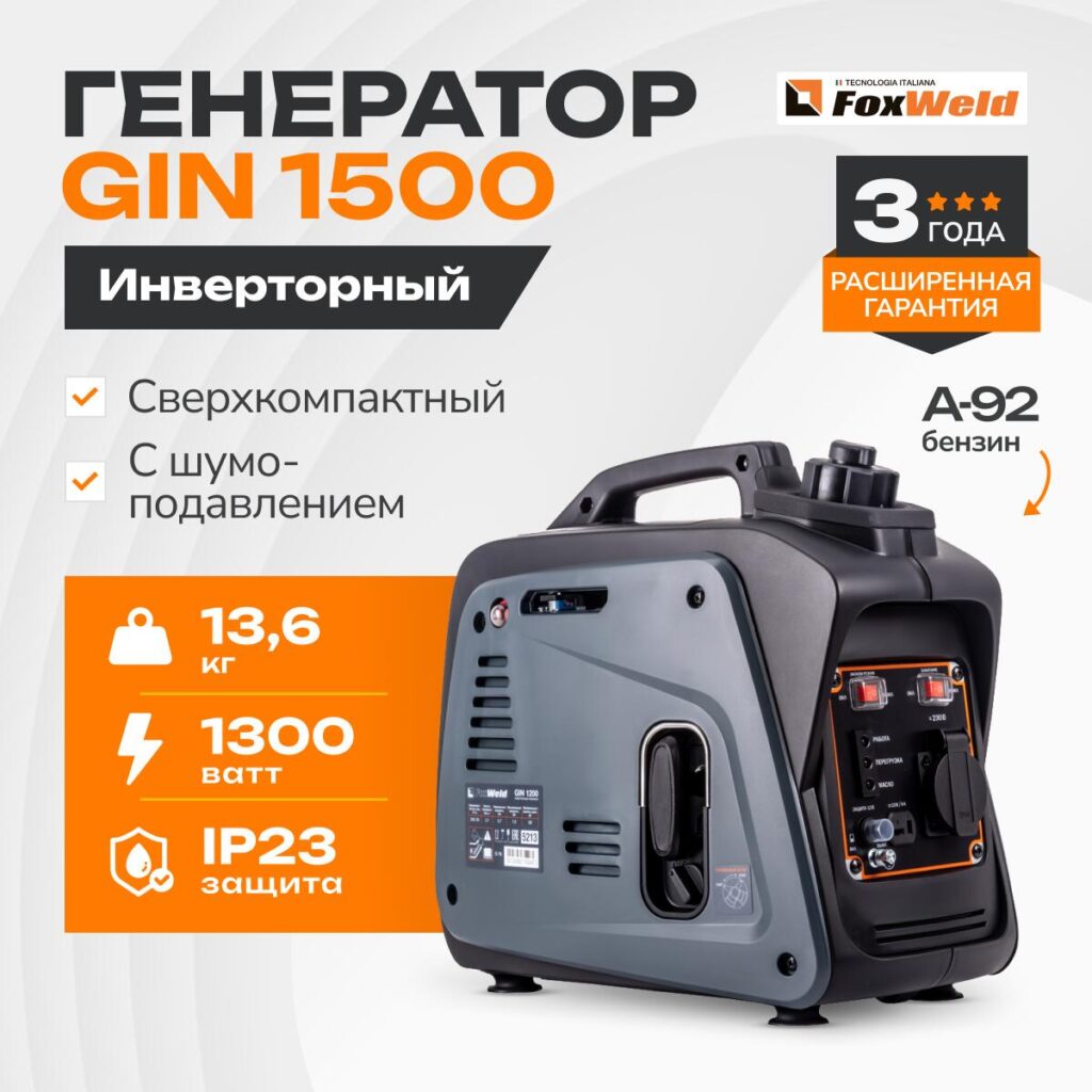
For the generator (GIN 1500), we move into a more badge-driven approach.
1. Massive Headline Dominance
“ГЕНЕРАТОР GIN 1500” appears bold and heavy. Ozon thumbnails require strong typography to remain legible at small sizes.
2. Feature Checklist Format
Check icons increase scan speed. Buyers recognize approval symbols instantly.
3. Performance Block
We grouped:
These are stacked inside an orange block for maximum impact.
4. Warranty Badge (3 Years)
We add a shield-style warranty emblem to reduce hesitation. Warranty graphics dramatically increase trust.
5. Italian Technology Reference
“Tecnologia Italiana” elevates perceived engineering value.
This layout balances authority and accessibility.
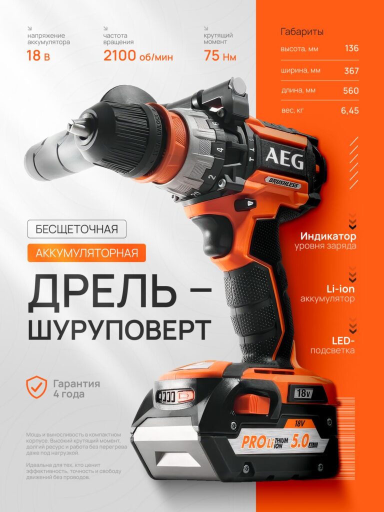
The drill image uses perspective to create dominance.
1. Aggressive Perspective = Power
We shot the drill diagonally toward the viewer to simulate motion and torque strength.
2. Split Background (White + Orange)
The right side orange strip anchors the composition and balances the product’s strong silhouette.
3. Key Data Points Above the Tool
We position specs above the drill’s head to align with its functional area.
4. Feature Column (Battery Indicator, LED, Li-ion)
Vertical bullet points increase scan rhythm.
5. Brushless Highlight
“Бесщеточная” is emphasized because brushless motors signal premium engineering.
This design merges technical density with aesthetic cleanliness.
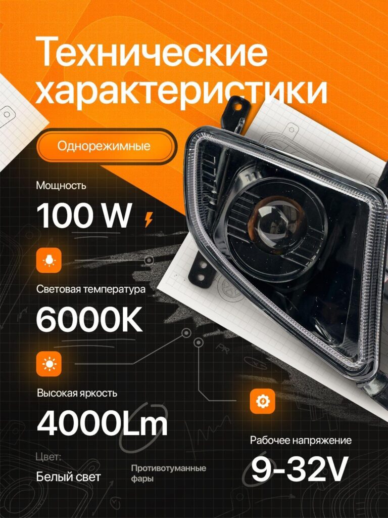
For the automotive fog light, we shift into blueprint-inspired storytelling.
1. Technical Grid Background
We simulate engineering schematics to suggest automotive precision.
2. Large Spec Typography
Each spec becomes a visual anchor.
3. Orange Information Capsules
Icons and small rounded blocks separate each metric clearly.
4. Lighting Emphasis
We focus on lens detailing and reflections to enhance perceived brightness.
5. Minimal Noise
We avoid excessive decorative elements. Automotive buyers want clarity, not art.
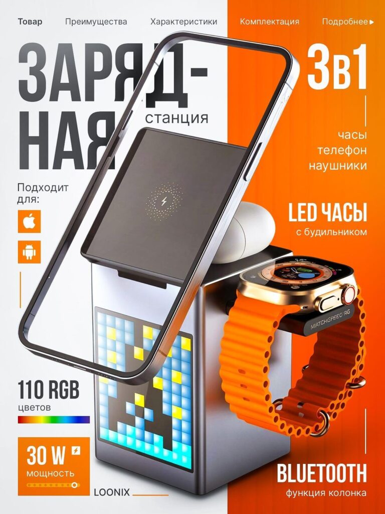
This product blends consumer electronics and modern lifestyle.
1. 3-in-1 Highlight at Top Right
We enlarge “3в1” to immediately communicate multifunctionality.
2. Layered Product Interaction
We show:
This stacked presentation demonstrates ecosystem functionality in one glance.
3. RGB Color Badge (110 Colors)
Color spectrum bar suggests customization and fun.
4. 30W Power Badge
Performance reassurance appears in a bright orange block.
5. Orange-White Balance
We split the background to keep the tech aesthetic clean.
This image targets impulse-driven tech buyers.
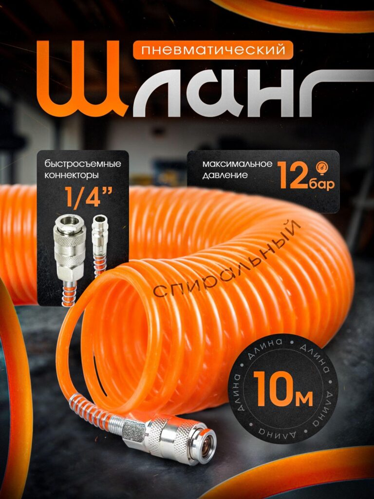
The final image returns to heavy industrial energy.
1. Macro Texture Emphasis
We zoom into the spiral hose to show material thickness.
2. Maximum Pressure (12 bar)
Large numeric emphasis reinforces reliability.
3. Connector Detail (1/4”)
Close-up connector visuals answer compatibility concerns instantly.
4. Circular Length Badge (10m)
We frame the length inside a bold circular seal to create balance.
5. Dark Industrial Background
Dark environments amplify orange vibrancy and communicate workshop realism.
Across all these products, we maintain a consistent orange theme logic:
Orange signals:
On Ozon’s marketplace grid, orange dominates neutral competitors.
We always apply:
No clutter. No confusion.
Although the theme remains orange, we adapt style per category:
We use large, legible fonts because:
Every font weight choice directly impacts CTR.
Each image combines:
This balance improves both click-through rate and conversion rate.
Ozon shoppers behave differently than independent website visitors. They compare products side by side in dense grids.
To win:
This orange theme main image system achieves all three.
Main image design is not decoration. It is competitive positioning.
In this orange theme الأوزون main image series, we built a scalable visual system that adapts across categories while maintaining strong brand consistency. Each design emphasizes clarity, bold specifications, and structured visual rhythm.
If you want your Ozon listings to outperform competitors, your main images must be engineered—not improvised.
This is exactly how we approach every marketplace visual strategy at أيرسانج.


