


لا توجد منتجات في سلة التسوق.

A jewelry website needs to do more than display beautiful products. It needs to create desire, build trust, guide customers through product discovery, and make the shopping journey feel effortless from the first scroll to checkout. For a modern jewelry brand like Shapes Studio, page design plays a central role in turning visual interest into purchase intent.
When we approached this Shopify website design project, our goal was not to make the store look busy or overly decorative. Instead, we focused on creating a clean, elegant, and conversion-friendly shopping experience that matched the brand’s refined jewelry style. The homepage became the core storytelling space, while the product, collection, gift guide, and support pages worked together to support a complete eCommerce journey.
This case-style article explains how we helped shape the visual direction, page structure, user experience, and Shopify design strategy for the Shapes Studio website. The focus is on design thinking, customer flow, content hierarchy, mobile presentation, and brand expression rather than complex development work.
| التسليم في الوقت المحدد | فئة | منصة التطبيقات |
| 20 يومًا | Jewelry | shopify |
| المصممون المشاركون | يكلف | تأثير |
| نانسي | $2200 | Sales📈221% |
Shapes Studio is a jewelry brand with a modern, chic, and approachable visual identity. The products include rings, earrings, necklaces, bracelets, pearl pieces, gold styles, and everyday accessories. The website also highlights practical selling points such as waterproof wear, tarnish-free quality, hypoallergenic materials, and a one-year warranty. These details are important because jewelry shoppers often care about both style and durability.
The website needed to communicate several things at once. It had to feel fashionable, but not cold. It had to look premium, but still accessible. It had to show product variety, but avoid overwhelming customers. Most importantly, it had to guide users quickly from brand discovery to product browsing and purchase.
Because the store runs on Shopify, our design direction focused on making the best use of Shopify’s natural strengths: clean product collections, visual merchandising, fast browsing, structured navigation, mobile-friendly layouts, and flexible promotional areas.
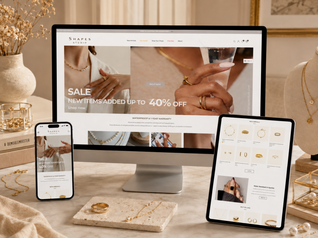
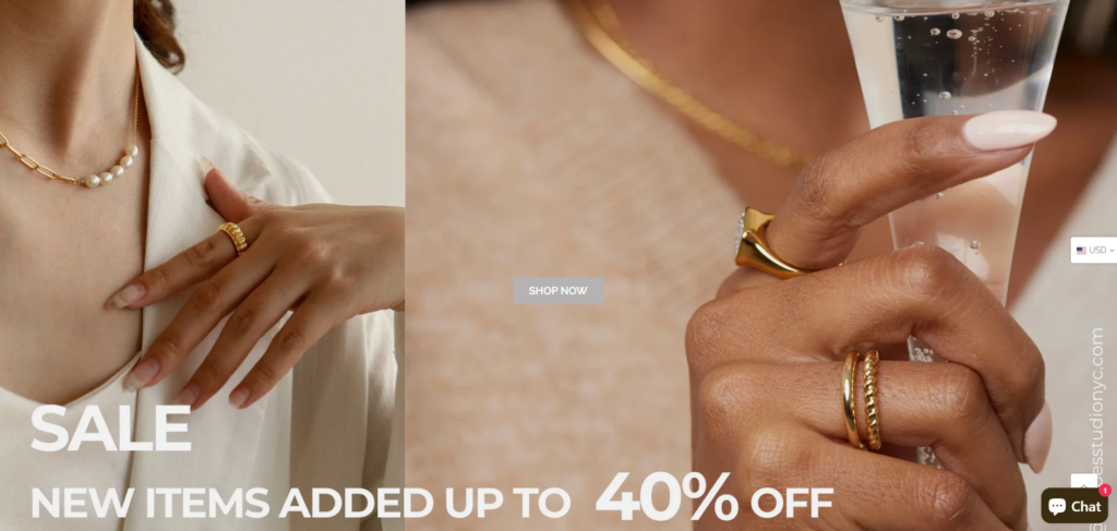
The first objective was to make the homepage feel instantly polished. Jewelry buyers often make emotional decisions based on visual confidence. If the first screen feels messy, outdated, or unclear, users may leave before they even explore the products.
We designed the homepage to feel light, modern, and easy to understand. The top area needed to introduce the brand clearly, highlight key shopping benefits, and provide a direct path to product discovery. A strong first impression gives customers confidence that the brand is reliable, stylish, and worth exploring.
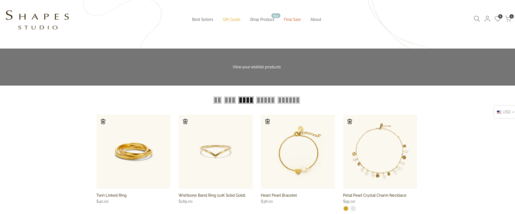
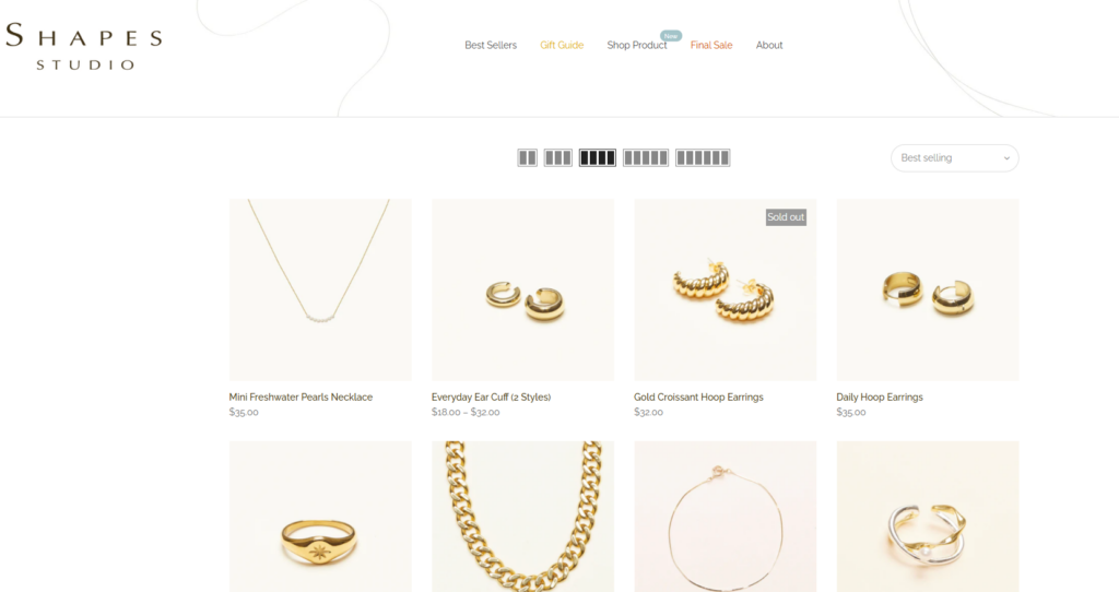
The second objective was to reduce hesitation. A jewelry website should not force visitors to guess where to go next. Clear navigation labels such as Best Sellers, Gift Guide, Shop Product, Final Sale, and About help customers understand the store structure quickly.
For a fashion and jewelry brand, Best Sellers and Gift Guide are especially important. Best Sellers help new visitors identify popular items, while a Gift Guide supports customers who are shopping for someone else. These sections create simple decision paths and reduce browsing friction.
The third objective was to balance emotional brand storytelling with commercial clarity. Many jewelry websites look beautiful but fail to guide customers toward action. Others focus too heavily on product grids and lose the feeling of brand value.
ل Shapes Studio, we planned the page experience around both goals. The homepage introduces the mood of the brand, showcases product categories, highlights new arrivals, explains material benefits, and then leads users into deeper shopping paths. This allows the brand to feel curated while still supporting sales.
Minimal design can easily become too plain if it lacks rhythm, contrast, and content hierarchy. Jewelry brands often use clean layouts, soft colors, and simple typography, but the challenge is making the experience feel distinctive.
For this project, we used spacing, product grouping, visual hierarchy, and refined content blocks to create a calm but memorable shopping experience. The design needed to let the products shine without making the page feel empty.
Shapes Studio offers multiple jewelry categories, including rings, earrings, necklaces, and best-selling pieces. When a store has many product types, the homepage must help users understand the range quickly.
We solved this through clear category entry points and product sections. Instead of forcing customers to browse one long product list, we organized the experience into smaller shopping decisions. This makes the website easier to scan and more comfortable for mobile users.
Jewelry customers want to know whether products are durable, comfortable, and suitable for daily wear. However, long paragraphs can slow down the shopping experience.
The website needed to communicate quality in a concise way. Short selling points such as waterproof, tarnish-free, hypoallergenic, and one-year warranty help build trust quickly. These details give customers practical reasons to continue browsing.
Many jewelry shoppers browse from mobile devices, especially when discovering products through social media. A homepage that looks good on desktop but feels crowded on mobile will lose potential buyers.
The challenge was to make the design responsive, readable, and easy to tap. Product cards, navigation, calls to action, collection sections, and footer links all needed to feel clear on smaller screens.
The website also mentions in-person shopping opportunities and artisan market features. This creates a broader brand experience beyond a standard online store.
The design challenge was to include these offline touchpoints without distracting from online purchases. We treated them as trust-building content that supports the brand story and gives customers another way to connect with the products.
We treated the homepage as the main entry point for new customers. Instead of designing it as a simple banner plus product grid, we shaped it as a guided shopping journey.
The page begins with clear brand positioning and immediate shopping access. From there, customers can explore key product categories, new arrivals, best sellers, material benefits, and brand story content. This structure keeps the homepage useful for both first-time visitors and returning customers.
A strong homepage should answer three questions quickly: What does the brand sell? Why should I trust it? Where should I click next? Our design approach kept these questions at the center of the layout.
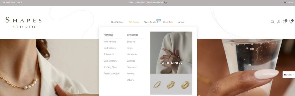
Navigation is one of the most important parts of Shopify website design. For Shapes Studio, the main menu needed to be simple enough for quick browsing but complete enough to support different shopping intents.
We organized the navigation around practical customer behavior. Some users want popular products, so they go to Best Sellers. Some need gift ideas, so they go to Gift Guide. Some want to browse the full catalog, so they go to Shop Product. Some are price-sensitive, so they check Final Sale. Others want to learn more about the brand, so they visit About.
This structure supports both emotional browsing and direct shopping.
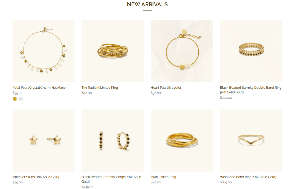
Jewelry products are small, detailed, and visually delicate. Product grids must be designed carefully so the items do not feel lost on the page. We focused on consistent spacing, clean product cards, readable product names, and clear pricing presentation.
New Arrivals and Best Sellers serve different purposes. New Arrivals create freshness and encourage repeat visits. Best Sellers create social proof and reduce decision anxiety. By separating these sections, the homepage becomes easier to navigate and more persuasive.
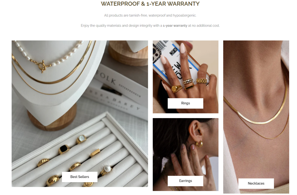
Instead of asking users to browse everything at once, we used category-led design to simplify choices. Rings, earrings, necklaces, and best-selling items each act as a doorway into a more focused shopping experience.
This is especially useful for jewelry stores because customers often arrive with a specific product type in mind. A user looking for earrings should not have to scroll through rings and bracelets first. Clear category blocks help users move faster and create a smoother shopping path.
Trust is a major factor in jewelry eCommerce. Customers want to know what they are buying, how long it will last, and whether the brand stands behind its products.
We integrated trust messaging into the page flow rather than hiding it in a policy page. The waterproof, tarnish-free, hypoallergenic, and warranty information helps customers feel more confident before they reach a product detail page.
This type of content is not just informational. It directly supports conversion because it removes doubts that might otherwise stop a purchase.
Collection pages play a key role in the shopping journey. Once a user clicks into Rings, Earrings, Necklaces, Best Sellers, or Final Sale, the design must help them compare products quickly.
For these pages, the goal was clarity. Product images need enough space to show detail, product names must remain readable, and prices should be easy to scan. A clean collection layout helps customers browse without distraction.
The collection experience also supports merchandising. Best-selling products, seasonal picks, giftable items, and sale pieces can each be presented with a different shopping intent.
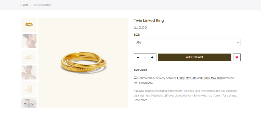
Product pages are where design must become more persuasive. A strong Shopify product page should help customers understand the item visually, emotionally, and practically.
For Shapes Studio, product pages need to support close product viewing, clear naming, pricing, material details, and purchase actions. Jewelry shoppers often want to imagine how a piece fits into their daily style, so the product page should feel elegant and focused rather than crowded.
The goal is to keep the product as the hero while making the buying decision easy.
A Gift Guide is valuable for jewelry brands because it supports shoppers who may not know exactly what to buy. Instead of browsing by product type only, customers can shop by occasion, style, budget, or recipient.
From a design perspective, the Gift Guide should feel more curated than a standard collection page. It can highlight thoughtful combinations, popular gifts, and easy choices. This helps turn uncertain visitors into confident buyers.
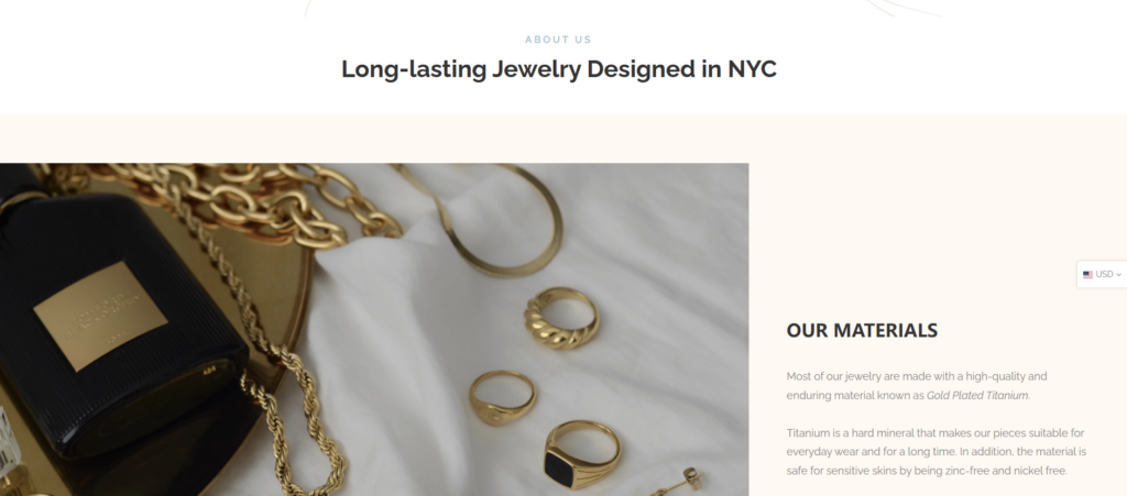
The About page gives the brand more personality. For a jewelry business, customers often want to understand the taste, values, and story behind the collection.
We approached the About page as a trust and brand-building space. It should not distract from shopping, but it should strengthen the emotional connection. A good About page makes the brand feel more human, more memorable, and more credible.
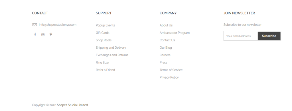
The footer is often overlooked, but it plays an important role in eCommerce trust. Shapes Studio includes useful support links such as shipping and delivery, exchanges and returns, ring sizing, gift cards, contact, blog, and policy pages.
This structure helps customers find answers without leaving the shopping environment. It also makes the store feel more complete and professionally organized.
A Shopify jewelry website must look aligned with the brand’s product value. If the design feels too generic, the products may feel less special. If the design feels too complicated, customers may lose focus.
Our design approach focused on building a visual system that feels modern, feminine, clean, and commercially useful. Every section has a purpose: introduce, guide, reassure, or convert.
Good design is not only about colors and images. It is also about movement. Customers should always know what to do next.
By organizing the homepage around product discovery, quality messaging, best sellers, new arrivals, brand story, and support links, we created a natural shopping flow. This helps users move from interest to action with less friction.
Mobile design is essential for Shopify stores, especially in fashion, jewelry, and lifestyle categories. We paid attention to section spacing, image scale, button visibility, and content order so mobile users can browse comfortably.
A mobile-friendly design does not simply shrink the desktop page. It rethinks the experience for smaller screens.
The website uses many content types: product grids, category links, quality claims, brand story, offline shopping information, newsletter signup, and support links. Without proper hierarchy, these sections could feel scattered.
We structured the page so each content block has a clear role. This keeps the experience clean and helps customers absorb information faster.
The final Shopify website design gives Shapes Studio a polished, modern, and customer-friendly online presence. The homepage introduces the brand clearly, product sections support fast discovery, and trust-building details help customers feel more confident about the quality of the jewelry.
The design also creates a flexible foundation for future campaigns. New arrivals, best sellers, gift guides, final sale items, artisan market updates, and in-person shopping announcements can all fit naturally into the page structure.
Most importantly, the website feels aligned with the product. It presents jewelry as stylish, wearable, and giftable while keeping the buying journey simple.
We designed the homepage as a full shopping journey rather than a static landing page. It combines brand mood, product discovery, category navigation, trust messaging, and conversion-focused calls to action.
We helped organize the customer journey around practical shopping paths, including Best Sellers, Gift Guide, Shop Product, Final Sale, and About. This makes the site easier to browse and more useful for different customer needs.
The overall visual direction supports a chic, modern, and approachable jewelry identity. Clean layouts, controlled spacing, and product-focused sections help the brand feel more premium.
The page design supports clear browsing, easy product comparison, confident decision-making, and smoother movement toward checkout.
The structure can support future product launches, seasonal campaigns, gift collections, blog content, and offline event updates without losing visual consistency.
ال Shapes Studio Shopify website shows how thoughtful design can turn a jewelry store into a stronger brand experience. By focusing on homepage structure, product discovery, mobile presentation, trust messaging, and visual consistency, we helped create a website that feels elegant, practical, and ready for growth.
For jewelry and lifestyle brands, Shopify design is not just about making pages look beautiful. It is about shaping how customers feel, browse, trust, and buy. This is the kind of cross-border eCommerce website design work that أيرسانج focuses on: helping brands present their products with clarity, style, and a stronger conversion-driven shopping experience.


