


لا توجد منتجات في سلة التسوق.

In the highly competitive electric bike market, a brand’s website plays a critical role in shaping customer perception, communicating product value, and guiding visitors toward purchase decisions. For brands selling premium mobility products, design is not simply about aesthetics—it is about building trust, simplifying complex product information, and creating a seamless browsing experience that mirrors the excitement of riding an electric bike.
تستكشف دراسة الحالة هذه كيف Shopify موقع إلكتروني لـ محول Electric Bikes was carefully designed to create a powerful digital storefront that combines storytelling, product discovery, and conversion-focused layout design. Our approach focused entirely on visual structure, user experience, and strategic content placement to ensure that visitors can easily understand the brand’s value while enjoying an immersive browsing journey.
Rather than relying on complex technical solutions, the project emphasized thoughtful Shopify design strategy: clean visual hierarchy, lifestyle-driven imagery, modular sections, and intuitive navigation. The goal was to transform the website into a modern brand experience that reflects innovation, performance, and reliability—core values that resonate strongly with electric bike enthusiasts.
| التسليم في الوقت المحدد | فئة | منصة التطبيقات |
| 24 يومًا | electric bike | shopify |
| المصممون المشاركون | يكلف | تأثير |
| لين تشانغ | $1200 | Store traffic📈214% |
CINVERTER operates in a fast-growing segment of the mobility industry: electric bicycles designed for modern commuting and outdoor adventure. The brand targets riders who value freedom, sustainability, and performance.
Because the product itself represents movement and exploration, the website needed to visually communicate those feelings immediately. Visitors should feel inspired the moment they land on the homepage.
The website design had to translate these abstract brand ideas into a concrete visual experience.
Before designing the layout, we identified several key goals that the Shopify website needed to accomplish:
Electric bikes are high-value purchases. The design must communicate reliability and professionalism from the first screen.
Customers want to quickly understand different models, features, and use cases.
The website should not feel like a simple product catalog. Instead, it should guide visitors through a narrative of riding, adventure, and lifestyle.
A well-structured layout helps visitors explore models easily without feeling overwhelmed.
Every design decision—from image selection to section hierarchy—should reduce friction and guide visitors naturally toward purchasing decisions.
Designing a Shopify website for a product like electric bikes requires balancing strong visual storytelling with structured product presentation. The design strategy centered around three main pillars:
Lifestyle imagery and real-world riding scenes help visitors imagine themselves using the product.
Clean sections and organized product collections allow users to quickly explore different models.
Clear service information, customer reviews, and brand credibility signals reinforce confidence.
By combining these elements, the homepage becomes both inspirational and practical.
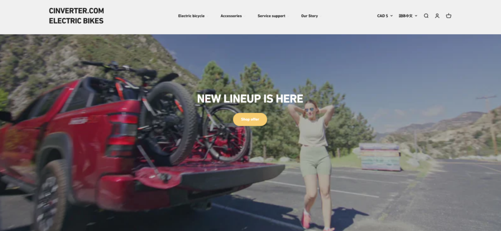
The homepage begins with a large cinematic hero banner featuring a rider interacting with an electric bike in an outdoor environment.
The headline “NEW LINEUP IS HERE” provides a clear announcement while the background video or imagery introduces movement and energy.
The hero section focuses on visual emotion rather than technical specifications. This approach mirrors the way customers shop for lifestyle products—they first connect with the feeling before evaluating the details.
The strong hero banner sets the tone for the entire browsing experience.
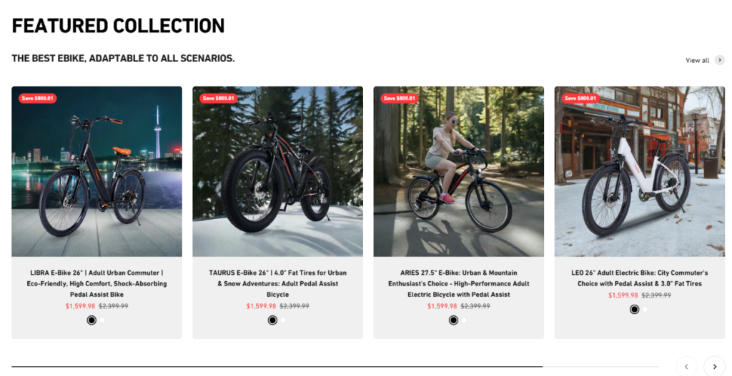
Directly beneath the hero section is a Featured Collection displaying several electric bike models in a structured grid layout.
Visitors can instantly scan multiple models without navigating to separate pages. This improves product discovery and keeps users engaged within the homepage.
The grid format also ensures that each product receives equal visual weight, preventing confusion about which model to explore first.

A full-width banner showcasing an electric bike in a scenic outdoor setting appears further down the page.
The word “ELECTRIC BIKE” overlays the landscape, reinforcing the product category while maintaining a clean visual composition.
This section acts as a visual breathing space between product modules while reinforcing the emotional aspect of riding.
Large lifestyle imagery helps users imagine how the product fits into their daily lives.
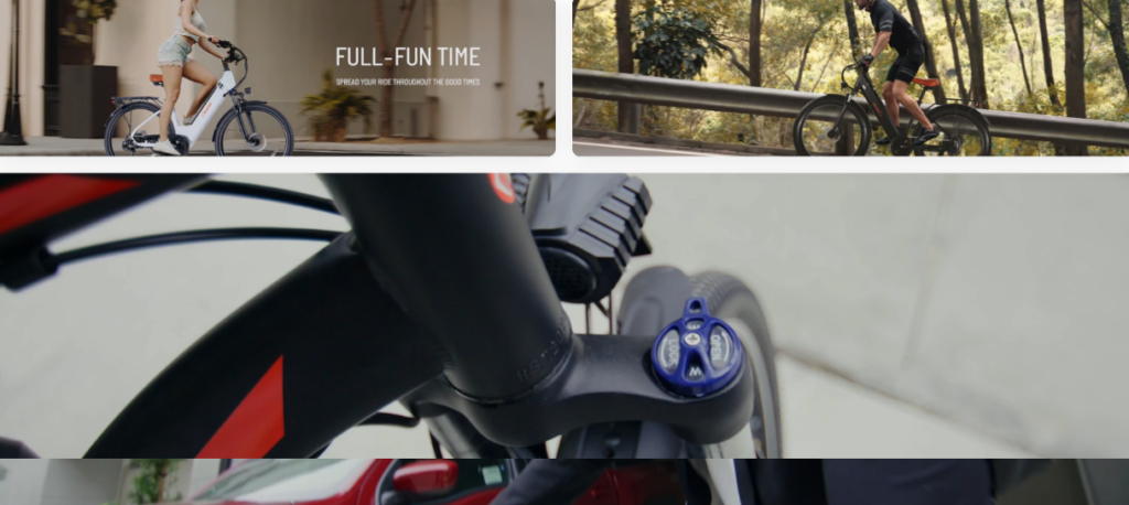
The design incorporates several smaller lifestyle image sections displaying riders in different environments:
Electric bike buyers often evaluate how the product fits into their personal routines. By showing real-world use scenarios, the design answers those questions visually without relying on lengthy text explanations.
This method keeps the page visually engaging while subtly communicating product versatility.
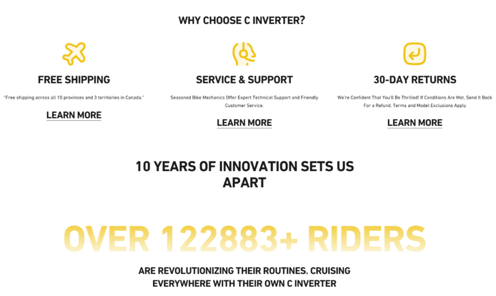
Trust-building content plays a crucial role in high-ticket product websites.
The homepage includes a section highlighting three key customer benefits:
This section reassures visitors that the brand stands behind its products and offers reliable customer service.
Simple visual icons allow users to understand the benefits quickly without reading long paragraphs.
One of the most powerful trust signals included in the design is the rider community section.
The page highlights a statistic:
Over 122,883+ riders
This number serves as a social validation indicator showing that many customers already trust the brand.
This approach transforms abstract numbers into visual proof of brand popularity.
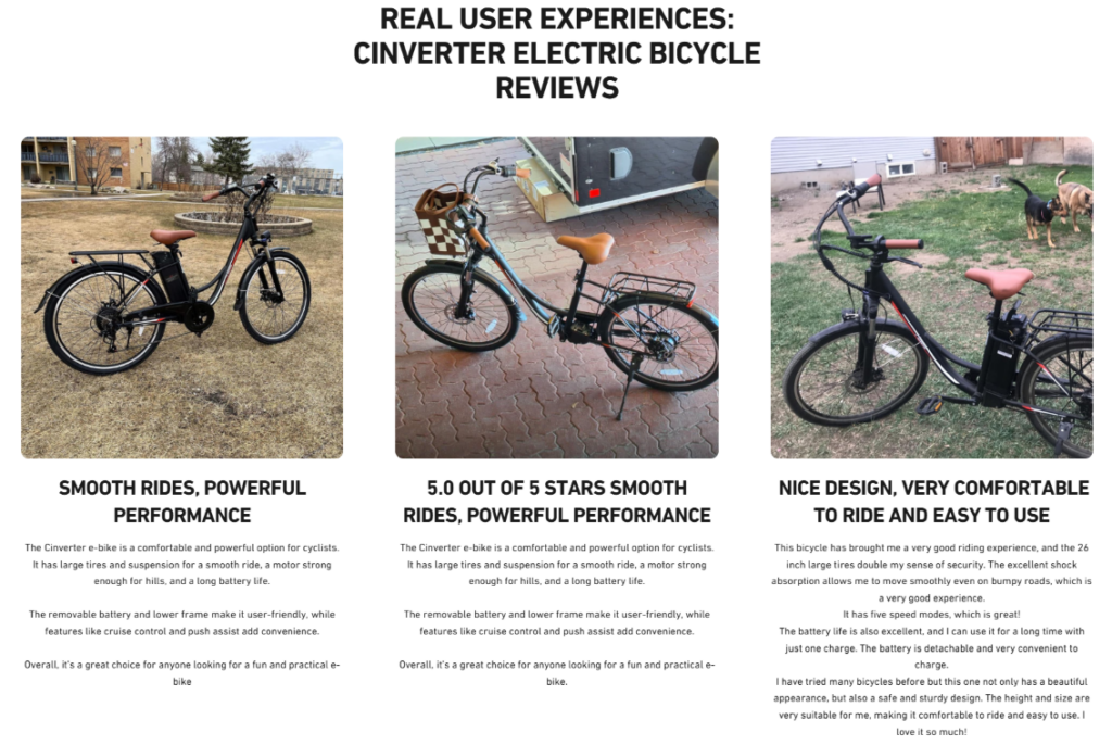
A dedicated review section showcases real riders sharing their experiences with the electric bikes.
Electric bike buyers often want reassurance from other users before making a purchase. Including authentic visual testimonials strengthens credibility and helps potential buyers feel more confident.
The grid layout ensures the reviews remain easy to scan without overwhelming the visitor.
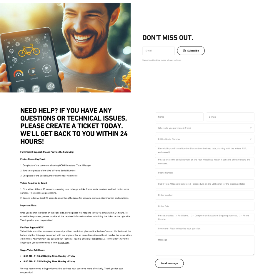
The design includes a visually engaging subscription section encouraging visitors to stay connected with the brand.
Instead of presenting a plain form, the layout features:
This approach transforms the subscription area into a natural extension of the brand experience.
Toward the bottom of the page, the design introduces a comprehensive support area encouraging visitors to submit inquiries.
The messaging emphasizes quick response times and customer care.
This final interaction point helps convert hesitant visitors into potential customers by providing reassurance and easy communication.
Designing an effective Shopify homepage for an electric bike brand presented several unique challenges.
Electric bikes involve many specifications and features. Presenting too much information at once could overwhelm visitors.
Instead of listing technical details immediately, the design prioritizes:
This approach introduces the product emotionally before presenting deeper information on product pages.
Another challenge was ensuring the website remained visually inspiring while still guiding users toward purchasing decisions.
We structured the homepage with alternating sections:
This rhythm keeps visitors engaged while maintaining clear navigation.
With multiple sections—including products, lifestyle images, reviews, and support forms—visual consistency was essential.
A consistent color palette, spacing system, and typography style unify the entire layout, ensuring the website feels cohesive rather than fragmented.
Before beginning the design, we analyzed:
This research informed the visual direction and layout structure.
The next step was mapping how visitors move through the homepage.
We designed a layout that gradually guides users through stages:
This structure ensures that visitors always know what to do next.
Once the structure was finalized, we developed the visual language of the website.
The result is a homepage that feels both modern and approachable.
The final website design successfully transformed محول’s online presence into a compelling brand experience.
By combining storytelling with structured product presentation, the website encourages visitors to explore the brand and feel confident about their purchase decisions.
The design also ensures that the homepage remains scalable as the product lineup expands in the future.
Designing an effective Shopify website for an electric bike brand requires more than simply placing products on a page. It requires understanding how customers think, what motivates their purchase decisions, and how visual storytelling can guide them through a meaningful browsing experience.
ال محول project demonstrates how thoughtful Shopify design—focused on layout strategy, visual hierarchy, and brand storytelling—can transform a standard e-commerce site into a powerful brand platform.
By carefully structuring each section of the homepage, balancing inspiration with clarity, and highlighting the rider community behind the brand, the website now reflects the energy, reliability, and adventure that electric bike customers seek.
Projects like this reflect the design philosophy behind أيرسانج, where Shopify websites are crafted not simply as online stores, but as immersive brand experiences that connect storytelling, product presentation, and user engagement into one cohesive journey.


