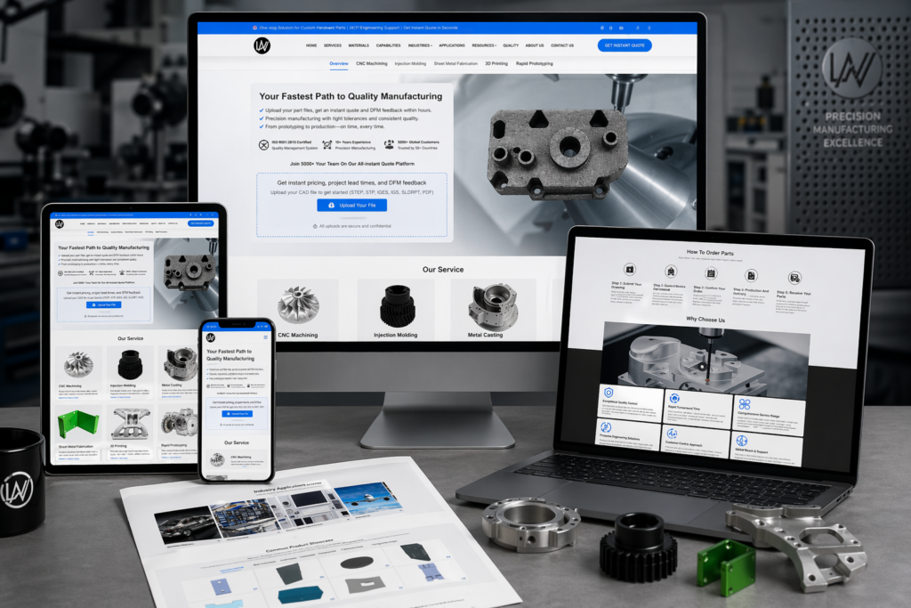
In the design of the Coupang product detail page of the MellowBuddy Multifunctional Camping Light, we organized the content around lighting modes and accessory combinations. Through dark camping atmosphere, warm-light photos, and white-background structural paragraphs, product identification, partial descriptions, and scene information are arranged at different levels, allowing readers to continue to understand the product in a clear sequence.
| الخدمات | Industry | منصة |
|---|---|---|
| Coupang product detail page design | Sports and outdoor | كوبانج |
| Project requirements | target market | design style |
| Lighting modes and accessories combinations | Korean content display | Dark camping atmosphere, warm light photos, structured paragraphs on white background |
| Project quotation | Delivery content | Delivery time |
| ¥1,500 | Version 1 product product detail page design | not disclosed |
Design challenge: Separate different reading tasks
This set of product detail pages should not only retain the shape recognition of MellowBuddy multifunctional camping lamp, but also accommodate different themes such as lighting modes and accessory combinations. Instead of letting each picture carry all the information repeatedly, we separated the whole, parts and scenes, and controlled the distance between titles, pictures and descriptions.
Our design strategy
We use dark camping atmosphere, warm-light photos, and white background structural paragraphs to establish a continuous visual language so that the subject can be clearly identified from the background. The title uses an obvious font size and weight hierarchy, and the supplementary description is relegated to the next level to avoid decoration, photos and text competing for attention at the same time.
In terms of content organization, we divide chapters according to the themes of real works: use larger pictures to establish overall relationships, use parts and diagrams to explain details, and then use bounded text areas or lists to organize supplementary information. Long pages create pauses through color blocks, cards, and white space between groups, and chapter switches can also be identified during continuous reading.
First screen theme: Warm light photo connection function directory
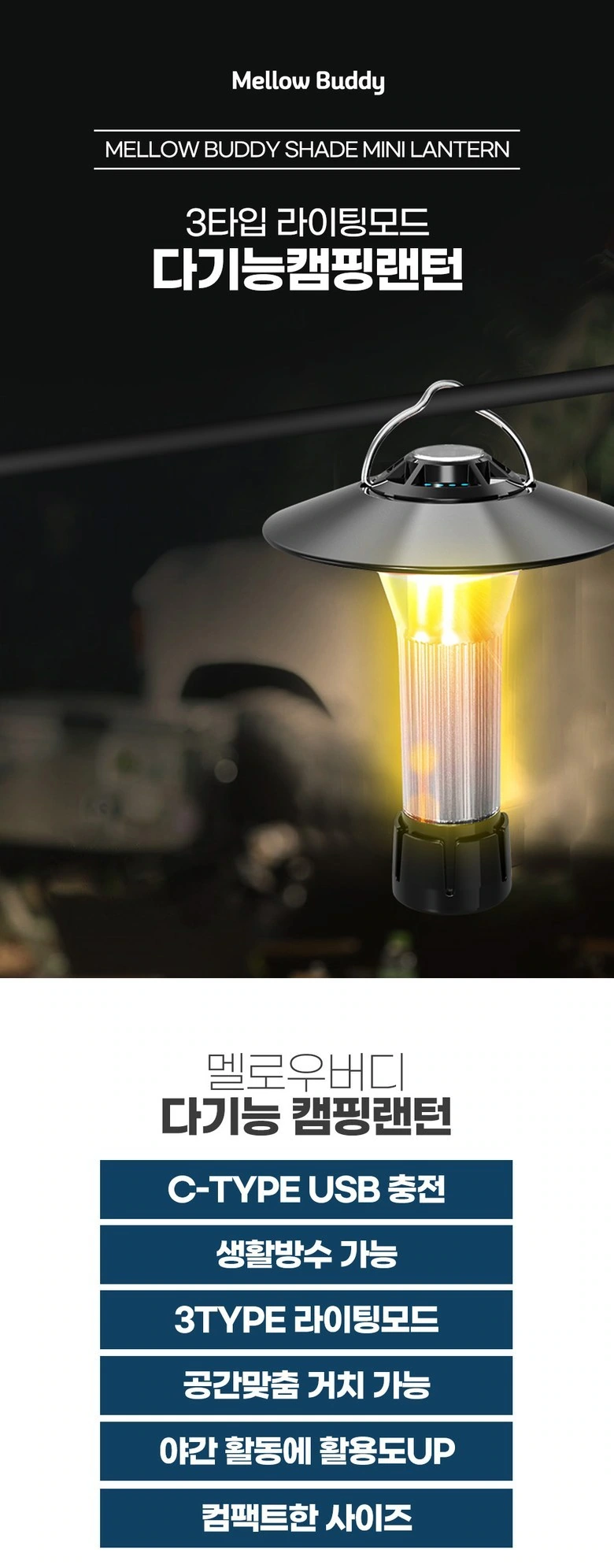
We highlight the light body in a dark environment, with the title near the top, and blue entries below to organize functional themes. The photos and catalog are clearly divided, giving the opening both atmosphere and reading direction.
Mode description: Three light pictures are aligned together
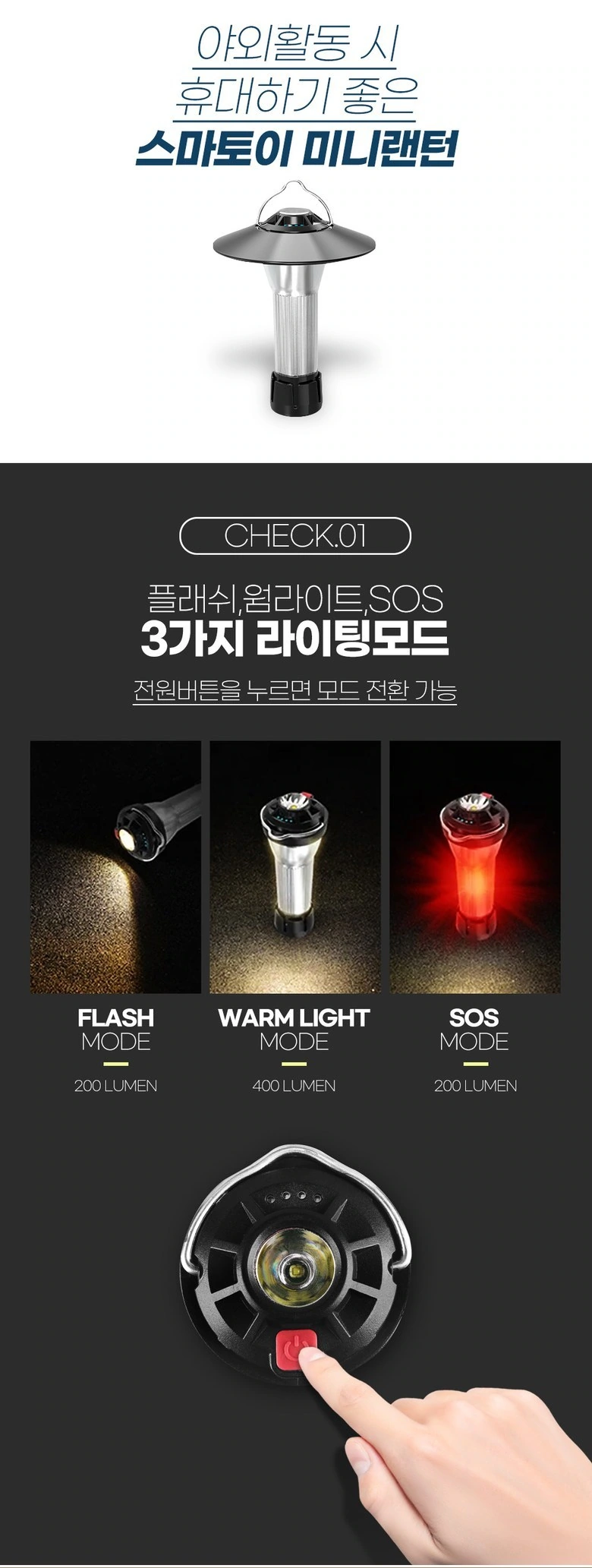
We arrange the three states in horizontal rows, with the close-up view of the button at the bottom, and the white background and the dark background to distinguish different contents. Photos, labels, and hand movements remain consistent.
Adjustment and interface: upper and lower partitions to avoid information stacking
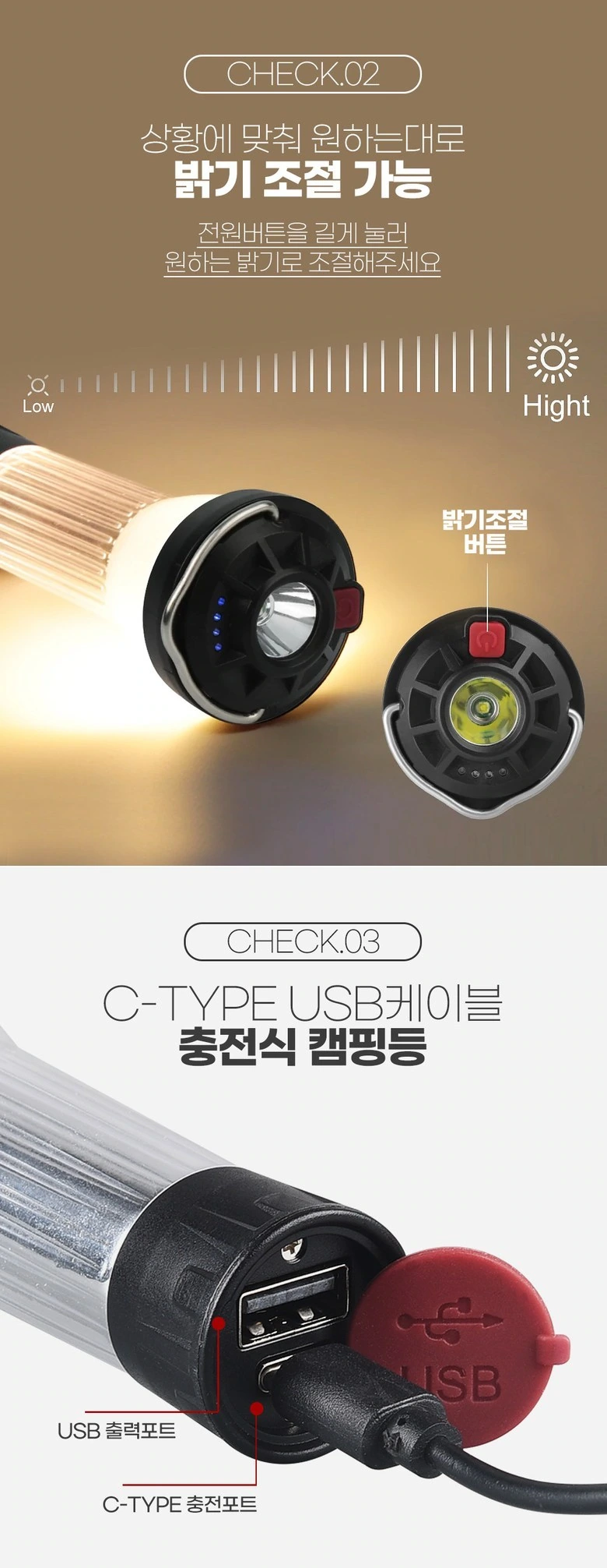
We use the warm color area to present the adjustment theme, and the white background below shows the connection interface. Different background colors divide tasks, and titles and partial pictures have separate spaces.
Power supply and placement: use scenes to supplement equipment relationships
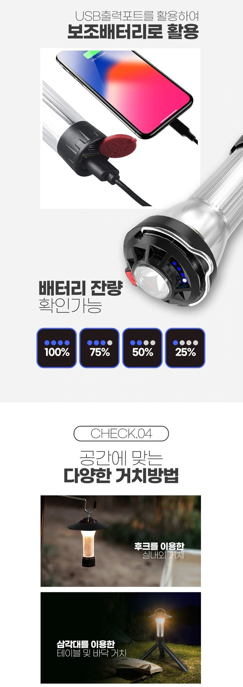
We put the combination of mobile phone and lamp body at the top, and the photos of the arrangement are listed below. The icons are arranged in a row to avoid crossing complex wires.
Magnetic theme: partial picture with direction arrow
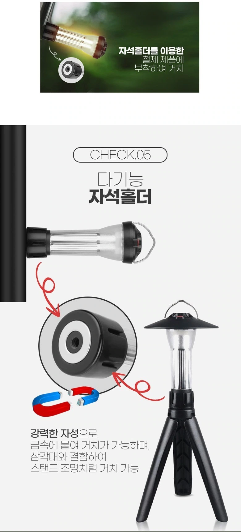
We use the bottom close-up view to enlarge the connection position, the red arc arrow indicates the direction of the diagram, and the bracket is shown below. Keep clear boundaries between parts and the whole.
Cover and Environment: Photo Groups to Form Chapter Changes
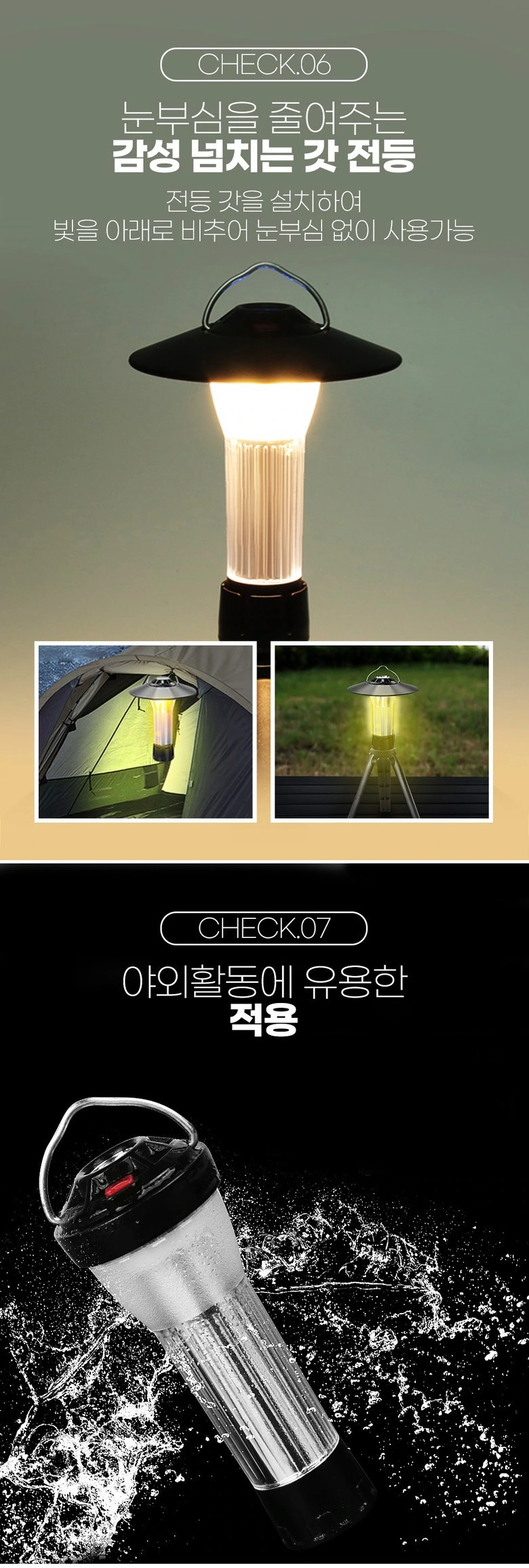
We put the hooded state at the top, the small environment pictures are arranged side by side, and the dark area takes on another type of theme. The division of labor between large and small photos is clear, allowing continuous pauses in long images.
Hand-held scale: reduce decorative protruding volume
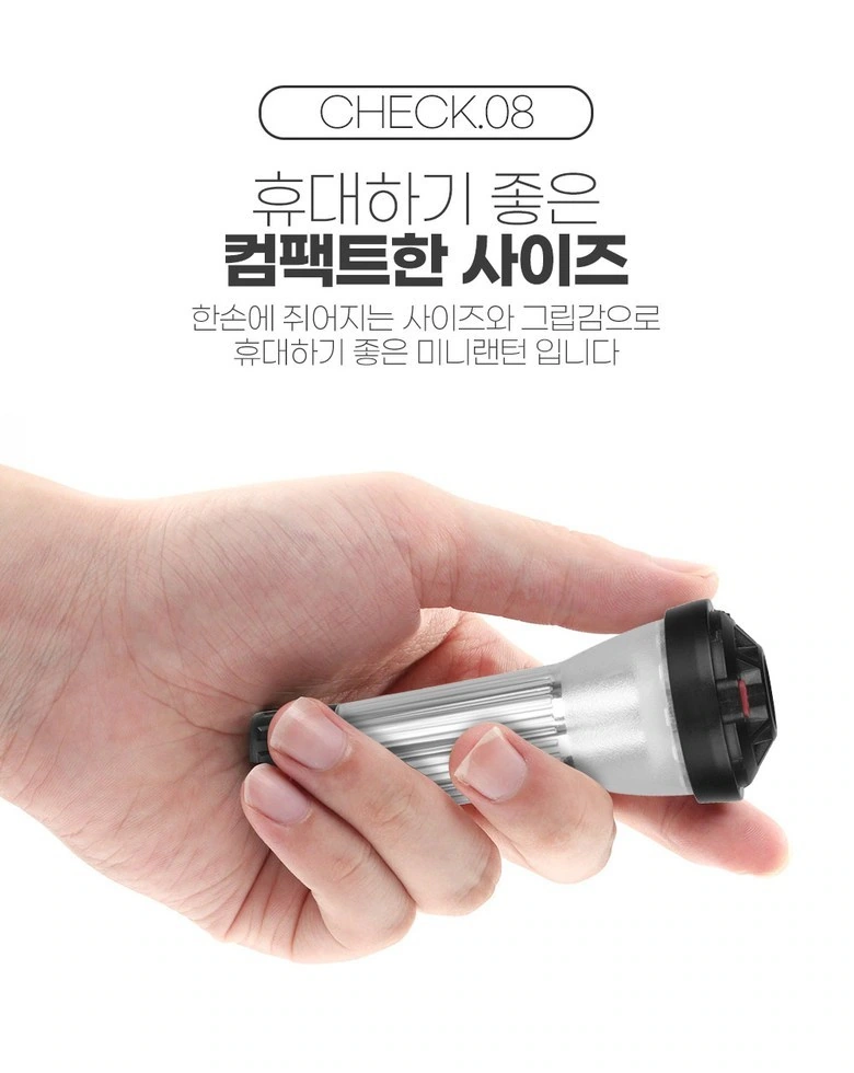
We use the palm of the hand to frame the folded light body, and the light background carries the large title. The subject and text remain independent, and the hand becomes an intuitive reference for scale.
Internal theme: technical graphics complemented by close-ups of lamp surfaces
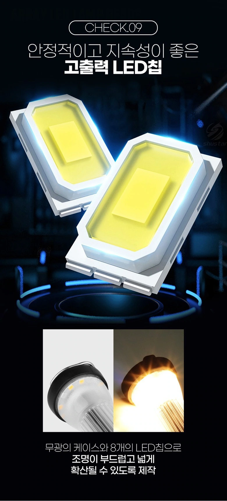
We have enlarged the internal diagram, and used two close-up shots of the lights below to supplement the form. The black background enhances the contrast of the outline, and the title and description maintain different font weights.
Overview of the combination: put the accessories back on the same white background
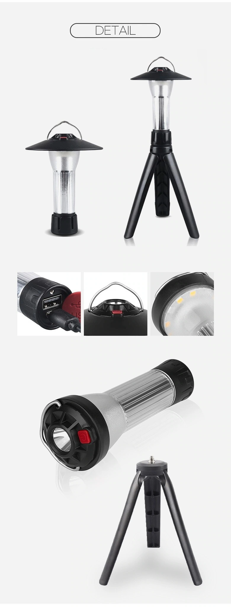
We display the lamp body, cover body and bracket in layers, and keep the same boundaries for local small pictures. The white background provides a reading buffer, allowing you to return to the product combination after complex instructions.
Specification closure: Dimensional drawings and information sheets separated
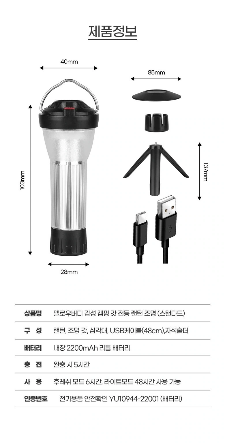
We illustrate proportions using the dimension lines of multiple items, with text tables below arranged along a fixed baseline. The diagrams and tables are connected to each other, and the end of the page is kept clean.
Deliver and design value
Through this version of the product detail page, we establish a continuous reading path around lighting modes and accessory combinations. Dark camping atmosphere, warm-light photos, and white-background structured paragraphs connect different chapters. Image scale, text level, and white space work together to distinguish priorities, allowing product overviews and partial descriptions to complement each other.
Develop a clear Coupang visual expression for your product
You can provide us with product links, existing materials, and key points that need clarification. We will combine the product structure, style and usage scenarios to plan the appropriate picture group or product detail page content and layout.